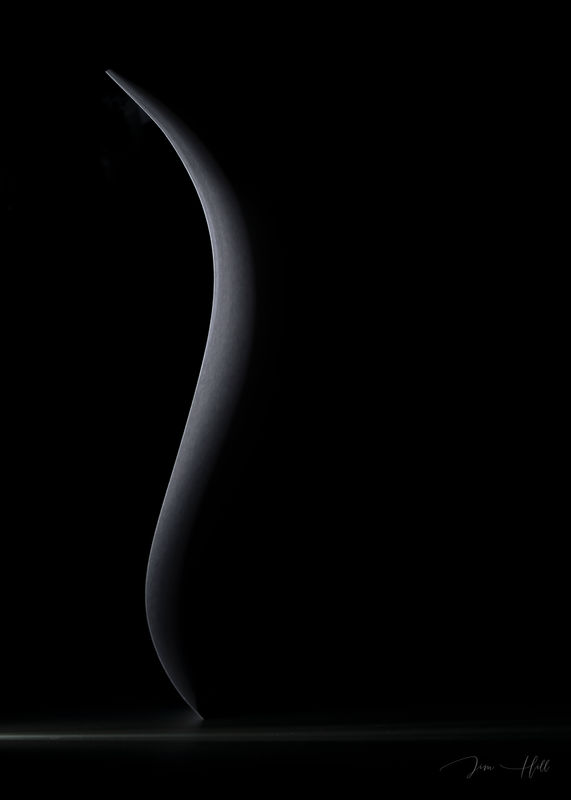
Edge of Light
Jul 26, 2019 11:44:03 #
I will post additional information about this shot if asked. Please Critique.
Jim
Jim
Jul 26, 2019 12:29:08 #
I really enjoyed this image Jim. I like that it's black and white, so that color doesn't interfere with the simplicity of the light graphic. I like the way you shaded the light, the fact it's off centered, and it has a base to ground it. Wonderful work. Bev
Jul 26, 2019 14:36:58 #
Jul 26, 2019 17:55:48 #
Jul 27, 2019 09:51:45 #
It's beautiful! Personally, I would like the extra negative space to be on the left instead of on the right. I'm not sure why.
Jul 27, 2019 12:40:07 #
Jim, this is a great image. Subtle, yet well defined and imaginative.
--Bob
--Bob
Jim-Pops wrote:
I will post additional information about this shot if asked. Please Critique.
Jim
Jim
Jul 27, 2019 16:22:42 #
AzPicLady wrote:
It's beautiful! Personally, I would like the extra negative space to be on the left instead of on the right. I'm not sure why.
Thank you Kathy. The only way that I know to add more space to the left is to expand & clone the black along with the table top white light. The problem is the slit of light opening has to be close to the paper or else it will spread. I have a shot of this wider spread of light but it becomes something much different. You might like it, I might post later and give you a heads up.
Jul 27, 2019 16:24:10 #
rmalarz wrote:
Jim, this is a great image. Subtle, yet well defined and imaginative.
--Bob
--Bob
Thank you Bob. I'm thinking about entering it in a show therefor asking for opinions.
Jul 27, 2019 17:08:40 #
Jim-Pops wrote:
Thank you Kathy. The only way that I know to add more space to the left is to expand & clone the black along with the table top white light. The problem is the slit of light opening has to be close to the paper or else it will spread. I have a shot of this wider spread of light but it becomes something much different. You might like it, I might post later and give you a heads up.
Thanks! Actually, I looked at it upside down, also. That puts the larger negative space on the left. Somehow that seemed better to me. Maybe because I'm a leftie?
Jul 27, 2019 17:39:00 #
AzPicLady wrote:
Thanks! Actually, I looked at it upside down, also. That puts the larger negative space on the left. Somehow that seemed better to me. Maybe because I'm a leftie?
I didn't think to flip it. It definitely makes a difference.
Jul 27, 2019 21:23:46 #
The sinuous curve adds a sense of wonder and peacefulness. Im a fan of visual simplicity and graphic design elements so this appeals greatly to me
Jul 28, 2019 21:32:25 #
Jul 29, 2019 10:33:50 #
Strodav
Loc: Houston, Tx
We all look at many, many photos in a week and pass over most of them in just a second or two. When I saw this image, I had to take it to full screen, stare at it and take it in. Nice work.
Jul 29, 2019 10:40:22 #
Strodav wrote:
We all look at many, many photos in a week and pass over most of them in just a second or two. When I saw this image, I had to take it to full screen, stare at it and take it in. Nice work.
Thanks so much, now that's the sort of reaction I was hoping to get.
Aug 1, 2019 18:06:30 #
Jim, kudos on...
A fascinating, absorbing...and the most gently impactful image I’ve had the pleasure to quietly ... and slowly ... and appreciatively view in a very long time.
Definitely better than my blood pressure meds!
Hogarth would be pleased!
Dave
A fascinating, absorbing...and the most gently impactful image I’ve had the pleasure to quietly ... and slowly ... and appreciatively view in a very long time.
Definitely better than my blood pressure meds!
Hogarth would be pleased!
Dave
If you want to reply, then register here. Registration is free and your account is created instantly, so you can post right away.


