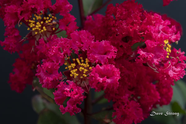
Red Crepe Myrtle Bloom
Jun 28, 2019 13:25:46 #
Strodav
Loc: Houston, Tx
I think I am at a point in photography where I need solid feedback in order to improve and am hoping this group can help me. Here is an image of a bloom on a Red Crepe Myrtle. While my wife said "oh wow" when she first saw it full screen I really need some feedback from those skilled in the art and science of photography, on technique, technical aspects and especially on composition.
Nikon D850, Nikon 60mm f/2.8 G ED macro, ISO 1100, 1/500 sec, f/16, AF-S, matrix metering, Vanguard Alto Pro tripod. Took about 10 shots CH (9fps) and used the sharpest. Distance from the yellow "flowers" in focus was around 12". Natural light on a cloudy day, sporadic light wind, with a black foam board background. Very little PP with a slight crop, a little noise reduction and brought up the yellows a bit.
Thanks in advance
Jun 28, 2019 14:31:58 #

Here's a run-down of observations and ideas.
1. The colors in the thumbnail are blah / muted because of your use of an uncalibrated colorspace. The file's EXIF reports being created by Lightroom, so I'm unsure how you ended up in this situation. Visit your Export settings and assure sRGB is the output colorspace when creating your final JPEGs. Other useful parameters are demonstrated in the examples section at the bottom of this post: Recommended resizing parameters for digital images
2. Picking where to focus within this type of image is a difficult decision. I clicked around a bit and decided the sharpest focus was slightly above and to the left of the yellow stamen in the center of the image. I don't know if there is a right / wrong / better location. I've done some experimenting in my own work and have decided the closest portion of the image to the camera / viewer seems to work better in my images. So, rather than the pink above / left of the yellow, you might have picked the petals of the flowers to the lower-right of the yellow. My own eyes seem to fall there naturally / first when viewing the image.
3. In LR, look at your sharpening parameters. The file EXIF includes the LR parameters of a Sharpening Radius of +1 and Sharpening Detail of +75. I'm on LR6 and it seems your LR8 software has some slightly different options / parameters as I don't see a "strength" value. Using a mask value will help. In the Detail module while editing this image, hold your <ALT> key while moving the masking slider to the right. You'll probably get to around +55 to have the sharpening applied to just the fine details of the image. Starting from the NEF RAW, you'll probably want a Sharpening 'strength' in the +50 to +75 range.
4. Along with sharpening, look closer at your Noise settings. The Luminance NR setting in the EXIF shows some customization, and the Color NR looks like the default (if I'm reading the EXIF correctly). This post gives some ideas and demonstration on how to use these two NR tools in LR: Basics of noise processing To my eyes, it looks like you need a bit less Color and a bit more Luminance in the NR processing.
5. Exposure / LR Basic adjustments - You might visit the whites / blacks / shadows of the image to better isolate the flowers from the background, such as Exposure +0.15, Shadows -35, Whites +10, Blacks -20. You can use the <ALT> key on each of these sliders and see the effect as the highlights and shadows move toward complete black and / or white.
6. Distractions - with the updates in item5, the bit of pink entering the frame in the upper right should be a minor distraction that is cloned away.
Summary - your image capture parameters are good, with ideas to modify being more personal preference / style rather than an area to address. More opportunity exists in the post-processing to harvest a stronger image from the out of camera NEF.
Jun 28, 2019 16:16:01 #
Strodav
Loc: Houston, Tx
CHG_CANON wrote:
Here's a run-down of observations and ideas. br b... (show quote)
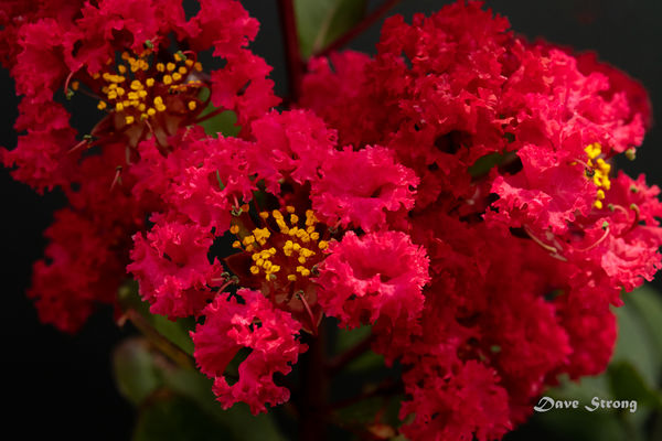
Thank you, your post was very helpful! Changed from Adobe Color to srgb color space, resized to 2048 x 1365, adjusted temp/tint for a neutral black background (I should have known better), shadows -35, whites +10, blacks -20, removed CA and applied lens compensation, cloned the upper right corner. In my first attempt, I reduced noise and tried to compensate with sharpness, which softened the stamen. In this pass, I left noise alone, which isn't objectionable to me unless you go 1:1, and sharpened a bit. Is this an improvement?
Final question. On a scale of 1 to 5 where 1 is delete it as it's not worth showing and 5 is a portfolio shot, where would you rate it. Thanks again.
Jun 28, 2019 17:31:00 #
Strodav wrote:
Thank you, your post was very helpful! Changed fr... (show quote)
Nice! Glad to help. For a candid rating, I'd say a solid 4 on your 5-point scale. I try not to be a prisoner to the rule of thirds. But, if you use that approach, none of the image details fall along the 1/3 guides nor the intersections. Nor is the subject directly in the middle. I like how all the current petals just touch the edge of the frame. Alas, they make re-cropping difficult where my attempts fail to look as nice as your version. I find the bit of dead space along the lower left to be a candidate to crop away. But, the positions of the yellow in the left and right corners prevent me from finding a way to pull-in the edges while not leaving these bright colors on a distracting edge of the frame.
An alternative use of the image might be a square crop of the closest flower, just clone away any distracting yellow from the background flower in the resulting upper left corner. The square would be a good instagram post. Coming back to my original comment about focusing on the closest detail, here's where that approach provides options for cropping later as those nearest petals become more obvious in the square crop. But, the sharp details of the stamen are more obvious in the square crop that negate my concern about the location of the sharpest focus.
If you have a version with more space available above the current top margin, you might slide the crop box vertically, taking away some space on the bottom and gaining space on the top. You'd also better align the image details to the lower 1/3 horizontal. I have my 1/3 guides active when cropping in LR.
Considering the 60mm lens, other ideas might be a step back giving an image with more 'working' space and cropping options. Or, 2-steps closer so that only one blossom is the focus of the image, ala the square crop. A bit of flash on just the closest blossom could place the background more in shadow. I don't know there is a '5' in this arrangement / view. Maybe closer and from a side- or angled-view might give that unusual / "haven't seen before" image?
Jun 29, 2019 13:23:02 #
This image can benefit greatly by editing and using dodge and burn techniques to bring out the detail and texture of the flowers and accentuate the lighting.
Jun 29, 2019 14:26:39 #


Jun 29, 2019 15:05:30 #

Paul mentioned a number of good points, and I liked your re-edited version. I'm currently playing with something new to me when I have some flowers, have you tried focus stacking? The D850 does it in camera, Nikon calls it focus shifting and the settings are found in the photo shooting menu. I use Photoshop to post proceess. I'm working on finding what type of image needs which settings, but it's interesting to practice.
I was wondering, what your Crepe Myrtle might look like all sharp.......maybe too much sharpness, but might be fun trying. Just a suggestion. Bev
I was wondering, what your Crepe Myrtle might look like all sharp.......maybe too much sharpness, but might be fun trying. Just a suggestion. Bev
Jun 29, 2019 15:35:55 #
Strodav
Loc: Houston, Tx
NikonGal wrote:
Paul mentioned a number of good points, and I like... (show quote)
I like your thoughts and focus stacking did cross my mind as I've used the technique for closer to 1:1 subjects, but in this case, I tried to keep the subject sharp (lower left) and soften everything else. In all honesty I skipped over focus stacking because it would have taken somewhere between 50 and 100 shots at 46mp each, which would have taken a long time to download and process. I took the easy way out.
This is my take away from your very thoughtful comment. I picked one technique, an easy one, and ran with it. As I become more serious, I need to try several different perspectives, different focal lengths, and different techniques and not take the easy way out.
Jun 29, 2019 15:41:14 #
Strodav
Loc: Houston, Tx
lloydl2 wrote:
This image can benefit greatly by editing and using dodge and burn techniques to bring out the detail and texture of the flowers and accentuate the lighting.
Thank you, I will try it.
Jun 29, 2019 16:35:21 #
You are right Stroday. One technique at a time, but just because a technique is easy, doesn't make it the wrong to go with it, if we like the outcome. After all, while we all strive to become better photographers and post processers, we're the one we need to please, and we're the one with our name on the image.
Hope to see more of your work. Bev
Hope to see more of your work. Bev
If you want to reply, then register here. Registration is free and your account is created instantly, so you can post right away.