Morning In The Blackhills
Jun 13, 2019 19:34:00 #
kenievans
Loc: Dallas
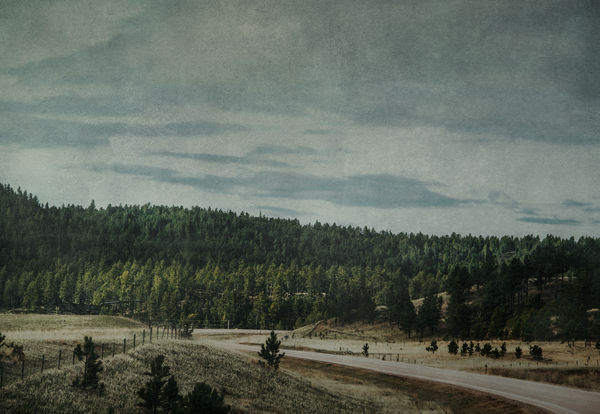
It was a beautiful crisp cool morning in April driving through the Blackhills of South Dakota. We had spent a couple of days at Mt. Rushmore and were heading to Boulder Colorado, just skirting the storms that were also headed that direction. The sun peaked out between the clouds as the road twisted and turned through the hills. Spring was starting to change the land that had not so long ago been covered deep in snow and the hordes of annual visitors to the area were still waiting for school to end before hitting the road. It was as if we had this beautiful country all to ourselves to just breath.
Spring Road Trip
2019
Spring Road Trip
2019
Jun 14, 2019 08:50:40 #

My initial thought is that it is starved for light. With the monitor brightness turned up to max. If the ultimate desired destination of an image is to be hanging on a wall, you should put your monitor brightness down quite a bit to get an idea what a print would look like. The histogram
Jun 14, 2019 09:55:25 #

I could not put my finger on it at first view, but Mark's description is very fitting IMO. I am not able to reconcile your description of beautiful and crisp with the processing, Keni. Sorry  One thought: to emphasize having the road all to yourselves, make it brighter - as if sun is shining there. Give our eyes a place to start within the frame.
One thought: to emphasize having the road all to yourselves, make it brighter - as if sun is shining there. Give our eyes a place to start within the frame.Jun 14, 2019 10:33:16 #

I am going to say that I am in agreement with previous responses. IF your vision finds the image to your liking you should do nothing but technically speaking the histogram shows underexposure of the highlight areas. As I said, if that is what you saw or what you want it is your image and your interpretation and nobody should object to that.
A couple of my observations. There is considerable noise in the sky but it does not bother me. Because of the lighting the image needs color correction unless you prefer to keep the underexposed mood.
A couple of my observations. There is considerable noise in the sky but it does not bother me. Because of the lighting the image needs color correction unless you prefer to keep the underexposed mood.
Jun 14, 2019 10:41:49 #
kenievans
Loc: Dallas
I have really been struggling with my images being too dark. They look fine on my screen at work and at home but when I print them they are darker. I send all my images to a local camera shop for printing so I know they do quality work. I know Linda has mentioned a few times about my images being dark on her screen. Any suggestions to get this working right would be great.
My office has bright overhead florescent lights and I have the typical 21 inch Dell work monitor. I have attempted to calibrate it several times in the past. I have a 27 inch curved monitor at home and my desk is in a little cubby hole with a desk lamp and one small overhead light fixture.
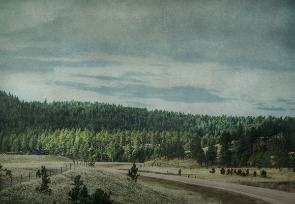
In the attached I reduced the brightness of my work monitor, added some brightness to the image as well as dodging the lighter areas. It looks much brighter to me. Please let me know how it looks on our monitors.
My office has bright overhead florescent lights and I have the typical 21 inch Dell work monitor. I have attempted to calibrate it several times in the past. I have a 27 inch curved monitor at home and my desk is in a little cubby hole with a desk lamp and one small overhead light fixture.
In the attached I reduced the brightness of my work monitor, added some brightness to the image as well as dodging the lighter areas. It looks much brighter to me. Please let me know how it looks on our monitors.
Jun 14, 2019 10:48:14 #
kenievans
Loc: Dallas
camerapapi wrote:
I am going to say that I am in agreement with prev... (show quote)
Thank you for your comments. The noise and color you see is from a couple of texture layers I applied to the image. I like a more artistic look to my images rather than always straight photography. Here is the shot with just the basic post processing and no artistic layers. It is a fine image but I don't think it has the same impact.
Jun 14, 2019 10:57:34 #
It looks better but it keeps a dull appearance. If you may, go to Curves and move the shadows slide to the right to taste but do not make it too dark. Now go to Color Balance move the magenta, yellow and red parameters to taste.
If the difference is to your liking you got the image you want.
After shooting with your camera check the histogram. Make sure the metering is done for the MOST IMPORTANT BRIGHT AREA when there is one otherwise go with a middle tonality, something called 18% gray. Your middle tonality in this image, using spot metering, is the grass on the hill to your left. Follow the meter, no correction is necessary to the exposure BUT look at the histogram and if necessary extend the exposure to the right of the histogram using exposure compensation. DO NOT CLIP THE HIGHLIGHTS while exposing to the right.
If you have been using matrix metering for the exposure you should know that matrix metering is many times fooled by the lighting conditions. ALWAYS LOOK AT THE HISTOGRAM.
Jun 14, 2019 11:04:40 #
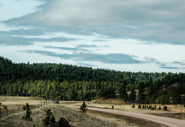
With all due respect, that second image looks fine to my eyes. Applying textures made your image underexposed and dull and obviously that needs adjustments.
No big deal, we do what we like with our images.
No big deal, we do what we like with our images.
Jun 14, 2019 13:44:04 #

As a further comment about the grainy texture, it's not conducive to the image looking "beautiful and crisp". It has a softening effect on the image and gives a grungy look.
Jun 14, 2019 13:54:45 #
kenievans wrote:
.....I know Linda has mentioned a few times about my images being dark on her screen. Any suggestions to get this working right would be great.....
Here's a link to some stuff that will help you get your monitor/graphics card set up properly (there are others out there, but this one's effective and comprehensive). I used it in conjunction with an image that I knew should look OK.
http://www.lagom.nl/lcd-test/
It's not just brightness that can skew things. Too much or too little contrast can affect how you set the other adjustments. If you have control over gamma I would recommend moderate adjustments aimed at achieving as natural a look as possible. In fact with all the controls, start off with moderate adjustments and be aware of how they affect each other. They can't be set up individually in isolation. Take your time to do it properly - it's time well spent.
Jun 14, 2019 15:21:10 #
kenievans
Loc: Dallas
R.G. wrote:
Here's a link to some stuff that will help you get... (show quote)
Thank you R.G. I have determined I have a POS monitor at work. I will work on my home monitor and see what I can do with that one. I guess I will be checking everything on my home monitor before posting or printing going forward although It has done a pretty good job with my really artsy stuff.
Jun 14, 2019 15:26:15 #
kenievans wrote:
Thank you R.G. I have determined I have a POS monitor at work. I will work on my home monitor and see what I can do with that one. I guess I will be checking everything on my home monitor before posting or printing going forward although It has done a pretty good job with my really artsy stuff.
 . When your artistic endeavours make you rich and famous you'll be able to afford a monitor calibrator (Spider Monkey or some such
  ).
).
If you want to reply, then register here. Registration is free and your account is created instantly, so you can post right away.