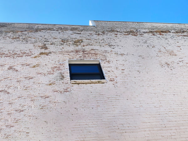
Sky Color / Wall / Window Drama
Jun 5, 2019 12:30:18 #

I'd appreciate comments on how this struck you, and any thoughts, changes beyond that.
Jun 6, 2019 07:47:30 #

Interesting. I didn’t like it at all at first, but it sort of grows on me. Perhaps the angle is a bit harsh for me; I’d prefer something more straight-on, I think.
Jun 6, 2019 08:06:40 #
JeffL
Loc: New Jersey
Interesting shot. First thought: “That’s way too high to escape from.” Second thought: “What type of building is this? A factory, a prison, a what?” This photo just makes you think.
Jun 6, 2019 08:47:18 #
The shades of blue in the window remind me strongly of a particular Rothko painting.
Richard
Richard
Jun 6, 2019 08:55:15 #

I like the basic idea. If this was my shot, I would have shot it vertically. The window about 2/3 up in the shot. With a bit of sky showing. For me it definitely is a minimalist image.
Jun 6, 2019 09:18:01 #
All very helpful and appreciated. I just liked the shot as I looked up, but I think a reason might be its minimalist simplicity, yet pushing that into a dynamic direction, in contrast to Rothko's quiet contemplation. The color, in both sky and window did strike me, so I removed a drainpipe and air conditioner.
Jun 6, 2019 17:39:07 #

Jun 7, 2019 19:04:03 #
NikonGal wrote:
I like your minimalistic presentation and the blue of the sky. Bev
Thank you. Good to know what I was aiming for reached you.
Jun 9, 2019 09:26:04 #

artBob wrote:
I'd appreciate comments on how this struck you, and any thoughts, changes beyond that.
For the past 100 years(it seems) I've been beating my head against a brick wall, trying to develop a technique for creating believable skies in photoshop.
Your image says it well!!

That being said, I like it for its lack of clutter
Jun 9, 2019 09:45:33 #
Rich1939 wrote:
For the past 100 years(it seems) I've been beating my head against a brick wall, trying to develop a technique for creating believable skies in photoshop.
Your image says it well!!
That being said, I like it for its lack of clutter
Your image says it well!!
That being said, I like it for its lack of clutter
Thanks. I've been noticing recently, after catching a view out a small office window, that the color of the sky is more amazing when not part of the usual landscape photo, but isolated.
Jun 18, 2019 18:32:15 #
artBob wrote:
I'd appreciate comments on how this struck you, and any thoughts, changes beyond that.
I really think that I would crop this so that the window is in the lower left rule of thirds intersection. To me the lower right and the upper left do not add much to your composition. I would also think about straightening the window. I like it.
Erich
Jun 18, 2019 18:41:48 #
ebrunner wrote:
I really think that I would crop this so that the window is in the lower left rule of thirds intersection. To me the lower right and the upper left do not add much to your composition. I would also think about straightening the window. I like it.
Erich
Erich
I get what you are after. Thanks.
If you want to reply, then register here. Registration is free and your account is created instantly, so you can post right away.