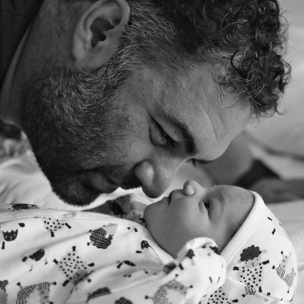
Father and Son
Jun 1, 2019 07:01:55 #

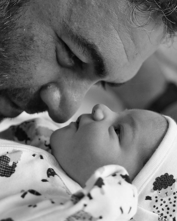
Trying to decide on B&W, color. Also thinking about a possibly much tighter crop showing only half of each head. What do you think?
Jun 1, 2019 07:05:30 #
billnikon
Loc: Pennsylvania/Ohio/Florida/Maui/Oregon/Vermont
dsmeltz wrote:
Trying to decide on B&W, color. Also thinking about a possibly much tighter crop showing only half of each head. What do you think?
That decision is yours. Personally I like the near matching skin tones on the color shot, I believe that this draws them closer together and creates that bond. I would also take the healing brush to the forearm and watch of the dad in the background, it draws away from the foreground.
Jun 1, 2019 07:32:00 #
jbk224
Loc: Long Island, NY
Interesting. I like the B+W. The reason is that newborns do not see color. They only see B+W+grey tones. B+W begins the story.
Jun 1, 2019 07:36:30 #
The graphic quality of the B&W is timeless in form and concept...Nice
Jun 1, 2019 08:22:01 #
...B&W...and good luck deciding on how much to crop...I really started to overthink the father’s ear...
Jun 1, 2019 08:37:27 #
Kaib795
Loc: Maryland, USA
dsmeltz wrote:
Trying to decide on B&W, color. Also thinking about a possibly much tighter crop showing only half of each head. What do you think?
I don't save files in B/W unless there are distracting areas of the shot I cannot remove or not allowed to remove or if the color is not appealing. One shot of Niagara Falls the angle and composition was great but it caught some construction orange fence and orange cones in the shot. I simply cloned them out as it was a vacation shot. Street pictures, in my view, are better in B/W as you only see composition so there is no eye candy pulling you away from the subject. A picture of a older relative I had taken in B/W was exquisite but it removed skin distractions. I like you color shot but would clean up any discolored mark on the fathers face (a distraction). The shot is simple and you have to look only at the two subjects with little else in the frame. I think because there is a baby in the shot you should keep the softness of the child's skin in color to show the pureness of a new born. Is it about him or the child, so the focus should be to the child. Sometimes cropping is works better and in this case I might cut off some of Dad to push the view to the child, the point of interest. Just my thoughts.
Jun 1, 2019 08:56:12 #
dsmeltz wrote:
Trying to decide on B&W, color. Also thinking about a possibly much tighter crop showing only half of each head. What do you think?
Nice image of father-child interaction.
B&W works better for me because it simplifies the visual statement.
I find the man's head visually too dominant compared to the baby. I would try cropping, but only from the top, perhaps to the level of the bottom of the man's ear?
Jun 1, 2019 11:35:30 #

Jun 1, 2019 12:32:13 #
srt101fan wrote:
Nice image of father-child interaction.
B&W works better for me because it simplifies the visual statement.
I find the man's head visually too dominant compared to the baby. I would try cropping, but only from the top, perhaps to the level of the bottom of the man's ear?
B&W works better for me because it simplifies the visual statement.
I find the man's head visually too dominant compared to the baby. I would try cropping, but only from the top, perhaps to the level of the bottom of the man's ear?
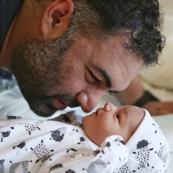
I did a crop earlier somewhat along these lines.
Jun 2, 2019 08:29:34 #
Jun 2, 2019 10:10:23 #

dsmeltz wrote:
Trying to decide on B&W, color. Also thinking about a possibly much tighter crop showing only half of each head. What do you think?
I like the B&W version and I don't think you should crop it any closer.
Jun 2, 2019 11:47:05 #

Peterfiore wrote:
The graphic quality of the B&W is timeless in form and concept...Nice
Spot on!
Jun 2, 2019 11:59:12 #

Jun 2, 2019 12:24:29 #

I would apply a Silver finish to the B&W version to accentuate the hair in his head and beard and some shadow in back of the baby's face & chin line to make it glow as if kissed by light from above. The miracle that it truly is only blessed further and the pride & joy on Dad's face clearly acknowledged in the manner displaying the overwhelming joy of this prize-winner.
The color version is equally attractive and I would keep it warm toned as much as possible to reflect the obvious love and happiness it reveals. Sharpen ever so slightly in those areas that are somewhat soft or vague and because both subjects have nearly-equal exposure , add contrast to bring the larger & darker Dad in the Glow of the newborn infant's aurora.
Great Work Man and thanks for the opportunity. Love your style.
Jun 2, 2019 12:34:55 #
If you want to reply, then register here. Registration is free and your account is created instantly, so you can post right away.