Iris
May 20, 2019 12:31:43 #

May 20, 2019 14:29:50 #

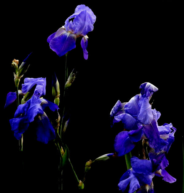
I love the black background and the light. I'm having problems with the composition, however; it seems disjointed. For me, a tall narrow aspect of just the left side offers more impact.
May 20, 2019 14:41:41 #
Linda,
Thank you for your comments. I thought the sort'a circular look was pleasing but I will try your suggestion and repost.
Ed
Thank you for your comments. I thought the sort'a circular look was pleasing but I will try your suggestion and repost.
Ed
May 20, 2019 14:43:35 #
May 20, 2019 14:50:02 #
Appreciated. Now I notice the stem on the left that ends abruptly in space 
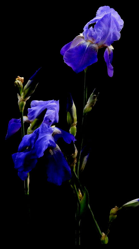
I think the circular look is a nice idea, but maybe there's just a skosh too much empty space in the middle. I don't know if you've seen the occasional share topics about "flipping" but when I reverse your original horizontally, it is more pleasing. I'm not sure I can even express why Many thanks!
I think the circular look is a nice idea, but maybe there's just a skosh too much empty space in the middle. I don't know if you've seen the occasional share topics about "flipping" but when I reverse your original horizontally, it is more pleasing. I'm not sure I can even express why
Many thanks!May 20, 2019 15:27:51 #
The stem ends in mid air because my wife had tied them up after a good rain and I pp'd them out...
Thanks again for your comments, Linda
Ed
Thanks again for your comments, Linda
Ed
May 20, 2019 15:36:52 #
I flipped it and cropped it from the bottom to remove the disappearing stem...
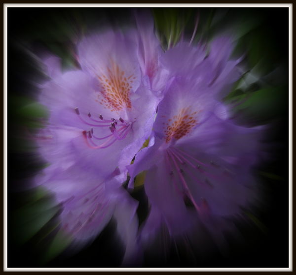
Here's a rhododendron I I messed with too.
Here's a rhododendron I I messed with too.
May 20, 2019 16:48:42 #
edrobinsonjr wrote:
Ohhh, love that zoom-blurred rhoddy! I also like the crop and flip of the iris shot. In some ways it's becoming more strongly and simply about color and form. Thanks!I flipped it and cropped it from the bottom to remove the disappearing stem...
Here's a rhododendron I I messed with too.
Here's a rhododendron I I messed with too.
May 20, 2019 18:04:51 #
May 21, 2019 13:30:44 #
edrobinsonjr wrote:
...
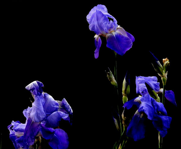
An interesting back and forth between you and Linda that produced some worthy edits. I like the vertical arrangement best. I think when you black things out, it lends itself to a 'less is more" type of composition. I also like the zoom blur. That is an effect that I try to work with a lot. Sometimes with success... mostly shots worth of the delete button.
Erich
May 21, 2019 14:10:18 #
If you want to reply, then register here. Registration is free and your account is created instantly, so you can post right away.