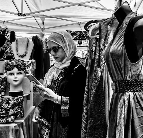
Checking for Messages
May 16, 2019 07:51:36 #

May 16, 2019 08:02:19 #
Guyserman
Loc: Benton, AR
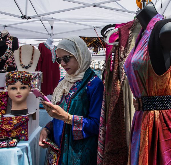
In this case I like the color better. It provides some separation in a very busy photo. (just my opinion.)
May 17, 2019 06:40:14 #
Guyserman wrote:
In this case I like the color better. It provides some separation in a very busy photo. (just my opinion.)
Yes, color does help with the separation here.
May 17, 2019 07:32:35 #

I like the color much better. I find all these street images in black and white to be depressing.
May 17, 2019 08:03:18 #

May 17, 2019 08:28:12 #

Voss wrote:
I couldn't decide between these, so here are both versions.
Hmmmm for the title I have to choose the black and white, it really sets the mood and isolates the specific activity. However, the colors are awesome. The color version needs a title with rainbow or kaleidoscope :-)

May 17, 2019 09:01:05 #
StevenG
Loc: Long Island, NY
Voss wrote:
I couldn't decide between these, so here are both versions.
I like color. But in this photo I think it is to busy. I think the b and w better separates the woman from the background. Just my opinion.
Steve
May 17, 2019 09:06:43 #
With the black and white, the focus of the photo is the title: "Checking for Messages.
With the color version, the focus of the photo becomes the colors, but the colors do not convey the message, hence my choice of black and white.
With the color version, the focus of the photo becomes the colors, but the colors do not convey the message, hence my choice of black and white.
May 17, 2019 10:03:40 #
AZNikon
Loc: Mesa, AZ
They are both excellent, that's why you can't decide. Neither could I. Well done!
May 17, 2019 10:35:51 #
Voss wrote:
I couldn't decide between these, so here are both versions.
The woman is too much in the center for me in both images. I would crop so that the phone is the focused target in center.
Also, I find the B&W to be the stronger image in that the colors compete with each other in the second version.
It is a very interesting shot either way.
May 17, 2019 13:44:00 #

May 17, 2019 14:43:57 #

Guyserman wrote:
In this case I like the color better. It provides some separation in a very busy photo. (just my opinion.)
Same - same.
May 17, 2019 15:27:41 #
Thank you all for responding. It's interesting how evenly balanced the opinions are. Generally, when I like the color shot, I like the B&W even better. So this was a relatively rare case for me. But you all have good arguments for each one.
May 17, 2019 15:38:13 #
DeanS wrote:
Same - same.
When I scroll the photo up (color ver) and eliminate the white canopy, it really pops for me.
May 17, 2019 17:51:58 #
Voss wrote:
I couldn't decide between these, so here are both versions.
I like both also. However because of the vivid colors, I have to say color.
 I
I
If you want to reply, then register here. Registration is free and your account is created instantly, so you can post right away.