Check out Black and White Photography section of our forum.
Interesting Hotel Room and Lighting
May 12, 2019 14:18:58 #
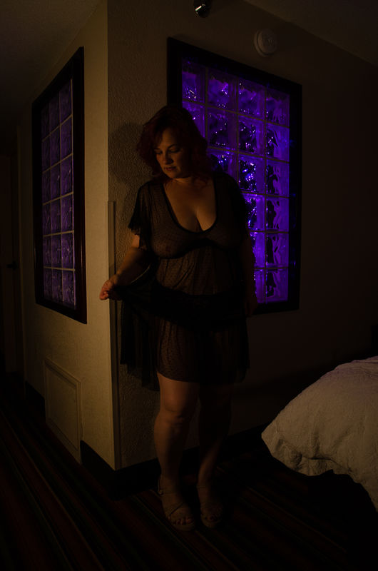
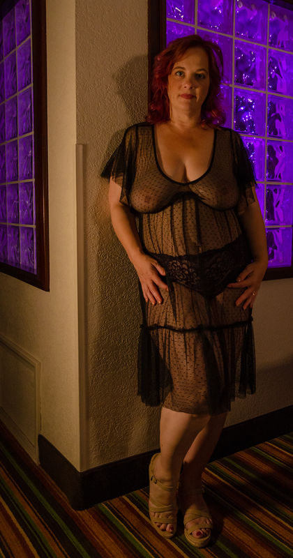
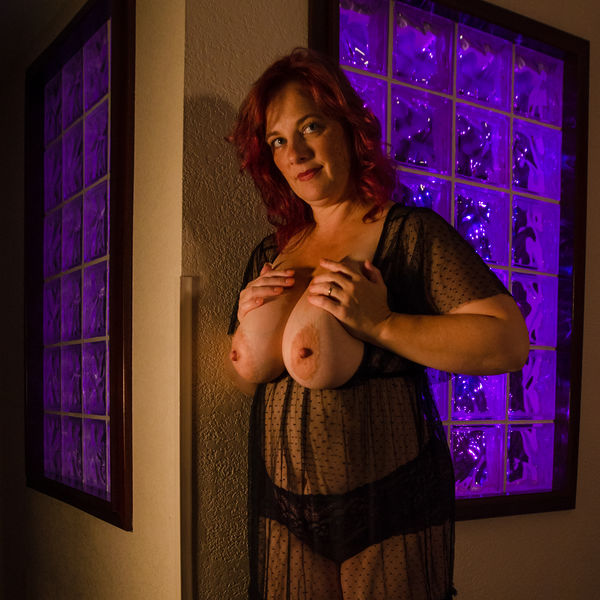
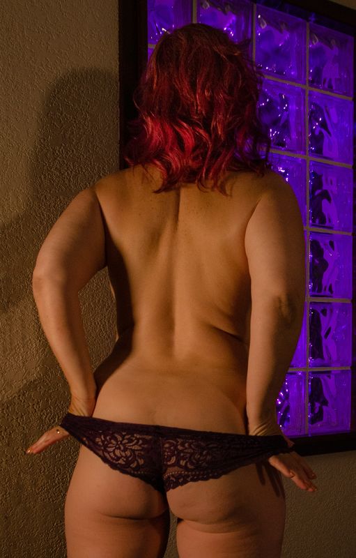
Stayed last night in a hotel room that had two, glass block "windows" between the tub area into the main room. I had six strands of tiny purple led lights a friend had given me. They run for hours off of watch batteries. I hung them inside the frame of the window facing the camera. The second window was illuminated passively. Two tunable LED photo lamps set to full warm were used on very low power to add frontal and side illumination. To get full figure shots that included both windows we fought the geometry of the room. There is a bed immediately to the right with bright white linens.
Shot at ISO 500, 1/8th of a sec, F6.3, with a 17-50mm Tamron F2.8
The first image is unedited to show the whole frame and the exposure. The subsequent images play with different crops and changes in exposure. I don't know if they need to stay dark and subdued or be brought up a great bit more. The last image has the exposure brought up to a more "normal" level, but it's not the level of light that existed in the room.
May 12, 2019 16:17:38 #
May 12, 2019 16:31:01 #
RogStrix wrote:
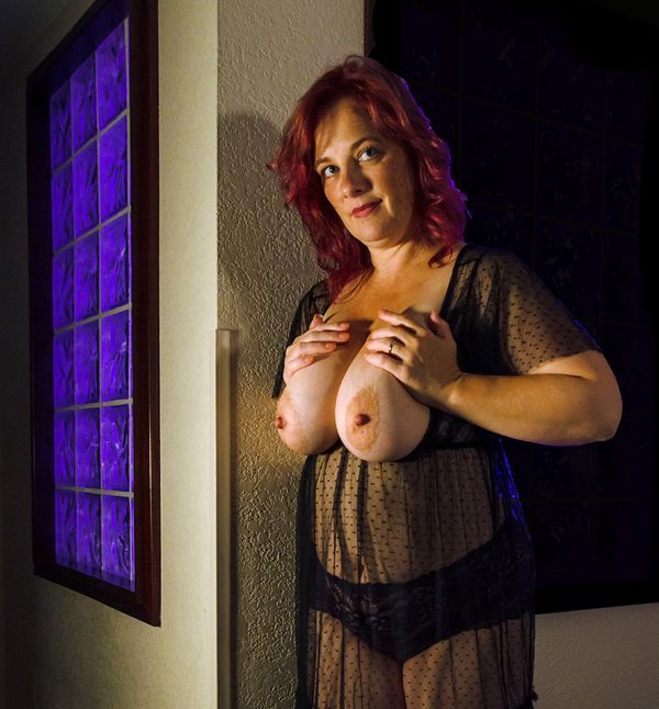
Think I would be inclined to crop one window out of shot?
OK, take one of the shots and show me.
Check out Wedding Photography section of our forum.
May 12, 2019 17:17:37 #
RogStrix
Loc: UK
InfiniteISO wrote:
OK, take one of the shots and show me.
Tomorrow when I'm back on my pc...
May 12, 2019 17:43:32 #
DIRTY HARRY
Loc: Hartland, Michigan
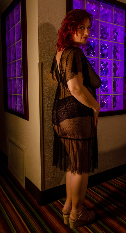
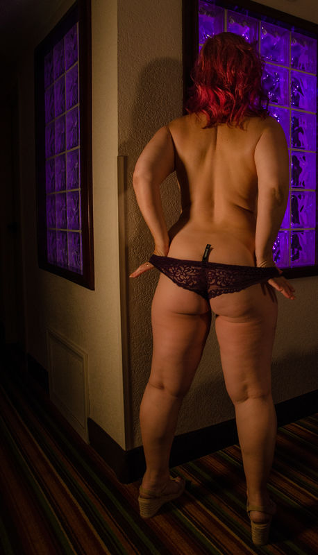
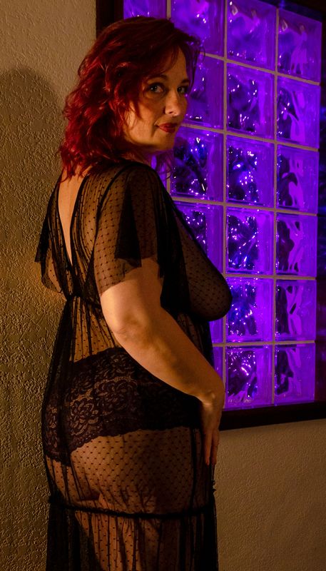
I really like the photo of the full back shot.. the lighting is very interesting.
May 12, 2019 18:42:43 #

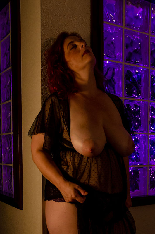
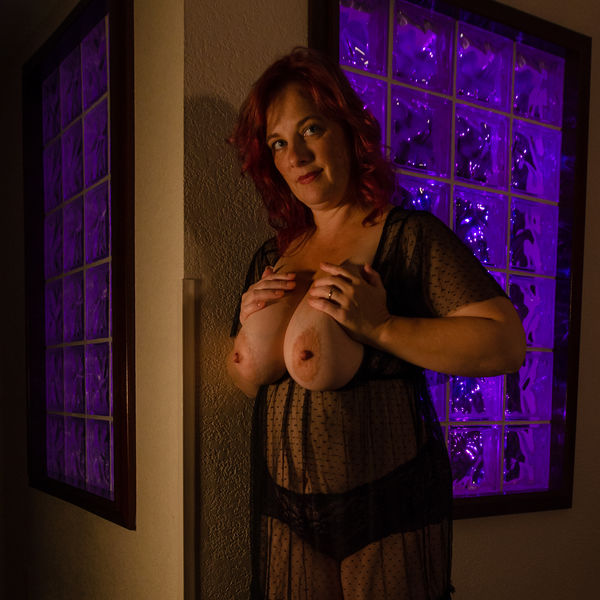
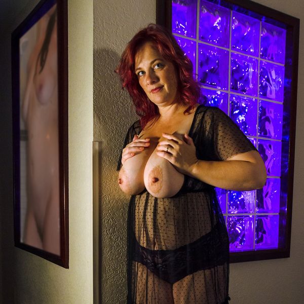
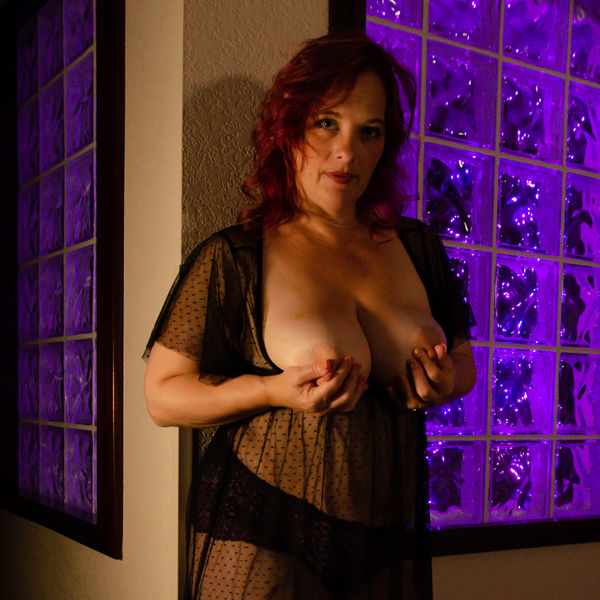
I would say your best work to date... except that in photo #5 her right elbow blends too much with her right breast, making for a funny/distorted/blurry looking areola.
May 13, 2019 00:12:03 #
JohnFrim wrote:
I would say your best work to date... except that in photo #5 her right elbow blends too much with her right breast, making for a funny/distorted/blurry looking areola.
I see what you mean. It's a tough spot to edit because all the colors there are very similar. I have tried to select and darken her right forearm and elbow and I've also boosted the exposure. If the breasts and nipples were not so crucial a focus point of the shot, it wouldn't be as glaring a problem.
Check out Video for DSLR and Point and Shoot Cameras section of our forum.
May 13, 2019 04:48:46 #
That is much improved, but it seems you were playing with brightness of the arm, with the result that you have an area that should be wall but has no texture. You might try cloning the wall texture onto the arm area. Because of the change in lighting on the wall in the area just in front of her breast you have to be careful what area you clone from. Try cloning "upward" until you reach the breast, then clone the area to the left of her breast "rightward" to just above the nipple.
May 13, 2019 06:37:41 #

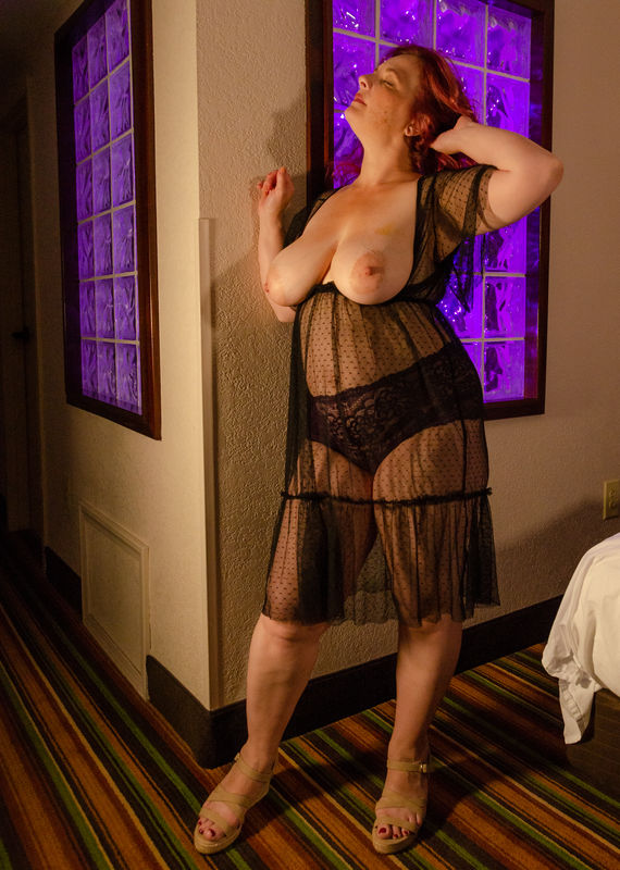
Photo 1 is a real winner needing only cropping to make the composition focused on the upper body. I am really taken by this photo... it has mystery.
May 13, 2019 07:01:20 #
May 13, 2019 07:06:04 #
I prefer the window included... but nice work on cloning out the arm.
Check out Panorama section of our forum.
May 13, 2019 07:24:20 #
May 13, 2019 07:38:30 #
RogStrix
Loc: UK
JohnFrim wrote:
I prefer the window included... but nice work on cloning out the arm.
ok window back in but other replaced by a picture....
May 13, 2019 07:52:53 #
May 13, 2019 07:58:59 #
RogStrix wrote:
cropped version of Image #2
The removal of the arm in #5 is good, but blacking out the window makes the purple highlights in the hair hard to explain, and the purple window was the reason I shot there in the first place, LOL. The 2nd crop is good, it's just another way of looking at the same image and changing the emphasis.
As you can tell from the first image, all of these are dark, so dark that until you start editing them you really don't know what you have. Right now, out of 95 images in this session I've only messed with about 25 and there are maybe a dozen OK photos and 3 or 4 really good images. When I posted this yesterday, the half-dozen I put up represented about half of what I'd touched. I have a hard time devoting a lot of time editing a photo like #5 until I get them all where I can grade them. Then if that image really stands out as something I want to improve a lot I go back and work on them. The grading system is something I really like about Lightroom.
On the day these were shot, we did two more sets and so all told I have about 300 images to look at.
This morning, this is an image that I'm really liking with a square crop. It's a little soft in the eyes because of movement or focus, but it stands out in the few I've looked at.
If you want to reply, then register here. Registration is free and your account is created instantly, so you can post right away.
Check out Traditional Street and Architectural Photography section of our forum.