Which is better
May 7, 2019 20:32:26 #
lsupremo
Loc: Palm Desert, CA
With all the talk lately about shall we PP our images or not? Also how much PP should we do? Is there such a thing as too much?
May 7, 2019 20:51:13 #
lsupremo wrote:
With all the talk lately about shall we PP our images or not? Also how much PP should we do? Is there such a thing as too much?
Fascinating...very thought-provoking....Yes, there is such a thing as too much, but only if it's done by going down the wrong road (whatever that is?)
 You're definitely going down the right road (whatever that is?)
May 8, 2019 10:31:20 #

May 8, 2019 11:39:19 #

This type of PP work is all a matter of taste. So you're going to receive a myriad of replies that will run the gamut from love it to hate it. What actually matters is your taste and that of your audience.
May 8, 2019 15:41:02 #

lsupremo wrote:
With all the talk lately about shall we PP our images or not? Also how much PP should we do? Is there such a thing as too much?
To not PP your work is to leave your work unfinished. I can't think of any art form that doesn't require numerous steps to achieve a finished piece. Not wanting to PP is understandable for some people, but doing it is where you refine your vision. If 'the best it can be' is not important to you, don't bother. If you want the best, you have to PP. I don't actually hear much talk on UHH about not PPing. I think most people here know better.
...Cam
May 8, 2019 19:17:27 #
lsupremo wrote:
With all the talk lately about shall we PP our images or not? Also how much PP should we do? Is there such a thing as too much?
So different!! Both are great!
May 8, 2019 22:41:31 #

May 17, 2019 09:13:34 #

lsupremo wrote:
With all the talk lately about shall we PP our images or not? Also how much PP should we do? Is there such a thing as too much?
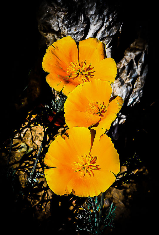
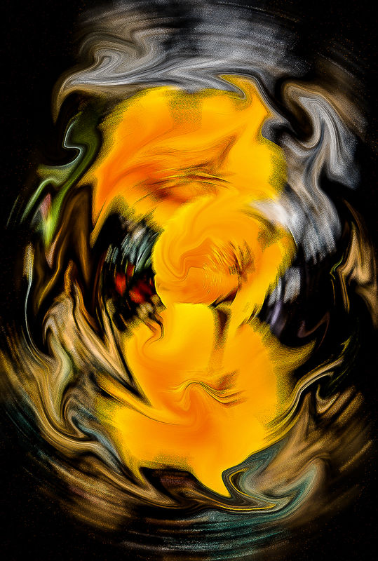
I found the first shot to be too harsh for my taste for a flower image. I don't think the dark vignette effect improved the image. For me, flowers are soft and beautiful, not dark and harsh. The second image is a very colorful abstract and is all a matter of taste. I did not find it to be distasteful and I did like the color mix.
May 17, 2019 14:44:41 #

I like two better. Your subject is the yellow flowers. I think the yellow flowers draw the eye more when the image is blurred. In the first one, the surrounding area is SO distracting. One more thing you may want to try is to blur the flowers less than the background. Have one tiny portion in sharp focus. I am assuming you did this in Photoshop. So mask out the blur entirely at the very center of each flower, then gradually increase blur as you move out to the edges. It's a very interesting comparison.
May 21, 2019 18:07:53 #

"Eye of the beholder" never helped me much; whereas digging into visual principles (color, shape, technique, composition, etc.) and how well they were used to present an emotion or idea, even one I did not share, seemed much more important. Form and content are traditional, effective ways of trying to get an honest discussion and appraisal.
Here, the harshness, Content, of #$1 is moderated by a flowing composition and a "bridge" color to keep the foreground and background together, while providing necessary contrast (the visual (design, compositional) principle include "Unity with variety," "center of interest". A successful image if brashness, harshness, strength is what you were after.
#2 is just another pretty picture. It uses a swirling filter (in itself uninteresting if you've seen the hundreds around)--to what purpose? Pretty colors, movement--but do they alone make a good communication? Here, form is ordinary, as is content. Good-ish, but not impactful.
If you want to reply, then register here. Registration is free and your account is created instantly, so you can post right away.