Impressionist Style
May 2, 2019 16:06:08 #

With my interest in the Impressionist, I have been trying to create an Impressionist style from some of my landscapes. How did I do? Constructive critic is welcome.
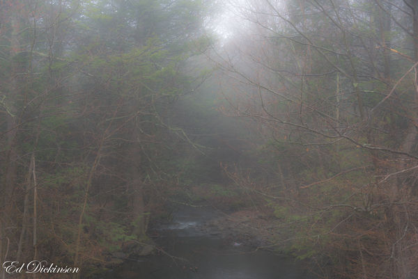
Stream in the clouds original.
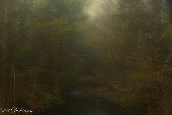
Stream in the clouds I
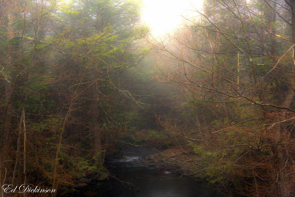
Stream in the clouds II
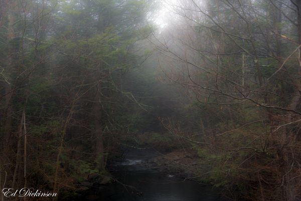
Stream in the clouds III
May 2, 2019 16:26:15 #
May 2, 2019 17:19:43 #

The warm and welcoming feel of Clouds I is my favorite. Beautiful! You might be interested in MinnieV's discussion topic: https://www.uglyhedgehog.com/t-590057-1.html
.
.
May 2, 2019 19:16:08 #
Cany143
Loc: SE Utah
There is no right way or wrong way to process an image like this; there is only the way --or ways-- you decide which works best for you. Ultimately, among those choices, only one of those is likely to truly say it for you as you wish it to be said.
That said, it may be that your definition of Impressionism and mine-- or for that matter, the definition(s) and executions that many of the originators and best known practitioners of the (exceedingly loose) 'school' of Impressionism-- are not entirely alike. At its most basic, Impressionism was a reaction against and a refutation of the academically idealized 'realism' of the Classicism that reigned (in painting) at the time. It set light, immediacy and color above all else, not uncommonly placing one color against another --yellow against blue, for example-- to achieve in the viewer a mentally, as opposed to visually, perceived third color (or in the example mentioned, the perception of green). Sure, a Monet might use a muted pallette to achieve his ends, but muted or unsaturated or lower value tones --as seen in your versions-- were not every Impressionist's goal. Van Gogh and Seurat and others would likely have attested to that.
I like your image. I especially like the fourth in your series. I say that because what you did was what I'd probably have done, i.e, by lowering the black point somewhat to give a little 'kick' to things. The second in your series is more a Tonalist rendition, something like a Wm Trost Richards might've painted, and he was no Impressionist. The third in your series might be the closest you've come to Impressionism, but in processing your image, you've lost a lot of the presence of the light and virtually all of the detail in the sky area center top where much of those could've been retained with the use of a luminosity mask.
I sincerely hope I've not offended. You've presented a genuinely fine image, and its one that doesn't need to be labeled with any antique or inaccurate 'isms.' But I don't think its quite finished yet.
May 3, 2019 08:05:07 #
Cany143 wrote:
... You've presented a genuinely fine image, and its one that doesn't need to be labeled with any antique or inaccurate 'isms.' But I don't think its quite finished yet.
We Pointalists await our turn! Long live Seurat!
Very good points regarding matching the various historical "-isms". The best we can do is simulate them with our own "impressions".
May 3, 2019 11:57:24 #

Good works, conveying meaning. You might also look at the work of J.M.W.Turner, which seems close to what you are after emotionally.https://www.google.com/search?q=J.+M.+W.+Turner+images&tbm=isch&source=univ&safe=off&sa=X&ved=2ahUKEwiBidrF3P_hAhUNTKwKHflkBz8QsAR6BAgKEAE&biw=1588&bih=1036 The Impressionists were pretty "soulless," mainly b being interested in capturing light itself.
May 3, 2019 12:43:41 #

There's too much recognisable detail for it to be properly Impressionist. And with the stream mentioned in the title, you've gone too far, to the point where it's all but invisible. Impressionism was all about essences, so to achieve your objective you'll need to develop your ability to perceive those essences. Then you can go about the business of portraying those essences.
May 3, 2019 14:09:49 #

Ed, it would have been helpful if you had allowed us to download for a larger image.
Don
Don
May 3, 2019 15:03:33 #
The pictures alone is really all you need. They all are fine pictures... with different moods. IMHO labeling them as some..."ism" can only bring about controversy by our readers. Again IMHO!
My only fault with them is that the signature is distracting. It pulls the eye away from otherwise very comfortable pictures.
As long as I've started... I've long been a believer that we should simply post the photos and let them stand on their own merits. I find that the "catchy" captions so often posted below pictures are not necessary and often have nothing to do with the actual scene.
It's kinda like watching football or basket ball... or other sports. On TV... the announcers feel the need to talk (or yell) at you forever. If you're at the game... you are spared all of that. Do you ever watch the game with the sound off? Try it.
And post pictures for the picture's sake without being told what to see or think.
Just my opinion.
Barry
May 3, 2019 19:03:18 #
Bob,
Thanks, I saw some of his works at the Tate a few years back.
Interesting that you considered them soulless, I just finished a book on The Hudson River School of impressionist called The Hudson River School And The Moral Landscape which seems to disagree, if you equate soul with morality.
I've always enjoyed the works of Cole, Church, Cropsey, and Monet.
Hopefully, in the fall I'll get back up to Kaaterskill to capture the lower falls and the view from Sunset Rock.
May 3, 2019 19:36:06 #
Thanks, no offense taken. I did ask for constructive critic.
I'm a fan of The Hudson River School and Monet, perhaps that is why I tend to choose a more muted palette. I never was a fan of Seurat.
I'm a fan of The Hudson River School and Monet, perhaps that is why I tend to choose a more muted palette. I never was a fan of Seurat.
May 3, 2019 19:39:53 #
Thanks Barry,
I only labeled so viewers would understand what I was trying to achieve.
Besides what is art without a little controversy.
Ed
I only labeled so viewers would understand what I was trying to achieve.
Besides what is art without a little controversy.
Ed
May 3, 2019 19:51:04 #
Always use the "store original" function.
This series is especially in need of it, so
that subtle effects can be seen. I'm sure
there is much more to be seen here than
is visible in these thumbnails.
TIA
This series is especially in need of it, so
that subtle effects can be seen. I'm sure
there is much more to be seen here than
is visible in these thumbnails.
TIA
May 4, 2019 11:49:08 #
edwdickinson wrote:
Bob,
Thanks, I saw some of his works at the Tate a few years back.
Interesting that you considered them soulless, I just finished a book on The Hudson River School of impressionist called The Hudson River School And The Moral Landscape which seems to disagree, if you equate soul with morality.
I've always enjoyed the works of Cole, Church, Cropsey, and Monet.
Hopefully, in the fall I'll get back up to Kaaterskill to capture the lower falls and the view from Sunset Rock.
Thanks, I saw some of his works at the Tate a few years back.
Interesting that you considered them soulless, I just finished a book on The Hudson River School of impressionist called The Hudson River School And The Moral Landscape which seems to disagree, if you equate soul with morality.
I've always enjoyed the works of Cole, Church, Cropsey, and Monet.
Hopefully, in the fall I'll get back up to Kaaterskill to capture the lower falls and the view from Sunset Rock.
My impression (couldn't help myself!) is that Impressionism was about light and the Hudson River School artists were about nature and God in nature. I was knocked out by the Hudson River School and the Luminists, whose views of the magnificence and mystery of the world influenced my own work.
Your works, which I like, seem to me to be more about Expressionism, feeling, like Turner's.
If you want to reply, then register here. Registration is free and your account is created instantly, so you can post right away.