Rica-34
Mar 8, 2019 12:52:35 #
Mar 8, 2019 14:40:07 #

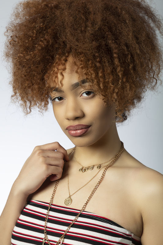
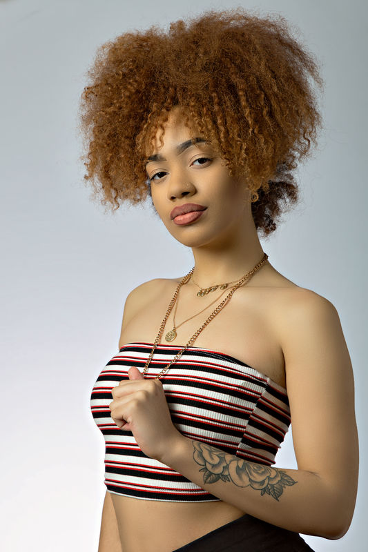
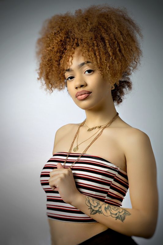
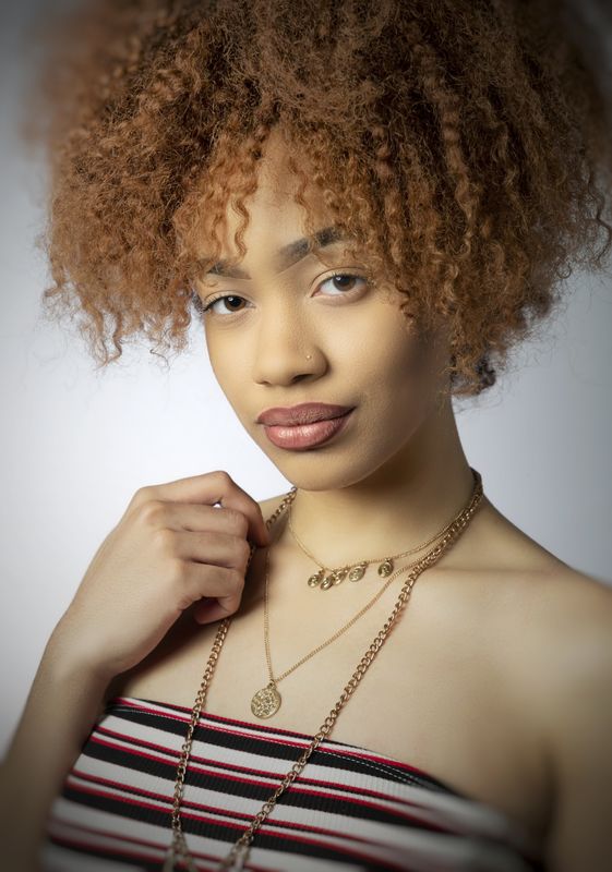
You have a nice medium key treatment of a lovely subject. The lighting is smooth and flattering and the poses are fashion-like and age appropriate. Excellent rendition of skin tone and texture. Great 3/4 view of the face.
Suggestions for improvement:
Pose: Consider a contra-pose, sometimes called the "feminine pose". That is where the head an body are facing in different directions in relation to the camera and main light. It is not an extreme twist of the head or neck but a gentle difference in direction. Usually, the body is directed away for the main light direction and the head is turned into the light. The pose forms an "S-curve composition within the pose. The type of pose is not necessarily a gender thing- the opposite of a cpntra-pose is a similar pose where the head and shoulders are posed in the same direction and that pose is usually used for males or sometimes ladies who are heavy set and turning rhe head would cause unflattering issues in the chin and jawline. it's not a hard and fast rule- more of a traditional thing.
When seated or standing, if the subject places more weight on the far hip the shoulders assume a more diagonal and relaxed line. Sometimes a posing table, not shown in the composition, helps the subject distribute weight for a better shoulder line- kind of a leaning post.
Watch the hands and arms. In one of the shots, the fingers are not well defined and give the impression that they are missing. In one of the 3/4 length sin one ts, the far arm is cut off and adds to the subject's waistline. Try to show the side of the hands, not the backs or the palms. Sometimes bending the wrist gently backward helps to pose the hands and defining the fingers. Rather than allowing the arms to drop, oftentimes placing a had on the hip on a 3/4 length pose is one method of defining the hands and fingers. In your 34 set the hands and arm posing is better- in the first set the arm is at a kind of 90-degree angle or "L" shape which is not as graceful. Also, watch that the arms don't leave and re-enter the frame and seem to come out of nowhere. Either show them the complete arm(s) or use a vignette to soften the effect at the t edges.
Background management: Since you are using a background light- here's a tip. Aim more of the light in the direction that the subject is facing. In a 3/4 length portrait- keep the majority of the background light in the back of the subject's face or keep it even.
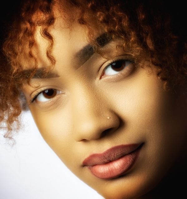
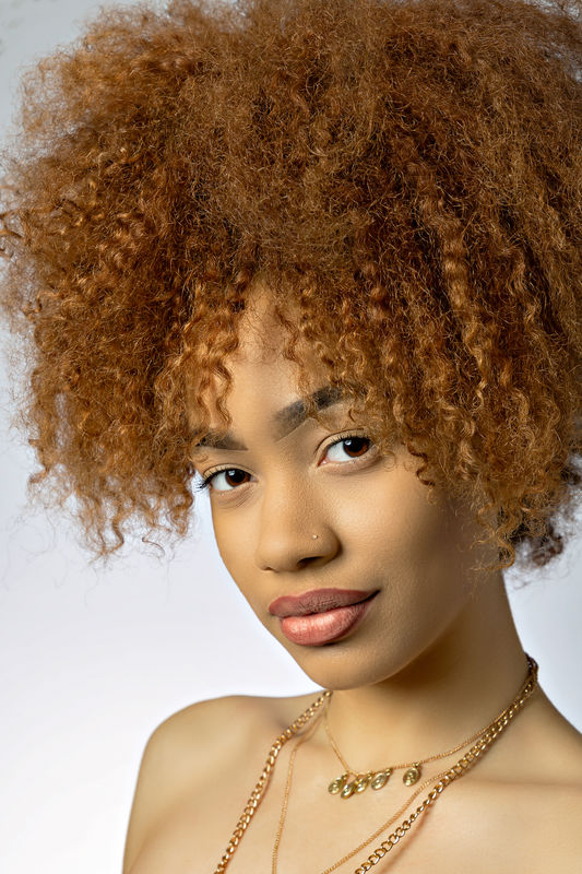
I like the 3/4 views- the younger folks like to show their costume and their INK- good job! Your subject has a great face so you may consider an additional tighter head and should view or a tight head shot where the eyes are about 1/3 down from the top- that is a very powerful composition featuring her eyes. Rack out your 24- 105 to 105mm and get in close and crop a bit if required.
You lighting form on her face is nice. you may want to consider lowering the main light VERY SLIGHTLY to get more light into her eyes and a more definite catch-lights. Besides the sideways glance try a few with the eyes centered and directed and a full face shot with eye contact.
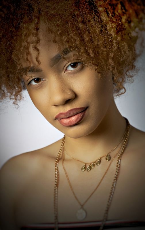
I have done a few quick and dirty edits to illustrate some of my suggestions. You work is going in a very good direction. All the CC points are the finer points to consider. You may want to give low-key a try with a bit more depth in the shadows and a darker background. The "key" is not a "mistake"- the suggestion is just a different approach.
Remember- Theses tips don't mean to create stiff poses-the subject can still move around and assume natural positions- these are just directions you can use or little tweaks to improve the aesthetics. Most portrait subjects appreciate the direction.
I hope this helps- please post some feedback!
This is for both of you posts.
Suggestions for improvement:
Pose: Consider a contra-pose, sometimes called the "feminine pose". That is where the head an body are facing in different directions in relation to the camera and main light. It is not an extreme twist of the head or neck but a gentle difference in direction. Usually, the body is directed away for the main light direction and the head is turned into the light. The pose forms an "S-curve composition within the pose. The type of pose is not necessarily a gender thing- the opposite of a cpntra-pose is a similar pose where the head and shoulders are posed in the same direction and that pose is usually used for males or sometimes ladies who are heavy set and turning rhe head would cause unflattering issues in the chin and jawline. it's not a hard and fast rule- more of a traditional thing.
When seated or standing, if the subject places more weight on the far hip the shoulders assume a more diagonal and relaxed line. Sometimes a posing table, not shown in the composition, helps the subject distribute weight for a better shoulder line- kind of a leaning post.
Watch the hands and arms. In one of the shots, the fingers are not well defined and give the impression that they are missing. In one of the 3/4 length sin one ts, the far arm is cut off and adds to the subject's waistline. Try to show the side of the hands, not the backs or the palms. Sometimes bending the wrist gently backward helps to pose the hands and defining the fingers. Rather than allowing the arms to drop, oftentimes placing a had on the hip on a 3/4 length pose is one method of defining the hands and fingers. In your 34 set the hands and arm posing is better- in the first set the arm is at a kind of 90-degree angle or "L" shape which is not as graceful. Also, watch that the arms don't leave and re-enter the frame and seem to come out of nowhere. Either show them the complete arm(s) or use a vignette to soften the effect at the t edges.
Background management: Since you are using a background light- here's a tip. Aim more of the light in the direction that the subject is facing. In a 3/4 length portrait- keep the majority of the background light in the back of the subject's face or keep it even.
I like the 3/4 views- the younger folks like to show their costume and their INK- good job! Your subject has a great face so you may consider an additional tighter head and should view or a tight head shot where the eyes are about 1/3 down from the top- that is a very powerful composition featuring her eyes. Rack out your 24- 105 to 105mm and get in close and crop a bit if required.
You lighting form on her face is nice. you may want to consider lowering the main light VERY SLIGHTLY to get more light into her eyes and a more definite catch-lights. Besides the sideways glance try a few with the eyes centered and directed and a full face shot with eye contact.
I have done a few quick and dirty edits to illustrate some of my suggestions. You work is going in a very good direction. All the CC points are the finer points to consider. You may want to give low-key a try with a bit more depth in the shadows and a darker background. The "key" is not a "mistake"- the suggestion is just a different approach.
Remember- Theses tips don't mean to create stiff poses-the subject can still move around and assume natural positions- these are just directions you can use or little tweaks to improve the aesthetics. Most portrait subjects appreciate the direction.
I hope this helps- please post some feedback!
This is for both of you posts.
Mar 8, 2019 23:20:34 #
If you want to reply, then register here. Registration is free and your account is created instantly, so you can post right away.