Too Much
This topic is locked to prevent further replies.
Mar 3, 2019 10:28:34 #
Mar 3, 2019 12:10:32 #
rborud wrote:
Curmudgeon you bird is indeed worth working with. Here is an alternative that I came up with, I do hope you find it useful. RBorud
I prefer the original . . . think this is a bit overdone.
Mar 3, 2019 13:19:39 #
Linda From Maine wrote:
Curmudgeon: for your consideration only because you dislike as-is, a quick adjustment to the background with an online app: desaturate and blur a little more. A sweet photo!
Linda,
That is very good advice, which I use fairly frequently to help separate the subject from the background. Let the saturation and brightness of the subject stand out from the desaturated background. jak
Mar 3, 2019 13:26:21 #
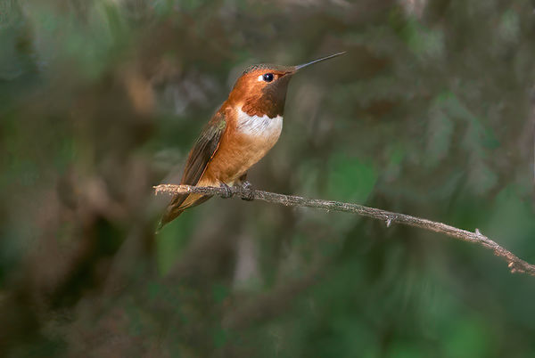
Curmudgeon wrote:
Upsized the photo 400%. I don't like the background but because of the quality of the bird I don't think it is worth the effort to mask out the bird and drop in a more neutral background. What do you think. If you feel it is worth it feel free to fold, spindle or mutilate.
moderator replaced original to show correct color space in thumbnail
moderator replaced original to show correct color space in thumbnail
Curmudgeon, very nice shot. A friend and I have been tying for some time to get a nice shot of a Rufous Humminbird. We have lots of Allen’s throughout the Winter, and as Spring approaches, they are nearly indistinguishable from Rufous. The migratory Rufous begin arriving in SoCal just around now, but often the only way to distinguish them is based on the tail feathers, and catching a good, focused shot of them with the tail spread can be daunting. Thanks for sharing this shot with us. jak
Mar 4, 2019 15:42:24 #

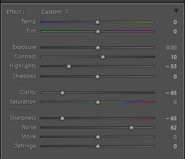
If toning down the background is taken too far it can become too bland. If you remove too much contrast it becomes too weak, if you desaturate too much it becomes too insipid and if you denoise too much it becomes too mushy.
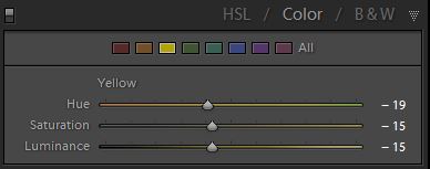
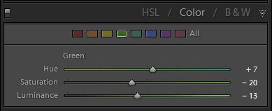
Rather than just bleeding colour out of the background using Saturation I used the HSL tool to target yellow and green, since they are the most garish (and therefore the most eye-catching and distracting) colours. Since some of the yellow shows up on the hummer I tint-shifted yellow towards orange, which suits both the bird and the background. I also tint-shifted green towards blue quite a bit to shift it away from yellow/green (which is the second most garish colour after yellow).
Taking too much contrast out of the background would weaken it too much, so after I selected the background I reduced the Highlights and Clarity and then added some Contrast to keep it visually engaging (but not to the point of being distracting). It's a fine balancing act, but it's possible to keep the visual interest while toning it down where the most eye-catching aspects are concerned.
The negative Clarity goes some way towards softening the background, but it also needed some denoise for the fine detail and some negative sharpening for the slightly larger detail. Adding generous amounts of blur as Russ did is one possibility which can leave it pleasingly soft but at the expense of losing all detail and even losing the shapes. Adding a moderate amount of softness allows some of the detail and shapes (i.e. the visual interest) to be kept.
So this is my alternative which has the background subdued in specific ways but has hopefully left it with some visual interest. IMO that is the way to achieve an optimal result, as opposed to just killing the background and leaving it wishy-washy.
PS - I also cloned out a couple of small bright bits. And I could have done a more careful job of selecting the background.
-
Mar 4, 2019 17:34:08 #

R.G. wrote:
Wonderfully presented, R.G. Thank you! I added to the tutorials on PP Forum home pageIf toning down the background is taken too far it ... (show quote)
https://www.uglyhedgehog.com/t-156310-1.html
Called it Backgrounds - toning down
Let me know if you can think of a better description

Mar 4, 2019 19:16:16 #
Thanks all of you for your comments and suggestions. As I've said before, I've got a lot to learn. You folks are all great.
Mar 4, 2019 22:21:09 #
rborud
Loc: Minnesota
R.G. wrote:
If toning down the background is taken too far it ... (show quote)
R.G. I want to say that I am in complete agreement with both you and Linda. But I would like to address one point, and do not mean to offend anyone, my image is not blur at all, I cut the bird out and cleaned up the pix-elation and cleaned the edges and the feather structure. I then placed it in a totally new background that has nothing to do with the original background which, I felt was too busy and strong and reduced the significance of the beautiful bird. With this to my eye the bird became more forward and important when viewed. Thanks for listening and looking. RBorud
Mar 4, 2019 22:25:00 #
rborud wrote:
R.G. I want to say that I am in complete agreemen... (show quote)
Thanks for the follow up. How did you clean up the pixilation and clean the edges and feather structure. These are techniques new to me.
Mar 5, 2019 01:04:53 #
rborud wrote:
......I then placed it in a totally new background that has nothing to do with the original background.....
That would explain the loss of detail lol.
Mar 5, 2019 01:13:52 #
Linda From Maine wrote:
....Let me know if you can think of a better description
Could I have done it better? lol. Well, I could have mentioned that tint-shifting green towards blue makes it cooler. As I'm sure we all know already, warm colours advance whereas cool colours retreat, so that adjustment helps the overall depth perception and gives separation between the bird and the background. I tried adding a small WB adjustment towards blue for the background but decided it was too much on top of my tint-shift so I left it out.
Mar 5, 2019 07:27:58 #
R.G. wrote:
Noooo, I was asking if you have a better idea for a title in the list of tutorials 🤗 I named it "Background - toning down."Could I have done it better? lol...
Mar 5, 2019 11:30:42 #
Linda From Maine wrote:
Noooo, I was asking if you have a better idea for a title in the list of tutorials 🤗 I named it "Background - toning down."
Aaaaah... No, your title sounds fine to me
 .
.Mar 5, 2019 15:29:20 #
rborud
Loc: Minnesota
Curmudgeon wrote:
Thanks for the follow up. How did you clean up the pixilation and clean the edges and feather structure. These are techniques new to me.
Curmudgeon first of all I do not use Photoshop or light room. I use Corel Paint shop pro. Over the years I have become an affectionado of brushes. It was cloning brushes, erasing brushes, softening brushes and smudging brushes. All of these have infinite variability which is the hard part, one has to practice to understand how they work. On your image I used a very nice background erase brush to cut the bird out.
I should add your image was very small so it was inherently full obvious pixels. I did a resize of about 150% to help reduce some of the pixel size, remember too much of this can make look glossed over. I use softening brushes, very small I should add, along edges that were quite heavily pixilated, this tends to divide pixels along a very narrow edge and remove the jagged look and make the line have a rounded edge and look as you see it. REMEMBER SMALL 2OR3 PIXELS WIDE. I use a regular eraser at about 90% hard to trim the rag left over from the out side cut out, adjusted to size to get the look of smooth transition. Light/dark brushes to add to and create a bit more of the natural look of feathers in their layers. I should say I work with a pen and pad, I find the conventional mouse difficult. I am sure there is more things I did and frankly I do not all the details. I saved the image as a png to retain transparency then added one of the hundreds of background I have accrued over the years.
Oh yes added a spot of pure white to the eye and smoothed it to taste. Added a touch of vibrancy extended the branch, combined the layers, to Jpeg and voila sent it to you. Thanks RBorud
Mar 5, 2019 15:40:40 #
Long ago I use Corel, I think it was called Photo Paint or something like that. I think it came on 6 floppy disks.
Thanks for the tips. I'm going to try to duplicate some of those techniques in PS.
Thanks for the tips. I'm going to try to duplicate some of those techniques in PS.
If you want to reply, then register here. Registration is free and your account is created instantly, so you can post right away.