February 7-9 2019-Using Visual Balance for better Photography
Feb 7, 2019 20:55:45 #
Rolk wrote:
I've never been good at "book learnin'" stuff, but here's
one I created which I feel has good visual balance enhanced
by color, size and orientation. (Two different orientations
are show.)
Let me know, JJ.
Tim
one I created which I feel has good visual balance enhanced
by color, size and orientation. (Two different orientations
are show.)
Let me know, JJ.
Tim
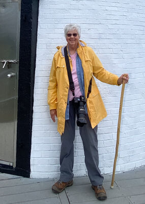
p.4 I really like the first image Tim
Feb 7, 2019 20:58:39 #
Kaskazi wrote:
I dunno - this is all too deep for me!
p.5 Looks to me like you got it!
Feb 7, 2019 20:59:39 #
Feb 7, 2019 21:05:34 #
Kaskazi wrote:
Well thank you Judy! But I'm struggling actually to figure out why I like some of my shots much more than others - perhaps it has partly to do with an unconscious application of balance principles. Hhmmm, application or sheer luck?
p.5 With me, it would be some of each
Feb 7, 2019 21:06:11 #
judy juul wrote:
I'm thinking that each tip applies to the example given. Not that all tips have to apply to one photo, Sunny.
I think that's why the author shows each example relevant to each tip. If you can do it all together --well, that's totally amazing!
I think that's why the author shows each example relevant to each tip. If you can do it all together --well, that's totally amazing!
Thanks Judy! Leave it to me to over think the subject!!! Maybe that's why I'm more comfortable with abstract than traditional photos.


Feb 7, 2019 21:08:59 #
lnightng7 wrote:
Visual Balance for better photography.....
p.5 Like the rusty bucket and the last landscape. To me, they look balanced
Feb 7, 2019 21:09:48 #
PAToGraphy wrote:
p.3 Must present a challenge when you try to dance!
Yes ma'am it does present a problem in that area.
Feb 7, 2019 21:21:11 #

danersmiff wrote:
I forgot to mention, you are all over this... the isolation of the church, is balanced by the colours, green, and the mist, which ads interest to the eye, drawing the viewer into the picture... the 2nd is the perfect blue of the sky, (colour) balancing against the imperfections of the tree...
Mucho Thanks, Dane
Feb 7, 2019 21:22:15 #
PAToGraphy wrote:
p.3 The church surrounded by green is very appealing
Thank you, Pat
Feb 7, 2019 21:24:11 #

Feb 7, 2019 21:25:20 #
Sunnybuck wrote:
Judy, visual balance is probably my hardest thing to achieve in composition. I have a couple I hope works.
Nice examples Johnna..Pg. 1
Feb 7, 2019 22:00:00 #
Rufe wrote:
I posted this photo before. The blue umbrella was placed in the photo to balance the photo both in color and orientation. This is the Missouri Governor's Mansion. The blue catches you eye first and then you look to see where the woman is looking.
Great example Rufe..Pg. 1
Feb 7, 2019 22:04:27 #
Greg Huntsinger wrote:
Hang Glider cropped . I think this works better. If I cropped to much the horizon would be in the center, trying for more balance .
I think your right Greg the second crop works much better..Pg. 2
Feb 7, 2019 22:06:16 #
Roadrunner wrote:
First try
The first one shows me inginuity(sp?) as thewindowisopen on the street sdie and also the things hanging in bit back.
The other two looks like a ''well'' a small neighbourhood set up at the bottom of a well as seen from the Chateau Frontenac and all three would make neat puzzles. BTW those yellow umbrellas shade a great spaghetti house
Really like 1 and 3 Jim..
Feb 7, 2019 22:09:34 #
If you want to reply, then register here. Registration is free and your account is created instantly, so you can post right away.