Sea Scape sunset.
Jan 24, 2019 12:23:21 #
colin64
Loc: lsle of islay Scotland
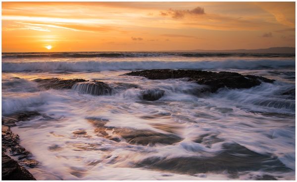
Worked on this image last night, looked at it this morning and didn't like the feel of it.....is it overcooked, soft, lacking contrast.
What's your thoughts ????
What's your thoughts ????
Jan 24, 2019 12:53:49 #

colin64 wrote:
Worked on this image last night, looked at it this morning and didn't like the feel of it.....is it overcooked, soft, lacking contrast.
What's your thoughts ????
What's your thoughts ????
Interesting, moody shot, not overcooked to my eyes. I can't find anything significant to pick at. Well done.

Jan 24, 2019 14:54:55 #

Jan 25, 2019 06:00:06 #

Jan 25, 2019 07:09:07 #

Lens Profile Correction may help the horizon what appears to be a bit curved, also it looks a bit out of level. Sometimes when you have distant hills on one side along the horizon can give the appearance of it being out of level even if it in fact is level. Try twisting it ever so slightly clockwise.
Jan 25, 2019 07:27:29 #

I agree that it needs leveling. I would try to remove the bit of rock in the lower left.
Jan 25, 2019 07:30:31 #

No, it is nice the way it is. The sky is bright but appropriate considering the position of the sun. Love that the foamy ocean is the dominant player.
Jan 25, 2019 08:22:26 #
joehel2 wrote:
No, it is nice the way it is. The sky is bright but appropriate considering the position of the sun. Love that the foamy ocean is the dominant player.
The Sun adds visual weight, which can contribute to making the horizon low on that side....scroll the picture/horizon to the top of your monitor and you will see it's not level.
Jan 25, 2019 09:06:48 #

Jan 25, 2019 10:01:34 #
colin64
Loc: lsle of islay Scotland
Thanking everyone for there comments, my thoughts were it was just a bit overcooked, had another look at it and knocked a tiny bit of saturation out of the sky, l like it better.
Waves are generally not very level, but looking at the distant hills in the top right, a wee level adjustment was required....Thanks again everyone for taking the time to reply..
Waves are generally not very level, but looking at the distant hills in the top right, a wee level adjustment was required....Thanks again everyone for taking the time to reply..
Jan 25, 2019 11:15:08 #

if it were mine I would try cropping up from just the bottom. I think it will improve the visual interest and cropping will also remove the bottom left rock....
Jan 31, 2019 18:48:51 #

Not overcooked at all. I think the colors are lovely and subtle. One small thing that might be bugging you is the dark rock bottom right corner. It's a contrast to everything else and draws the eye to the edge of the frame. I wonder if you could do a content aware edit to that. I like the smaller line of rocks with some light on them, but the one in the corner has no detail and does not add to the photo in any way. It really is a beautiful photograph.
Jan 31, 2019 18:59:08 #
colin64
Loc: lsle of islay Scotland
Thank you Nightski , it's one of these pics that you look at and just feel there is something not right, will definitely give that corner a look, thanks again for your thoughts,
If you want to reply, then register here. Registration is free and your account is created instantly, so you can post right away.