Storybook Elopement
Jan 16, 2019 21:41:46 #
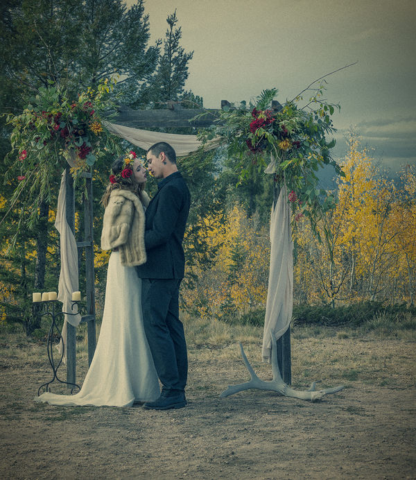
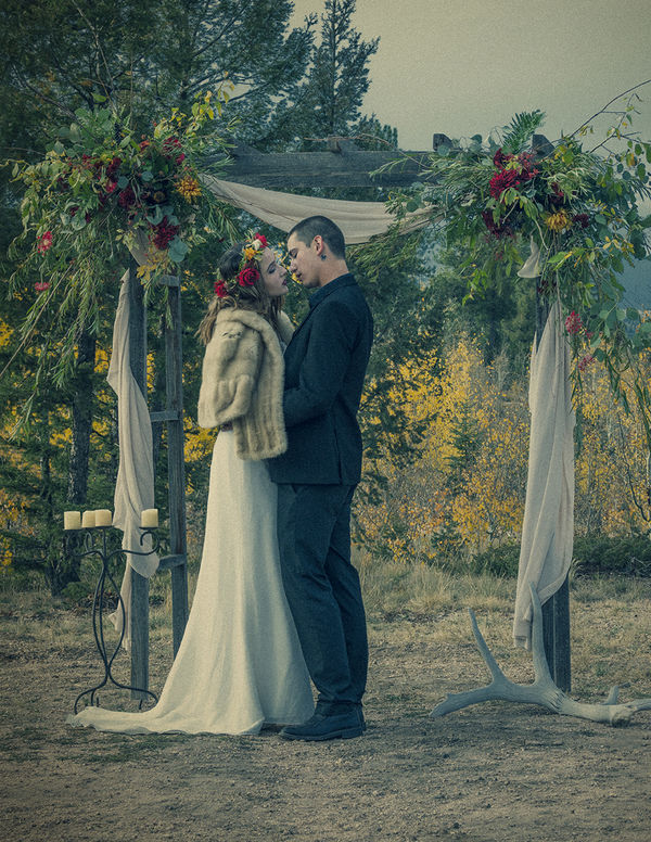
This is my first effort in the critique forum. I am an advanced student in an AAS Pro Photography program at the local college. I have been shooting seriously for 2 years as of this month.
I am having a lot of trouble figuring out exactly what went off in this composition. I am rather hostile to the antlers on the right (though one could make a "leading lines" argument) and the lampstand to the left. This seems too cluttered to properly tell the story. Is that what is frustrating me, or is it something else? Sometimes I just get stuck.
I will say that as long as your critique is serious and I can build from it, it is very hard to hurt my feelings. It is hard to learn if everyone blows smoke up my skirt.
Jan 16, 2019 21:58:15 #
Old Timer
Loc: Greenfield, In.
For me the scene is too busy, the antler are not conducive to the pic. The couple should be more to the center, the post looks as it is coming out of her dress. The background is to strong and distract from the subjects. I am not sure what is going on behind the bride, is that a hall tree or what is it supposed to portray? Some times we have to much in a picture, to much confusion and clutter some times.
Jan 16, 2019 22:02:13 #
Old Timer wrote:
For me the scene is too busy, the antler are not conducive to the pic. The couple should be more to the center, the post looks as it is coming out of her dress. The background is to strong and distract from the subjects. I am not sure what is going on behind the bride, is that a hall tree or what is it supposed to portray? Some times we have to much in a picture, to much confusion and clutter some times.
I think we agree on the clutter. You see it as all around rather than just in the stylist's choices. That makes sense.
Jan 16, 2019 22:31:12 #

I believe that simply making a tighter, well placed crop, you can accentuate the subjects and reduce the apparent business. 
Photo is artistic, original and quite lovely in my opinion.
Photo is artistic, original and quite lovely in my opinion.
Jan 16, 2019 22:44:49 #
There is too much going on. I think that the posts and the flowers are too busy and the antlers seem very out of place. I really like the mood you set and the colors. If you take some of those items out you've got a wonderful photo.
Jan 16, 2019 22:45:11 #
I agree about the clutter. I won't say, "Less is more." because that's actually ridiculous. However, I think less would have been better. Antlers - out. Lampstand - out. I would even get rid of the white drapery thing. Center them a bit and shoot from a little lower angle. Just my advice.
The color is very unusual, but I absolutely LOVE it!
The color is very unusual, but I absolutely LOVE it!
Jan 16, 2019 23:42:25 #
A closer crop and getting rid of things. That will make me happy. I will just keep this one for my archives because this was a styled shoot and the photo is for the stylist.
Definitely, I have to work on my angles and centering the couple. I have to slow down.
thank you all for taking the time to help me "see". If I get the time, I will put up my changes.
Definitely, I have to work on my angles and centering the couple. I have to slow down.
thank you all for taking the time to help me "see". If I get the time, I will put up my changes.
Jan 16, 2019 23:42:52 #
Jan 17, 2019 06:38:27 #

Red in Colorado wrote:
This is my first effort in the critique forum. I a... (show quote)
I can't see the wood for the trees.

Jan 17, 2019 06:50:25 #
Like has already been said, the coloring is wonderful. Recompose and remove as many suggested. This is a tender moment and it should be preserved by completely focusing on the couple. Place them on center. I'd blur out the background , maybe only as little as 5-6 pixels. Easy to experiment with.
Jan 17, 2019 08:29:45 #

Everyone is saying pretty much the same thing regarding a crop to reframe in such a way as to feature the couple. I absolutely agree. Its a very nice photo. This would be a suggestion for that crop. I think its ok to post an alternation here in the critique section,
Jan 17, 2019 08:39:59 #
fergmark wrote:
Everyone is saying pretty much the same thing regarding a crop to reframe in such a way as to feature the couple. I absolutely agree. Its a very nice photo. This would be a suggestion for that crop. I think its ok to post an alternation here in the critique section,
IMHO - I think it would take more than zooming in. The problem remains - the background is not going to work.
Jan 17, 2019 09:12:15 #

I actually like the decorated trellis. It's the type of thing people do for outdoor weddings. I'm sure the antlers have some importance to the people in the scene, and lampstands are common at weddings. The background of trees would normally be nice, but in this case, I think they sort of fight with the trellis. The tinting and grain give the image a sort of old-timey look. Was that intentional? If so, well done. If not, do you like the fact that you got that? In my opinion, it's the lighting that's sort of off somehow. The sky is a really funny colour and I don't see any shadows.
Jan 17, 2019 09:15:27 #
fergmark wrote:
Everyone is saying pretty much the same thing regarding a crop to reframe in such a way as to feature the couple. I absolutely agree. Its a very nice photo. This would be a suggestion for that crop. I think its ok to post an alternation here in the critique section,
The question that popped into my mind was, "What are we supposed to look at here?" If it is the couple, then they should be the focal point in placement. In this shot, I would crop up to mid thigh, with the upright camera left as framing with the overhead bar for the same. The upright on camera right is iffy, to me. The couple should be separate from the surroundings to make it a great wedding photo. The times I would have them "interacting" with the frames is when the frames add to the story. There are a few possibilities here. Playing "catch me if you can", for example.
Jan 17, 2019 09:40:30 #
Stephan G wrote:
The question that popped into my mind was, "W... (show quote)
I was thinking the same thing. No-one asked the op what he was wanting, or thinking.
If you want to reply, then register here. Registration is free and your account is created instantly, so you can post right away.