email or Royal Mail
Nov 21, 2018 07:18:16 #

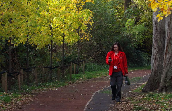
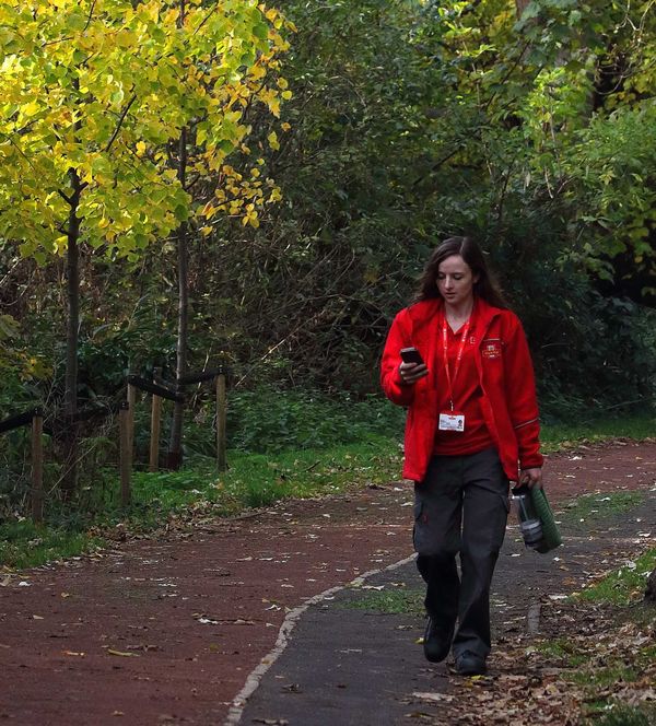
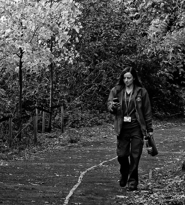
My first entry in the local clubs most recent competition, and the first this year that was for a specific discipline - Street Photography. From the more experienced followers of this discipline I'd like to draw their views.
I made the crop from a bigger scene with the path leading in and was drawn by the Royal Mail employee walking home whilst possibly using the smart phone for e-mail - which was a contrast with her employment. I was a bit slow on the shutter and the subject is not quite as sharp as I'd have liked. The judge gave me 16/20 and I'm quite happy with that considering the focus issue.
But the Judge thought the subject was acceptably sharp and critiqued the image for the trunks on the right hand side. She would have liked the girl tighter to the right and maybe a more severe crop all around.
What do members think? Feel free to do whatever you wish with the image so long as you explain why. Here to learn.
Nov 21, 2018 07:45:16 #
tommy2
Loc: Fort Worth, Texas
John N wrote:
...She would have liked the girl tighter to the right and maybe a more severe crop all around...
That is a very nice photo to my eye.
Taking a hint from your post I can see where more cropping would make the photo very different and more intimate. Covering the left side up to slightly left of the third tree trunk counting toward the left from the young lady's right shoulder and no more than the large trunk on the right would be my suggestion.
Doing this would put the bright leaves in the top left of the photo and the young lady would be the main focus object in the image.
Then my eyes, when first seeing the photo, are first drawn to the light and then across to the pretty red color of the uniform with the diagonal line of the path giving depth.
But hey, as I said in the beginning, "it is a very nice photo".
Nov 21, 2018 08:05:13 #

Tighter would be acceptable, but I disagree with your judge because the trees complete the overall scene and define the sense of place, so to speak.
Personally, I’d have given it a try in black and white.
Personally, I’d have given it a try in black and white.
Nov 21, 2018 08:21:27 #
John N wrote:
My first entry in the local clubs most recent comp... (show quote)
At least she is on the correct side of the lane for the location.

To me, it looks more like a portraiture shot at first glance. It is a good capture. However, without the description, many of us would have missed the salient aspect of the shot. And this may be something to consider. In most street photos, the environment plays a strong part in presenting a story. This is why Black-and-White is used because it "unifies" the shot for the presentation. Color becomes a secondary consideration. This is not to say that color cannot be a primary integrator for the story.
For your shot, the color of the outfit is important to the story. Competing are the colors of the leaves. Without the title, I would have taken this shot to be of a woods path walk by someone who was too busy to notice the surrounding beauty.
I would tighten the crop to the the person, to include one and a half boles on the right. the path lane on the left. It would include areas above and below the figure. But for my self, I would try to include others in the shot to engender the feeling of a run of the mill event that enhances the central story.
I do reiterate that the above is my sole view only.
Nov 21, 2018 10:17:43 #

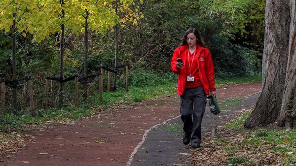
I disagree with the judge. I processed your photograph in Adobe Camera Raw only, and then saved it out of Photoshop as a JPEG file, which you can see below.
I know you said you are learning. Let me please suggest you spend time using ACR -- a most powerful image processor. Anything left over you can fix later in Photoshop.
Here you have a good exposure, with more than adequate sharpening.
The EXIF data shows an ISO setting of 640, fairly low, yet I detect pronounced noise in the face of the main subject. This information indicates you use a camera with less than optimal noise suppression at lower ISO settings.
I cropped your photograph (9 by 16 in landscape orientation) as the main edit, for visual balance and for simplification, with a view to the Rule of Thirds. The masses to the left and right of the female figure bracket her. Your eye will tell you this fact. Notice that your eye will go back and forth between the tree trunk and the bright leaves while always perceiving the main subject near the middle of the frame. In addition, the curved path leads the eye across the frame where it bisects the main subject, to maximize attention to it. This presentation produces an internal cohesion along with a perceptual dynamic.
I am not a contest judge for photographs, but I do have an eye for composition. By this measure you have a winner although requiring a judicious cropping for a more effective framing.
The exposure came out very close and needed only a little adjustment in ACR.
I let ACR automatically set the white balance. I only brightened the face of the female a little, to decrease shadow. You likely already know that the human face in a photograph will always without fail attract the eye of the viewer. So the photographer will want to make sure the exposure and the white balance together flatter the human face.
As to subject, the photograph strikes me as average in interest. Part of this grade goes to the necessity of explaining the main subject when it should explain itself, without words -- the strong point of all worthy photographs.
My basic formula in doing photography: Composition and Exposure along the importance of Subject.
Overall, I like your photograph because it presents a human in a fairly natural setting with attractive colors and some color contrast (primarily green and red here). It has these values apart from average subject interest.
I could say more but I prefer to recommend that you spend time learning the ins-and-outs of composition.
This element includes framing and perspective.
Good luck.
John N wrote:
My first entry in the local clubs most recent comp... (show quote)
Edited version of lady near path
Nov 21, 2018 15:16:32 #
I think I see where your Judge is coming from. As I look at it, it's unbalanced. Divide it at the center, and all of the "weight" is on the right side, specifically the red top and the large tree trunk. There is no counterbalance on the left. By eliminating the trunk, you eliminate much of the "weight." Crop heavily on the left to remove some of the trees that do not really contribute anything to the photo. I set it into a basic rule-of-thirds grid and used the yellow-green leaf mass to balance the red (a lighter color, but a larger mass). Anyhow, this is how it seems to me. Also, I tried it in black and white, and in this photo I think color works better to give separation to the various elements.
Jan 15, 2019 13:34:03 #
The distinct masses, in both color and near monotone, in my version go more to visual balance and to the sense of the subject as alone on a path in a wooded area.
These masses more or less group around the main subject, producing an internal dynamic to the image.
Further, the leading line of the path draws the eye to the main subject. This path has to stay for this purpose.
The contest officials evidently lacked a higher level of perceptual distinction to see the given qualities of this photograph.
Voss wrote:
I think I see where your Judge is coming from. As... (show quote)
Feb 23, 2019 06:18:26 #
Thanks all for your contributions which I will consider for future use. The two edits both give more emphasis to the tale but distract from the scene - which I suppose is good as it was not shot for a scenic competition.
I would go for the colour version as over here people recognise the red uniform as being the Post Office, however the comments have taught me that it would be lost on a viewer from elsewhere.
More to this street photography than I realise.
I would go for the colour version as over here people recognise the red uniform as being the Post Office, however the comments have taught me that it would be lost on a viewer from elsewhere.
More to this street photography than I realise.
If you want to reply, then register here. Registration is free and your account is created instantly, so you can post right away.