Composition question
Oct 15, 2018 14:31:12 #
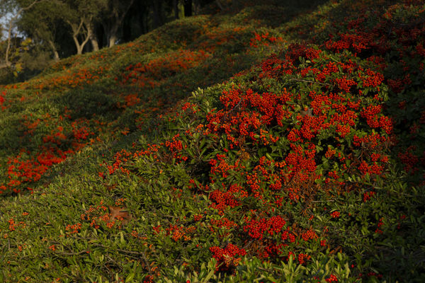
Which do you like better? I know the focus isn't perfect (hand held and I vibrate like an energy bunny) but I'd like feedback on what you think of the composition. This is an exercise in color.
Thanks!
Thanks!
Oct 15, 2018 14:43:20 #

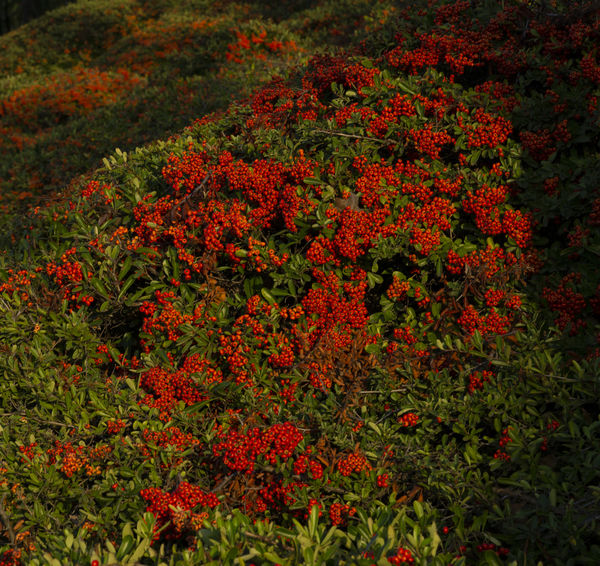
My vote is for the first one.
--Bob
--Bob
Diocletian wrote:
Which do you like better? I know the focus isn't perfect (hand held and I vibrate like an energy bunny) but I'd like feedback on what you think of the composition. This is an exercise in color.
Thanks!
Thanks!
Oct 15, 2018 14:48:03 #

Oct 15, 2018 14:52:25 #
Oct 15, 2018 14:52:44 #

Oct 15, 2018 14:54:50 #

I like the uncrossed shot much better because it shows context. It helps me understand the subject and is of greater interest. The mass of red will catch the eye in any case and uncropped it tells more of the about the place where you found this nice shot.
Oct 15, 2018 14:57:55 #
adamsg wrote:
I like the uncrossed shot much better because it shows context. It helps me understand the subject and is of greater interest. The mass of red will catch the eye in any case and uncropped it tells more of the about the place where you found this nice shot.
Curious, what is "uncrossed"?
Oct 15, 2018 15:03:22 #
"Uncrossed" is a dumb typo or something Orwellian in my computer. I meant uncropped, but spell check on my computer seems to not like that word, as I just discovered:).
Oct 15, 2018 15:09:58 #

I was tempted to crop the first one even a little more, so I did....the dark area on the right didn't seem to be adding much for me.
I also darkened up the lower right hand corner a little.
I also darkened up the lower right hand corner a little.

Oct 15, 2018 15:31:07 #

larduggan nailed the composition IMO, and the reason for the trim. Now, there's a better flow from lower right to upper left. This is a study of light and shadow as much as color - terrific!
Oct 15, 2018 15:36:04 #
adamsg wrote:
"Uncrossed" is a dumb typo or something Orwellian in my computer. I meant uncropped, but spell check on my computer seems to not like that word, as I just discovered:).
I know what that's look!

Oct 15, 2018 23:18:55 #
Oct 15, 2018 23:19:22 #
Oct 15, 2018 23:20:16 #
Oct 15, 2018 23:20:48 #
adamsg wrote:
I like the uncrossed shot much better because it shows context. It helps me understand the subject and is of greater interest. The mass of red will catch the eye in any case and uncropped it tells more of the about the place where you found this nice shot.
Thanks for your explanation adamsg.
If you want to reply, then register here. Registration is free and your account is created instantly, so you can post right away.