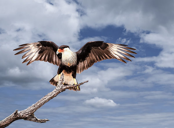
Is it obvious that I replaced the sky, and
May 9, 2018 17:00:54 #
May 9, 2018 17:09:07 #

May 9, 2018 17:09:40 #
hightor
Loc: Portland, Maine
What gives away the compositing is the difference in light quality between the bird and sky, the bird being very contrasty and sharp edged, the sky being much less contrasty.
May 9, 2018 17:13:55 #

wapiti wrote:
Bill, Looks as taken to me. Great Post processing job. Perfect as is.if so, what would improve the image?
May 9, 2018 17:29:04 #

Bill, the contrast difference between the main subject and the background is markedly different. Additionally, there are "tell tale" signs of cutting around the main subject. So, to the trained eye, it's quite noticeable.
--Bob
--Bob
wapiti wrote:
if so, what would improve the image?
May 9, 2018 17:30:01 #

I agree with hightor's assessment of the light; however, I wouldn't want to see the sky as bright as the bird because it would detract from subject. If you are going for a more realistic look, you could adjust the light on the bird and branch, but I think it's quite beautiful as-is. Any tweaks would depend on what your goal is for the work. Frame and hang, or enter into a competition of "composites" or ?
edit - reading rmalarz's comments that were posted as I typed, would less definition (softer) edges alleviate the cut-out look?
edit - reading rmalarz's comments that were posted as I typed, would less definition (softer) edges alleviate the cut-out look?
May 9, 2018 17:35:11 #
LELON CUDE
Loc: Texas
Fantastic picture of a Mexican Crested Eagle, or of a Mexican Raptor. When we see them here in Texas they are always on the top of a telephone pole, on the ground eating caria
What a "fantastic" shot of a Mexican crested eagle, or a Mexican Raptor. We usually see them here in Texas perched on top of telephone poles, or on the ground eating carnage. I don't think this shot can be improved in any way at all. Congratulations.
What a "fantastic" shot of a Mexican crested eagle, or a Mexican Raptor. We usually see them here in Texas perched on top of telephone poles, or on the ground eating carnage. I don't think this shot can be improved in any way at all. Congratulations.
May 9, 2018 17:38:28 #

Nice shot of the Northern Crested Caracara!
It is noticeable a bit around the bird.
We've had one in our area recently (40 miles south of Ft Worth Tx). First saw one up here last year on a donkey carcass across the road.
It is noticeable a bit around the bird.
We've had one in our area recently (40 miles south of Ft Worth Tx). First saw one up here last year on a donkey carcass across the road.
May 9, 2018 18:10:47 #

Nice pic but the different lighting quality kind of gives it away; a shot like this ** could ** be taken with reflected or artificial lighting (fill flash or LED lighting) aimed at the bird. It appears there are three light sources in this shot; a sun at 1:00 position (based on cloud shadows), a second sun at 10:00 position (based on tree branch shadows) and frontal lighting - not taken on planet earth unless with supplemental artificial or reflected light - unlikely a bird photographer would set this all up.
May 9, 2018 19:37:50 #

May 10, 2018 09:02:16 #
The edge of the left wing has a tell tale white line around it. (usually means over sharpening) Lower the contrast of the bird slightly.
Otherwise a great composite.
Otherwise a great composite.
May 10, 2018 09:26:32 #
Thanks guys. While I've done this a few times, I'm still kind of new at it. Appreciate your assistance. I'm sure that there are many who object to this, but I find no problem with replacing a dull sky.
May 10, 2018 10:31:55 #
gvarner
Loc: Central Oregon Coast
Looks like you got th bird/branch with a direct flash. Maybe try to soften them up, reduce contrast or saturation or clarity or …
May 11, 2018 17:58:20 #
wapiti wrote:
if so, what would improve the image?
Yes, it is quite obvious, you could place a sharpness gradient in the sky to make it look more natural, but even though I is quite noticeable, it is a rather fitting choice of a sky and makes for an overall pleasing image!
If you want to reply, then register here. Registration is free and your account is created instantly, so you can post right away.