Senior pictures
Aug 25, 2011 08:52:01 #
Hi,
I need some ideas for "manly" senior picture poses for my son.
Thanks.
Laura
I need some ideas for "manly" senior picture poses for my son.
Thanks.
Laura
Aug 25, 2011 12:04:49 #
Theme pictures seem to be the trend. Go with his interests - football, cars, lumberjack; whatever it is work it into the frame. Maybe sitting on the hood of a car, in his football uniform, holding an axe. Okay - maybe a little too much, but you get the idea. I would try to avoid getting too cute or having the frame too cluttered - remember you want the fucos on the subject. Good luck
Aug 25, 2011 12:25:34 #
brandy sanders
Loc: louisiana
if you have train tracks in the area it is good for the thought of him leaving and heading down a new track
in life
in life
Aug 25, 2011 12:28:12 #
Aug 25, 2011 19:25:40 #
jdtx
Loc: SA, Tx.
check out some of the posing data available online..be sure you have him pose in a manly manner..there is a lot out there on this..good luck
Aug 26, 2011 02:33:55 #
Ugly Hedgehog Newsletter wrote:
Hi,
I need some ideas for "manly" senior picture poses for my son.
Thanks.
Laura
I need some ideas for "manly" senior picture poses for my son.
Thanks.
Laura
Here are a few I shot just a few months back. These boy's were best friends and wanted some together. Wasn't too happy with the time of day they wanted but I had to work around their schedule.
Senior pic 1

The pair of Seniors
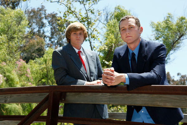
Senior Pic 2

Aug 26, 2011 05:32:12 #

I think you done great on the ones you've taken. The backgrounds aren't overly cluttered and the color is vivid. The postures are manly and the sun light adds great features. None of them seem to be exactly centered and subject(s) are clear and crisp. The bottom one i would have cropped out the left edge of the tree as it's is kind of bright there but it's all in your opinion. Great shots and a great eye!
P.S. The bottom two photographs have just a bit of noise in them. You may try bringing down your ISO to 100-200 because it is so bright. Also, if you didn't already, you may try an adjustable CPL filter to bring out more shade in the photographs. The top photograph is perfect!
P.S. The bottom two photographs have just a bit of noise in them. You may try bringing down your ISO to 100-200 because it is so bright. Also, if you didn't already, you may try an adjustable CPL filter to bring out more shade in the photographs. The top photograph is perfect!
Aug 26, 2011 07:44:17 #

Great pics and I'm guessing these fellows will appreciate your work. I must question the comment about the 1st one being the best, as everything I've ever read says not to shoot faces in direct overhead sunlight. His nose looks HUGE because of the shadows on his face, imho. Try putting him in the shade if you can't get the sun behind you so his face is evenly lit. Overall, really nice photos, to my eye. :thumbup:
Aug 26, 2011 08:30:00 #
Copy and paste this on the adress bar of your browser.
http://www.google.com/search?tbm=isch&hl=en&source=hp&biw=1200&bih=617&q=senior+portraits&gbv=2&oq=senior&aq=1&aqi=g10&aql=&gs_sm=c&gs_upl=3497l4950l0l7116l2l2l0l1l1l0l352l352l3-1l1l0
http://www.google.com/search?tbm=isch&hl=en&source=hp&biw=1200&bih=617&q=senior+portraits&gbv=2&oq=senior&aq=1&aqi=g10&aql=&gs_sm=c&gs_upl=3497l4950l0l7116l2l2l0l1l1l0l352l352l3-1l1l0
Aug 26, 2011 11:11:15 #
ninker1 wrote:
Copy and paste this on the adress bar of your browser.
http://www.google.com/search?tbm=isch&hl=en&source=hp&biw=1200&bih=617&q=senior+portraits&gbv=2&oq=senior&aq=1&aqi=g10&aql=&gs_sm=c&gs_upl=3497l4950l0l7116l2l2l0l1l1l0l352l352l3-1l1l0
http://www.google.com/search?tbm=isch&hl=en&source=hp&biw=1200&bih=617&q=senior+portraits&gbv=2&oq=senior&aq=1&aqi=g10&aql=&gs_sm=c&gs_upl=3497l4950l0l7116l2l2l0l1l1l0l352l352l3-1l1l0
Is this a positive way of saying you don't like her photographs? I don't understand what the reasoning for so little words directing towards nothing more than a link that had no explanation to where it would lead.
Most of the smarter people will not click a link with that kind of comment because of all the viruses going around. However, I trusted you and clicked it. So I'll explain to the others for you... and your welcome!
The link will redirect you to www.google. com/images and will provide a full page that will never end of senior photographs from all over the world... It's not harmful unless you click on a photograph and try to view it larger but then are redirected to another site. good luck and click smart...
Aug 26, 2011 11:32:54 #

notnoBuddha wrote:
Theme pictures seem to be the trend. Go with his interests - football, cars, lumberjack; whatever it is work it into the frame. Maybe sitting on the hood of a car, in his football uniform, holding an axe. Okay - maybe a little too much, but you get the idea. I would try to avoid getting too cute or having the frame too cluttered - remember you want the fucos on the subject. Good luck
When I read your post, this is what jumped into my head.
http://www.youtube.com/watch?v=A52p9jc-gOo
Aug 26, 2011 14:31:46 #
SnapHappy wrote:
Great pics and I'm guessing these fellows will appreciate your work. I must question the comment about the 1st one being the best, as everything I've ever read says not to shoot faces in direct overhead sunlight. His nose looks HUGE because of the shadows on his face, imho. Try putting him in the shade if you can't get the sun behind you so his face is evenly lit. Overall, really nice photos, to my eye. :thumbup:
As you read in my post I was not happy to be shooting mid day like that but I was at the mercy of their schedule.
Aug 26, 2011 14:37:33 #
Jwilliams0469 wrote:
I think you done great on the ones you've taken. T... (show quote)
The originals have no noise and were shot iso 125. Compression for the web dose not help. As for the foliage in the right corner it was done on purpose. I gave the a choice of the one you see and a cropped version... They liked the one you see here.
Aug 26, 2011 16:36:03 #
If you look at those three photos again closely you will see that she did not take them.
I do agree that the limbs in the forground should be cropped out , aside from the photo being a little flat I like the third one the best .
I like the poses but as he pointed out the lighting was not the best .
Sometime you have to work with what you are delt.
I think he did best he could with the situation.
Sometimes shade is the best but this is close cropped too.

Aug 26, 2011 16:57:55 #
If you want to reply, then register here. Registration is free and your account is created instantly, so you can post right away.