A little black and white
Oct 3, 2016 19:46:20 #

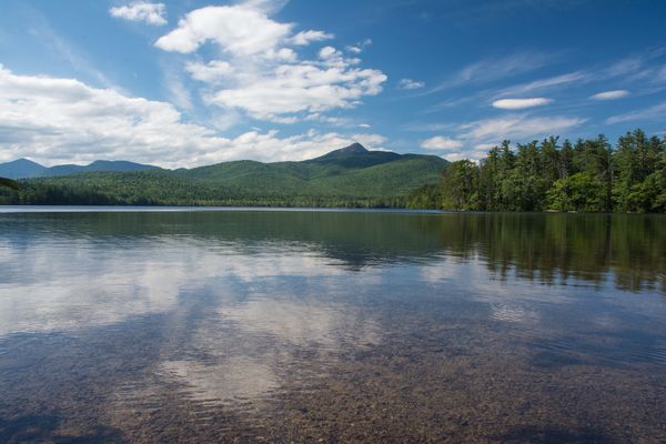
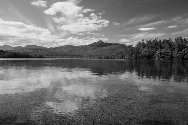
I have no plans to totally dedicate myself to B & W but I would like to develop an "eye" for knowing what shots might look good if I make the conversion. Here's a photo I posted recently and my attempt at a respectable black & white version. I think dramatic sky and clouds make for good conversions and this shot had foreground detail I really liked. Honest comments and criticism please.
Oct 4, 2016 06:43:41 #

It's a very good conversion, Dennis. A good range of tonal values, and the dramatic sky does help. But truthfully I like the color version better, myself. The color works better to define the lake bottom in the foreground, as well as give you separation between the trees on the right and the forest on the distant hills.
Oct 4, 2016 08:08:10 #

I love B&W, and you did a fine job on this...I just think for this shot, color works better!!
Oct 4, 2016 08:11:22 #
Treepusher wrote:
It's a very good conversion, Dennis. A good range of tonal values, and the dramatic sky does help. But truthfully I like the color version better, myself. The color works better to define the lake bottom in the foreground, as well as give you separation between the trees on the right and the forest on the distant hills.
Thanks, Randy. I'm glad I posted these shots. Really learning a lot.
Oct 4, 2016 08:13:58 #
rlaugh wrote:
I love B&W, and you did a fine job on this...I just think for this shot, color works better!!
Thanks for your comment, rlaugh. My first attempt resulted in the foreground looking muddy, so I was much happier with the one posted here. But the other half of the project is learning how to choose what shots to convert. This has been a good experience.
Oct 4, 2016 12:00:17 #
I shot, oh, half my work at least for 40 years in B&W, and never thought I had "the eye." There are discussions about "seeing" in monochrome; I can't do it. But in this case, IMHO, I think the color shot works better because the whole scene lacks contrast, "punch," so the B&W looks pretty anemic. Now, that said, it's a simple matter to punch them both up in almost any PP app. I think I'd try upping the saturation first, and maybe the contrast too. There's a fine line. But what caught your eye in the first place was the delicate pastels of the lake-bottom gravels, and that's lost in the B&W. This is not to say not to do it; I just happen to think this is not the picture. I myself almost never make a B&W conversion, and I should! Since I never developed "the eye," probably the way to develop it is to try lots of stuff and see what works. When I started in photography B&W was pretty much what there was, and certainly all I could process myself, so I stuck with it, but not having the eye would explain why so much of my stuff was not very good. 

Oct 5, 2016 05:33:22 #

Dennis, B&W is tricky business, which is why I do little of it! I think you've done well with this one, but I prefer the color! Keep at it! 

Oct 5, 2016 09:40:40 #

A solid shot....either way. Beautiful colors and landscape. However, to improve it, I would love to see this in more of a pano crop...same width, and much less height. I'd probably choose less foreground *(even though you have a nice foreground, which has beautiful sky reflections). Another option is to accentuate the eye's line into the photography by punching up the stones in the water to catch your eye. Maybe up the orange in that area, as well as the contrast. But then again, who am I? If 100 photographers took this shot, and processed it, you would have 100 different outcomes. I'd love to play with it if you don't mind!
Oct 5, 2016 09:56:24 #
Oct 5, 2016 11:48:52 #
dennisallard wrote:
I have no plans to totally dedicate myself to B & W but I would like to develop an "eye" for knowing what shots might look good if I make the conversion. Here's a photo I posted recently and my attempt at a respectable black & white version. I think dramatic sky and clouds make for good conversions and this shot had foreground detail I really liked. Honest comments and criticism please.
Sorry my first reply was so blunt but I did from my phone, which I'm clumsy with. I appreciate your comment and look forward to seeing what you can do with it. Will be gone for a few days so I probably won't be able to reply right away. Enjoy.
Oct 7, 2016 16:24:52 #

dennisallard wrote:
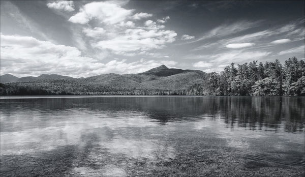
Cyndi and I must be on the same wave length ..... I agreed with her comments on what might be done to Dennis' b&w version. With permission from Dennis, I have posted another b&w interpretation of his original color photo of clouds and water. As I relayed to him some days ago, I personally love the genre. I downloaded his color image, cropped a bit of the foreground out, converted it to monochrome in NIK Silver Effex, added some control points to darken the clouds, lighten up the very dark blue sky, then used the Color Filter set to green and used the various Sensitivity Filters (mainly green, cyan and blue to create some tonal separation in the colors so they "suggest" different colors. Afterwards I used Topaz Adjust, Global Adjustments, Adaptive Exposure and Regions to separate the "color" tones even more. Finally I used Smart Photo Editor to create a water ripple texture overlay, and masked it to cover the water only ..... to give a more realistic look to the water.Go for it.
Oct 7, 2016 16:46:32 #
Bob Yankle wrote:
Cyndi and I must be on the same wave length ..... ... (show quote)
I"M BACK!!! This looks really good. What impresses me most is, out of all those tools you have available, how do you know which ones to use? I'm still learning Elements but am so impressed by what you folks do with Nik and Topaz.
Oct 11, 2016 09:35:30 #
Bob Yankle wrote:
Cyndi and I must be on the same wave length ..... ... (show quote)
I won't even bother playing around with this now! It's a good day when Bob Y says we are on the same wave length! Beautiful job.
If you want to reply, then register here. Registration is free and your account is created instantly, so you can post right away.