Cropping Question
Mar 9, 2015 16:41:51 #
Apr 7, 2015 00:48:01 #
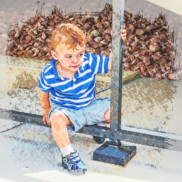
Some images lend themselves to square crops, I think this one does. It shows where he is, and what he is doing. I like it.
Apr 7, 2015 12:47:53 #
I love your picture and it reminded me of the type of pictures used on the cover of the Saturday Evening Post Magazine back in the day. Here is my rendition of a magazine cover.
davefales wrote:
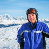
I offer this composition for comments. There are so many variables to the best way to crop this one (Rule of Thirds, Rule of Space, general impact at first view).
This is No. 4 grandson. I used Topaz Simplify lightly.
What do you think about the cropping? I have a fair amount of image space outside of the crop. Thanks in advance.
This is No. 4 grandson. I used Topaz Simplify lightly.
What do you think about the cropping? I have a fair amount of image space outside of the crop. Thanks in advance.
Saturday Evening Post
Apr 7, 2015 13:19:40 #

Apr 10, 2015 22:56:57 #
mper812 wrote:
I love your picture and it reminded me of the type of pictures used on the cover of the Saturday Evening Post Magazine back in the day. Here is my rendition of a magazine cover.
I like that mper. What filter did you use for PP to get the magazine effect?
Apr 11, 2015 00:07:17 #
I use Smart Photo Editor. It is a very good program and not expensive.It provides hundreds of special effects which are supplied by the users of the program.
davefales wrote:
I like that mper. What filter did you use for PP to get the magazine effect?
May 17, 2015 22:25:13 #
CO wrote:
If the original image has more space on the right I would include that. It would be good to have more space in the direction that he is looking. I think your vantage point is too high. It would have been good to squat or kneel down to get the camera closer to his height.
I am a bit of a newbie, but I was going to say a little more space on the right. Not much though, and cute grandkid!
May 18, 2015 10:07:17 #
Gendarme wrote:
I am a bit of a newbie, but I was going to say a little more space on the right. Not much though, and cute grandkid!
Thanks for you comments, Gendarme. I was surprised that there is still activity on this thread. I have more image space to the right but would have to go to a 2x3 crop. I've been playing with square lately.
May 18, 2015 11:28:51 #
davefales wrote:
Thanks for you comments, Gendarme. I was surprised that there is still activity on this thread. I have more image space to the right but would have to go to a 2x3 crop. I've been playing with square lately.
I just happened to be browsing. The pic is good, but you may have what I have which is Nevergoodenoughitis! I am always thinking my focus could be better, the lighting could be better, the composition could be better. Often it takes my wife looking at a photo and saying "Wow, great picture." to get me to stop.
May 25, 2015 17:09:21 #
pithydoug wrote:
Yes the boy alone is interesting but you have removed the reason he is looking. If the reason he is looking is important..
Not that thirds is always appropriate but in this case a little slice off the left leaving where is looking the larger area, a more compelling image.
Not that thirds is always appropriate but in this case a little slice off the left leaving where is looking the larger area, a more compelling image.
You cannot see what he is looking at regardless...it's a photo of the little boy not a photo of what he's looking at or where he's looking.
May 29, 2015 10:21:24 #
It's the boy's face, particularly the eyes, that caught my attention. I didn't even see the triangle until I read the comment. Nice photo.
May 29, 2015 13:34:56 #
Alby and suterjo - your comments together capture what my primary thought was when I started pp. The eyes. It's up to the viewer's imagination as to what he's focused on. I didn't know what he was looking at when I shot it. Thanks.
May 29, 2015 22:05:51 #
davefales wrote:
Alby and suterjo - your comments together capture what my primary thought was when I started pp. The eyes. It's up to the viewer's imagination as to what he's focused on. I didn't know what he was looking at when I shot it. Thanks.
You are welcome! Photography, for me, is about capturing what the photographer sees and portraying that image to others.
May 29, 2015 22:07:46 #
mper812 wrote:
I love your picture and it reminded me of the type of pictures used on the cover of the Saturday Evening Post Magazine back in the day. Here is my rendition of a magazine cover.
I think your rendition is awesome! It's a good example of of what you can do in post processing....
Jun 24, 2015 11:29:18 #
hosh
Loc: Hollywood FL
davefales wrote:
I offer this composition for comments. There are so many variables to the best way to crop this one (Rule of Thirds, Rule of Space, general impact at first view).
This is No. 4 grandson. I used Topaz Simplify lightly.
What do you think about the cropping? I have a fair amount of image space outside of the crop. Thanks in advance.
This is No. 4 grandson. I used Topaz Simplify lightly.
What do you think about the cropping? I have a fair amount of image space outside of the crop. Thanks in advance.
The triangle in the upper right is distracting. I would have gotten down a bit lower to take the photo, that would have helped with the background and the angle of viewing your subject.
If you want to reply, then register here. Registration is free and your account is created instantly, so you can post right away.