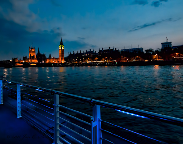
Night Image London Waterfront (What do you think)
Sep 21, 2011 09:32:17 #

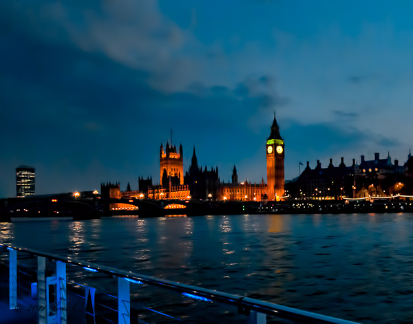
This image was captured at 8:30 in April. It is a High Dynamic Resolution (HDR) image composed of three images combined to achieve the color saturation and detail seen here. Images were captured at the correct exposure and then two stops down and two stops up to get the full range of light and color.
The base image camera settings:
Nikon D300, Exposure 1/3 sec at f/6.3, Aperture priority, Metering Center-weighted average, ISO 1600, Sigma 10.0-20.0 mm f/4.0-5.6.
Any suggestion or comments welcomed.
The base image camera settings:
Nikon D300, Exposure 1/3 sec at f/6.3, Aperture priority, Metering Center-weighted average, ISO 1600, Sigma 10.0-20.0 mm f/4.0-5.6.
Any suggestion or comments welcomed.
London Waterfront at Night
Sep 21, 2011 10:12:08 #

jonsund wrote:
This image was captured at 8:30 in April. It is a ... (show quote)
Although the night lights are interesting the photo as a whole just doesn't grab me.
Sep 21, 2011 10:22:34 #
Sep 21, 2011 10:29:40 #
the only thing that detracts from this shot is whatever is on the bottom left side has a deep blue cast where it should be white. i do like the composition and the warmer colors around big ben :thumbup:
Sep 21, 2011 10:34:01 #

I think it is a very nice composition although the rails in the lower left are quite distracting and would be better cropped out. It also seems to be slightly out of focus but that could be my monitor.
Sep 21, 2011 11:24:09 #
waltwilkitis wrote:
I think it is a very nice composition although the rails in the lower left are quite distracting and would be better cropped out. It also seems to be slightly out of focus but that could be my monitor.
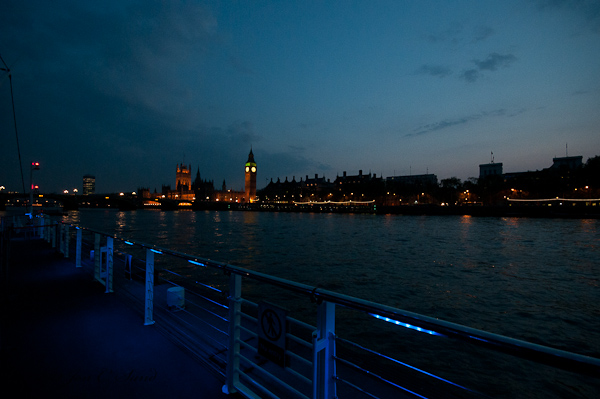
I am uploading the original so you can see how the image started and I have cropped it further to eliminate the rail.
The rail is blue because there are blue lights shining on it and I agree it is out of focus, but how could you get a depth of field at night to keep this entire composition in focus?
Original
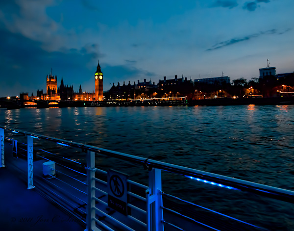
Second Crop
Sep 21, 2011 14:14:44 #

Sep 21, 2011 19:55:09 #

Try longer expsure f stop 11 or maybe 16? That would increase your depth of field. Your focus spears to be on the rail. You could set your focus to center and then focus on Big Ben and see what happens.
Sep 21, 2011 19:57:46 #
That tall building on the left seems a little out of place though but you still have a pretty picture. I really enjoy night shots.
Sep 21, 2011 20:13:18 #

Funny , I actually like the original photo the best ... I think the composition is much better in the original and it adds texture and interest to the photograph. In the second crop I think there is too much sky and that is not really your subject. The buildings on the shoreline are not in focus enough to be your subject but when you add the rails that are a unique color and an interesting perspective the buildings add to the interest as a whole and the composition is divided nicely into thirds. With the railings it is much more unique... out of the ordinary and interesting. (the little square sign on the railing is the only thing that distracts me ) . Just a different point of view :-)
Sep 21, 2011 20:19:55 #
now that you explained that the rails havee blue lights on them, I gotta like the first one again. it does add an interesting line as well as a nice contrast between the orange around big ben and the blue of the rails. To a Florida Gator fan you cant go wrong with orange and blue. You know I really am decisive....sometimes, maybe, ocasionaly :lol: :thumbup:
Sep 21, 2011 20:32:35 #
When I was explaining why I liked the original I meant that I liked the second one that you have labeled "original" the second photo. for all the reasons I stated above. I like the composition better than the first one. My least favorite is the one where the rail is edited out.The second one is in a word ... really cool.
Sep 21, 2011 20:35:43 #
I will work on removing the sign tomorrow and you will be able to see what it looks like with it removed.
Sep 21, 2011 21:29:10 #
jonsund wrote:
I will work on removing the sign tomorrow and you will be able to see what it looks like with it removed.
actually I don't even mind the sign that much, gives it a bit of urban feel.
Sep 22, 2011 09:53:27 #
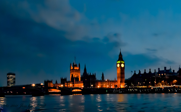
Oops, lost track of my files. I have posted the real original of the waterfront and big ben. I have also included the image I thought was the orginal with sign and a few other items removed.
What do you think of it now. I have printed my original post and it doesn't look too bad.
What do you think of it now. I have printed my original post and it doesn't look too bad.
Oops the Real Original
Objects removed from earlier post
If you want to reply, then register here. Registration is free and your account is created instantly, so you can post right away.