Comparing two lenses
Jul 17, 2014 07:58:18 #

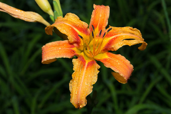
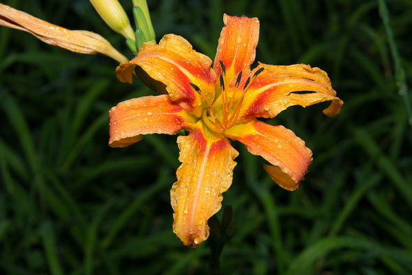
I am evaluating two lenses and would appreciate comments. To avoid any biases, I am omitting any details about the two lenses. The subject may not be the best for testing lenses but I wanted a real world comparison rather than test targets. I am including a link to the raw's. I know that people can figure out what gear is involved but please do not refer to it now. After a few posts, I will add those details.
http://www.dropbox.com/sh/t7ibhsq1tym5j61/AADB5mYO3liCurcGgl_POI23a
http://www.dropbox.com/sh/t7ibhsq1tym5j61/AADB5mYO3liCurcGgl_POI23a
Jul 17, 2014 08:09:31 #

Brought both into LR.
Basically...no difference as far as I can see. 1378 MIGHT have a SLIGHT edge but that's just being nit-picky as far as I'm concerned.
Basically...no difference as far as I can see. 1378 MIGHT have a SLIGHT edge but that's just being nit-picky as far as I'm concerned.
Jul 17, 2014 08:10:45 #
deberry
Loc: Spartanburg, SC
Number 1 gets my vote. Great idea on getting comparisons. This is a true test. Smart!!
Jul 17, 2014 08:26:08 #

In looking at the download only, not looking at the originals in lightroom, number one seems a touch sharper either because of DOF, the lens, or maybe there is a slight bit of motion? I can't tell because it is so slight. What I'm looking at is the (sorry, I'm not a bottonist, or even a flower guy, so I don't know the "real" name) the stamens and pistols (or whatever they are called... the parts that stick out of the center of the flower)
Just based on that, and the color in the download looks just a touch more vivid in number 1 (to me, on my monitor) If I had to decide which is better, I'd have to give number one a slight, very slight, edge.
Just based on that, and the color in the download looks just a touch more vivid in number 1 (to me, on my monitor) If I had to decide which is better, I'd have to give number one a slight, very slight, edge.
Jul 17, 2014 08:42:10 #

Jul 17, 2014 09:23:41 #
Thanks for the responses. I would appreciate if people find a difference between the two, please mention if the difference is small or large.
Jul 17, 2014 10:56:43 #

I like #1. Colors a bit more vivid. Did you do any thing in post? If you did that may be the differance. I think did any PP it might be the differance. I would think on a test like this you would use JPEG so that there is no chance of you making a differance. - Dave
Jul 17, 2014 11:05:14 #
wilsondl2 wrote:
I like #1. Colors a bit more vivid. Did you do any thing in post? If you did that may be the differance. I think did any PP it might be the differance. I would think on a test like this you would use JPEG so that there is no chance of you making a differance. - Dave
Lens 2 was darker so I up the exposure 2/3 stop in LR so they brightness would be the same. I probably could have cropped 2 a little to match 1 but that was trivial. I wanted to eliminate as many variables as possible so that the differences would be due to the lenses only and to avoid observer bias. Post-processing can make these the same rendering the exercise moot.
Jul 17, 2014 11:24:09 #

#1 is a tiny bit sharper - this could be from wind or slight camera shake in #2. On my monitor, #2 is brighter. The brightness difference can be seen in the background leaves of #2.
Jul 17, 2014 12:18:40 #

The first one has slightly more vivid colors & is slightly sharper. I prefer no 1, but the difference is small.
Jul 17, 2014 13:13:33 #

The colors in 1 seem slightly more saturated and vivid. Number 1 also seems to be sharper. I am at work on a laptop so I may be not seeing things as they should be seen an a calibrated monitor.
Jul 17, 2014 13:21:05 #
abc1234 wrote:
Lens 2 was darker so I up the exposure 2/3 stop in LR so they brightness would be the same. I probably could have cropped 2 a little to match 1 but that was trivial. I wanted to eliminate as many variables as possible so that the differences would be due to the lenses only and to avoid observer bias. Post-processing can make these the same rendering the exercise moot.
The BEST way to compare multiple lenses is to crop only. Or if you have to re-size, do the same for both images.
Unfortunately, subconscious bias ALWAYS creeps into these types of situations, and if both sets of data are not processed EQUALLY, the results may be tainted or tilted. :(
That being said, I couldn't see any meaningful difference between the two images and both are quality photographs. :thumbup:
Jul 17, 2014 13:30:46 #
CHOLLY wrote:
The BEST way to compare multiple lenses is to crop only. Or if you have to re-size, do the same for both images.
Unfortunately, subconscious bias ALWAYS creeps into these types of situations, and if both sets of data are not processed EQUALLY, the results may be tainted or tilted. :(
That being said, I couldn't see any meaningful difference between the two images and both are quality photographs. :thumbup:
Unfortunately, subconscious bias ALWAYS creeps into these types of situations, and if both sets of data are not processed EQUALLY, the results may be tainted or tilted. :(
That being said, I couldn't see any meaningful difference between the two images and both are quality photographs. :thumbup:
Your point is well taken. Both were processed identically and minimally. As mentioned above, I tweaked 2 slightly so as to match the brightness of 1. Otherwise, no cropping, sharpening, lens profiling or anything else. I took both with the same lighting and color balance.
After a few more responses, I will reveal the secrets behind the shots. I just want to get unbiased opinions.
Jul 17, 2014 13:36:34 #
Well, if one was darker than the other with all other factors compensated for... ;)
Jul 17, 2014 21:52:16 #

If you want to reply, then register here. Registration is free and your account is created instantly, so you can post right away.