black & white
Feb 20, 2014 22:25:07 #
Feb 20, 2014 22:34:53 #

Feb 20, 2014 22:41:28 #

Feb 20, 2014 22:43:12 #

1 for me!
Like the tones.
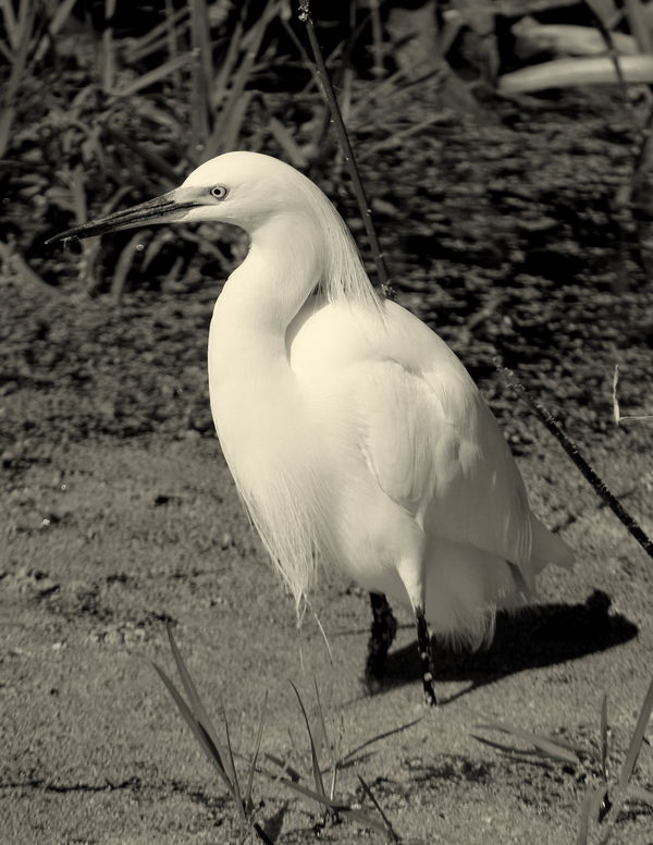
Bird stands out from the background.
For me, could use a little more space on the left side.
Two thumbs up!!
Pat
Like the tones.
Bird stands out from the background.
For me, could use a little more space on the left side.
Two thumbs up!!
Pat
Feb 20, 2014 22:49:57 #

Feb 20, 2014 23:06:54 #

Feb 21, 2014 05:52:39 #

I prefer color on wildlife shots... I do like #1 though, good focus & and stands out nicely.
Feb 21, 2014 06:29:37 #

Feb 21, 2014 06:45:23 #

Feb 21, 2014 09:20:01 #
#1 for me as well Mitcha.
Jay, interested in your comment on needing more space on the left.
Can you explain your theory/reason for that? No criticism here...just like to hear all angles. Thanks
Jay, interested in your comment on needing more space on the left.
Can you explain your theory/reason for that? No criticism here...just like to hear all angles. Thanks
Feb 21, 2014 09:38:26 #
Mark7829
Loc: Calfornia
Number 1 is too warm. You might consider removing the color cast and them make the whites really white and do the same for backs without losing detail. . The background should have been softer. I would have used a lower aperture such as 5.6.
You shot nearly at mid day. This shot has high contrast. Shooting in the early morning would have been better. If you want to shoot landscape and wildlife, you are on site at dawn and sunset.
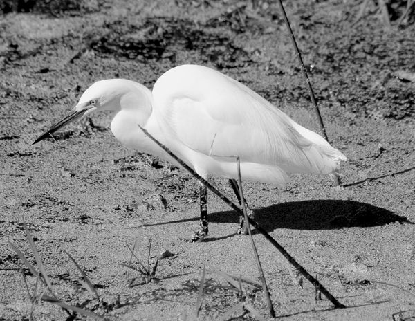
Number 2 does not work. The plant crosses the subject. The pose is not good as number 1. Again high contrast is detrimental.
It would be better if you posted meta data, i.e, time of day, lens, settings etc. Please no hate mail
You shot nearly at mid day. This shot has high contrast. Shooting in the early morning would have been better. If you want to shoot landscape and wildlife, you are on site at dawn and sunset.
Number 2 does not work. The plant crosses the subject. The pose is not good as number 1. Again high contrast is detrimental.
It would be better if you posted meta data, i.e, time of day, lens, settings etc. Please no hate mail
Feb 21, 2014 09:44:34 #
MCHUGH
Loc: Jacksonville, Texas
bsmith52 wrote:
#1 for me as well Mitcha.
Jay, interested in your comment on needing more space on the left.
Can you explain your theory/reason for that? No criticism here...just like to hear all angles. Thanks
Jay, interested in your comment on needing more space on the left.
Can you explain your theory/reason for that? No criticism here...just like to hear all angles. Thanks
bsmith52 I think Jay is saying this because the crane's bill tip is closer to the left side than its tail on the right side. Since the eye starts at the lower left corner and moves up on the subject matter it is easier for it to leave the photo. It does not bother me personally and I think the #1 photo is great. Started out in B&W and it is still in the blood stream after 50 years
Feb 21, 2014 09:59:35 #
ecards
Loc: Fort Myers, FL
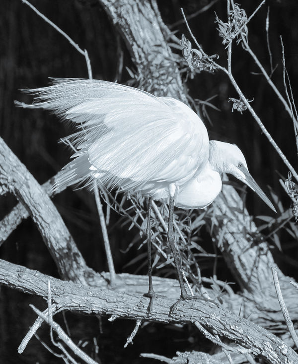
Here is one of my Snowy Egrets from a shoot about this time last year at the rookery in Venice, FL.
Feb 21, 2014 10:00:36 #
ole sarg
Loc: south florida
An excellent critique with helpful hints on how to do it.
Mark7829 wrote:
Number 1 is too warm. You might consider removing... (show quote)
Feb 21, 2014 10:19:22 #
bsmith52 wrote:
#1 for me as well Mitcha.
Jay, interested in your comment on needing more space on the left.
Can you explain your theory/reason for that? No criticism here...just like to hear all angles. Thanks
Jay, interested in your comment on needing more space on the left.
Can you explain your theory/reason for that? No criticism here...just like to hear all angles. Thanks
It's to give more room for the subject to look out in the image. Instead of the edge of the image. The extreme issue would be if the edge of the image was closer to the tip of the bill/beak.
We don't know what is over to the left. Could be something that MITCHA didn't want to include in the image.
Hope this helps!
Pat
If you want to reply, then register here. Registration is free and your account is created instantly, so you can post right away.