What am I not getting?
Dec 2, 2011 01:58:42 #
This is very frustrating. I thought that I had a great idea. I put this stuff together thinking that it would be cool. I liked the lighting but I would have liked less shadows. And to me, like me, it's kind of boring. I know the 60's were good to me but do I really lack that much imagination? I need to learn- quick! Statistically I only have about 20 years left. Please assist me.
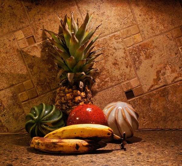
#1
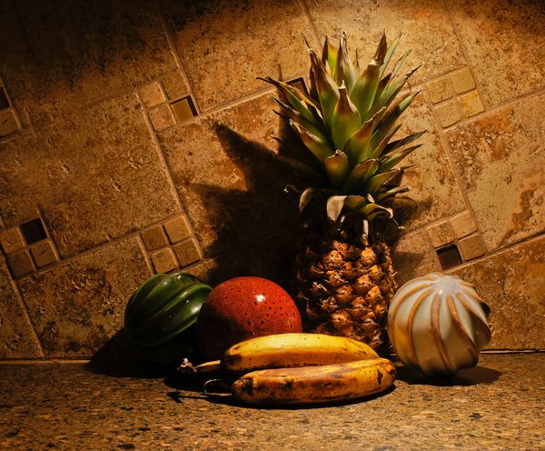
#2
Dec 2, 2011 02:18:14 #

since you have twenty years..... I don't think I could do a good still life with out help. but I'd suggest looking on line at the old master pieces of still life and learn from them.from placement, lighting, number of objects, colors, how were they placed in the frame.
Dec 2, 2011 02:34:28 #
saside wrote:
Yeah, I've been looking at books and stuff. I am persistent though. I finally got my colors right on my printer. Now if I can only get them to print as bright as they are on my monitor. So maybe I will get some where with my still life.since you have twenty years..... I don't think I could do a good still life with out help. but I'd suggest looking on line at the old master pieces of still life and learn from them.from placement, lighting, number of objects, colors, how were they placed in the frame.
Dec 2, 2011 04:25:49 #
Dec 2, 2011 10:15:49 #
Dec 2, 2011 10:25:05 #

The color tones are too close to one another to provide any contrast or "oomph".
And the lighting needs to be upped.
This is only being offered because you said that to YOU this is a boring composition.
I think what drew you to these particular objects is their varied textures (I applaud your vision in that regard :thumbup: )... but because you've placed them against a similarly textured background, the textures just all mingle too much to stand out.
Instead of supporting each other, they blend together.
And again, the subjects are all on one plane... nothing to make any of them visually separate from other objects.
Don't sell yourself so short...you have vision and recognize interesting subjects naturally. You have an eye for textures that many don't have... you'll get there!! :)
You could place maybe the bananas on a brightly colored plate, or replace ONE thing with an object that offers a pop of color... or edit the number of unifying textures to maybe three... any number of small changes could get you where you want to be with this one.
And btw- I like the composition of #2 much better than #1... you're developing a good eye for arrangement.
Dec 2, 2011 11:01:07 #

tilde531 wrote:
The color tones are too close to one another to pr... (show quote)
Tilde hit the main point....its too monochromatic....vary your colors and tones to get the light to pop and absorb in a variety of ways. Light from either 45 degree angle and reflect from the opposite side.
Dec 2, 2011 11:16:17 #

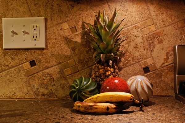
I think you need to change the height of one or two of objects, maybe try a dark colored piece of fabric to set up something underneath them.
Dec 2, 2011 11:38:55 #
tilde531 wrote:
The color tones are too close to one another to pr... (show quote)
This is how I started.
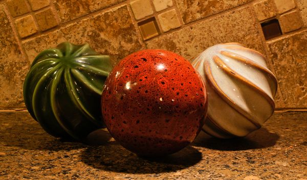
Then this.
Dec 2, 2011 11:40:46 #
tilde531 wrote:
The color tones are too close to one another to pr... (show quote)
This is how I started.

Then this.

Dec 2, 2011 11:44:25 #
tainkc wrote:
My quoted replies have not been showing up lately when I send secondary pix. I do not know why. This is the reason for my double post. Sorry. quote=tilde531 The color tones are too close to o... (show quote)
Dec 2, 2011 11:46:09 #
Dec 2, 2011 11:48:55 #
Now I see it. My replies are just blended in with your respnse, Tilde. Sorry guys. Tom
Dec 2, 2011 12:05:36 #
Dec 3, 2011 08:17:25 #

To lessen the shadows: 1) move the subject out from the wall, and 2) use a larger aperture to reduce the DOF, which will keep your subject in sharp focus but blur the background.
If you want to reply, then register here. Registration is free and your account is created instantly, so you can post right away.