little girl pix
Mar 1, 2012 06:16:08 #
Mar 1, 2012 06:27:44 #

Nice shots overall but there is room for improvement.
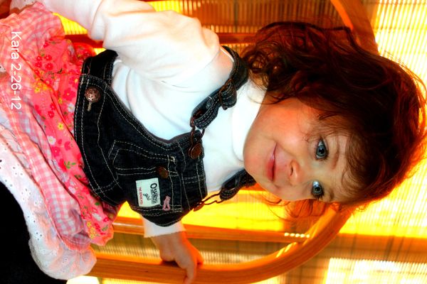
#1: The window light is too orange and the window is too hot in my opinion. Not sure why. Otherwise nice shot.
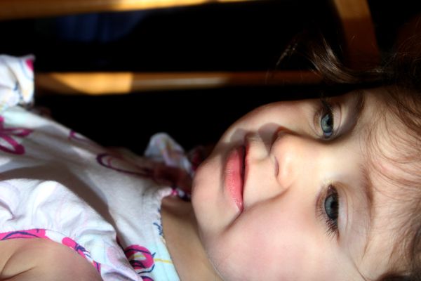
#2: Nice shot, nice cropping...nice moment.
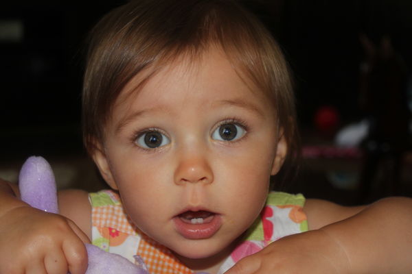
#3: Nice, the expression is priceless.
On all three it appears that you used the "on camera flash" and that makes for "flat" lighting.
Can you see that there is no "texture" to the faces? (#2 is the exception; notice how her face has some 3Dness?) Each side of the face is exactly equal in light value to the other?
That makes for less-than-exciting lighting and is easily cured by purchasing an external flash and bouncing the light sideways to mimic studio lighting or taking the flash off the camera alltogether.
Either way, it will improve your shots.
But having said that...they are pretty good.
#1: The window light is too orange and the window is too hot in my opinion. Not sure why. Otherwise nice shot.
#2: Nice shot, nice cropping...nice moment.
#3: Nice, the expression is priceless.
On all three it appears that you used the "on camera flash" and that makes for "flat" lighting.
Can you see that there is no "texture" to the faces? (#2 is the exception; notice how her face has some 3Dness?) Each side of the face is exactly equal in light value to the other?
That makes for less-than-exciting lighting and is easily cured by purchasing an external flash and bouncing the light sideways to mimic studio lighting or taking the flash off the camera alltogether.
Either way, it will improve your shots.
But having said that...they are pretty good.
Mar 1, 2012 10:13:14 #
Mar 2, 2012 10:37:21 #
photeach
Loc: beautiful Kansas
A. Number 2 is my favorite. It shows that little kid skin nicely. B. Number 3 could be improved by going vertical. (My tombstone will read "Go Vertical!") That way we could see the bunny thing she is holding.
C. I agree that Number 1 has a "hot window." Get your model away from the window, or wasn't she working with you that day?
D. Count your blessings that you have that sweet little kid in your life.
C. I agree that Number 1 has a "hot window." Get your model away from the window, or wasn't she working with you that day?
D. Count your blessings that you have that sweet little kid in your life.
Mar 3, 2012 15:53:56 #
Apr 25, 2013 20:35:50 #
1. The blinds in the background caused the orange hue that you see it might have been better with them closed a bit.
2. if you would have dropped the flash value by a stop or 2 if you can get the subject to cooperate you would have seen softer lighting,
3. i d dont really agree with going vertical on this one the arms add quite a bit to attract the eye to your main focus. over al li thnk it is a very nice shot.
over all all three are prett good and some of the things can be corrected using a photo editor.
If you want to reply, then register here. Registration is free and your account is created instantly, so you can post right away.