Challenge Series - Focal Point
Feb 19, 2018 06:49:34 #
This challenge is about the focal point in an image. There are all kinds of ways of drawing the viewers eyes to the focal point: you may use railroad tracks, a road, a river, etc,.
A focal point is a point of interest that stands out and makes a photograph unique. Alternatively, a point in the image where rays of light converge; for example the sun with rays of light emanating from it. (There are plenty of articles online about the focal point in photography.)
In this Challenge we aim to use color to create the focal point. The color must attract the eye. Now we are adding to your skills by concentrating on creating a focal point using color alone. See the image below. (Is this image natural? No! The image is enhanced to sell a place or product.)
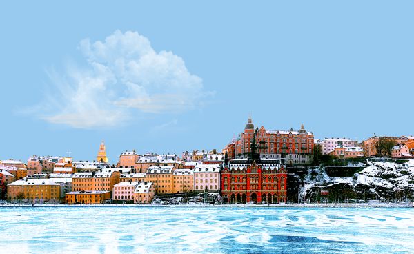
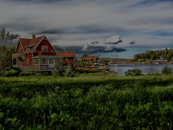
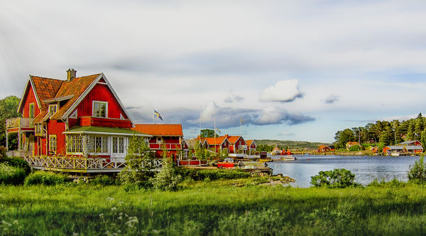
The second image is Alno, Sweden (Photo from Pixabay,com). Your work image is split 50/50 (more or less) between sky and land. Most of the work photo below is a cloud filled sky, red buildings, and green vegetation. You chose the focal point for this image. (The point which attracts the viewers eyes first.) Change the sky if you wish. Crop the way you want to make either sky or land dominate. Use color to draw the viewers eye to the focal point. Also use bold bright colors to enhance the village. Get rid of elements which lead your eye away from the focal point. You can all do this . . . but stop and think before you rush at it. You as the PP aficionado are able to create this photo magic.
Have fun.
PLEASE do not comment until you have posted your interpretation of the work image below.
No RAW file. The .png file will be fine.
A focal point is a point of interest that stands out and makes a photograph unique. Alternatively, a point in the image where rays of light converge; for example the sun with rays of light emanating from it. (There are plenty of articles online about the focal point in photography.)
In this Challenge we aim to use color to create the focal point. The color must attract the eye. Now we are adding to your skills by concentrating on creating a focal point using color alone. See the image below. (Is this image natural? No! The image is enhanced to sell a place or product.)
The second image is Alno, Sweden (Photo from Pixabay,com). Your work image is split 50/50 (more or less) between sky and land. Most of the work photo below is a cloud filled sky, red buildings, and green vegetation. You chose the focal point for this image. (The point which attracts the viewers eyes first.) Change the sky if you wish. Crop the way you want to make either sky or land dominate. Use color to draw the viewers eye to the focal point. Also use bold bright colors to enhance the village. Get rid of elements which lead your eye away from the focal point. You can all do this . . . but stop and think before you rush at it. You as the PP aficionado are able to create this photo magic.
Have fun.
PLEASE do not comment until you have posted your interpretation of the work image below.
No RAW file. The .png file will be fine.
Feb 19, 2018 07:50:50 #
Feb 19, 2018 11:26:12 #
GalaxyCat wrote:
very nice!
Hello, GalaxyCat. Thank you for your kind comment. If you would care to read the preamble to the images you'll discover that this is a PP Challenge section. Members are requested not to post comments until they have they have posted their image as an interpretation of the challenge. I understand that it is easy to be lead astray when the title appears in the Upcoming Topics section. If you would like to join us PP enthusiasts you would be made very welcome. Thanks.
Feb 19, 2018 13:28:50 #
Enjoy your challenges Shakey try to learn a new procedure on each one. This time I tried to put more focal area on the home on the left by adding sun beams. Also made a bit larger while changing the perspective and straightened it out some. Tried many things with the foreground and finally settled on a foreground blur while reducing the saturation. Smoothed and lightened the sky while removing noise. Not sure if this covered all your requirements will see.
Feb 20, 2018 10:51:40 #
Jim-Pops wrote:
Enjoy your challenges Shakey try to learn a new procedure on each one. This time I tried to put more focal area on the home on the left by adding sun beams. Also made a bit larger while changing the perspective and straightened it out some. Tried many things with the foreground and finally settled on a foreground blur while reducing the saturation. Smoothed and lightened the sky while removing noise. Not sure if this covered all your requirements will see.
Good work, Jim. An excellent crop and the foreground blur is a great idea. The sun beams were not visible, I downloaded your image and opened it in Affinity Photo. Big difference. The sun beams were there at top left. Here's a tip, sun beams work best when they come through a dark area. Imagine a dark forest with the sun beams coming through the trees. Now those beams really have impact. Try it with a dark forest photo from Google images, you'll be amazed. Sun beams are not so good with a light or white area. But you know that now, right?
Magnifying your image to 100% showed the houses and boats as a little soft. Use your Clarity adjustment tool and/or your Sharpen tool to make those houses pop. The sky was not great. In Affinity it looks way better than on the UHH download page. However, it is not the best sky you could use for this image. Personally, I would have chosen a different sky. There are plenty of skies to download from the Internet. The important thing is you are thinking about what you want to achieve. Your use of your software is improving all the time. You were asked for bright and bold colors and you almost got it. Be daring and be a tad brighter with your reds or any color that is your focal point. The green of the vegetation was fine, no problem. The viewers eye was drawn to the house on the left and naturally followed the line of waterside homes into the distance. A perfect example of the illusion of depth. You get five thumbs for technique and creativity. (Brighter and bolder still needed
 .)
.)
Feb 20, 2018 16:00:37 #
Thanks for doing these challenges. Lets me practice my skills (or lack there of!!!). Tried to accent the house by increasing the vibrance and saturation of the house and slightly desaturating the sky and greenery. Also cropped, straightened and removed noise in sky
Feb 20, 2018 20:29:29 #

I had so many layers I can't recall all the changes. Major were sky, color, crop, etc.
Noise control was not too successful in some parts of the image, ie, house.
Noise control was not too successful in some parts of the image, ie, house.
Feb 20, 2018 21:07:23 #
[quote=Shakey]Good work, Jim. An excellent crop and the foreground blur is a great idea. The sun beams were not visible, I downloaded your image and opened it in Affinity Photo. Big difference.
Just a note to explain my edits. I did understand that a darker sky would have shown the sun beams better but I didn't want the sky take over the picture as the homes were so bright already. Wanted the homes to drew your attention not sky or foreground grass. I went as far as I thought I could on the clarity / sharpening. When I viewed the picture at 100 or 200% it was looking bitmapped and sharpening was making it worse on my machine anyway. As you stated different software is producing a different look on different machines. Something to keep in mind but not sure what decisions should be made because of it. I am making sure I upload with srgb. I couldn't get enough green out of the house on the left and that stopped me from bringing any more saturation into the picture. I am not necessarily disagreeing with your assessment just explaining my thinking as I processed the image. Thanks for you critique.
Just a note to explain my edits. I did understand that a darker sky would have shown the sun beams better but I didn't want the sky take over the picture as the homes were so bright already. Wanted the homes to drew your attention not sky or foreground grass. I went as far as I thought I could on the clarity / sharpening. When I viewed the picture at 100 or 200% it was looking bitmapped and sharpening was making it worse on my machine anyway. As you stated different software is producing a different look on different machines. Something to keep in mind but not sure what decisions should be made because of it. I am making sure I upload with srgb. I couldn't get enough green out of the house on the left and that stopped me from bringing any more saturation into the picture. I am not necessarily disagreeing with your assessment just explaining my thinking as I processed the image. Thanks for you critique.
Feb 21, 2018 07:23:20 #
Revet wrote:
Thanks for doing these challenges. Lets me practice my skills (or lack there of!!!). Tried to accent the house by increasing the vibrance and saturation of the house and slightly desaturating the sky and greenery. Also cropped, straightened and removed noise in sky
Revet, at first glance I thought you had a very strong image (but not bright and bold). I clicked on download. I was suspicious of a few things and downloaded your image and opened it in Affinity Photo. Why did I suspect problems? The sky has been over processed because you used one or more adjustment filters too strongly. What I see is typical of overuse of the Denoise Filter. You certainly got rid of noise in the sky but at the cost of clouds which are way too soft and even appear over-exposed.
The opposite is true of the near house, which needs treatment for get rid of noise. The grass in the foreground appears tangled (not your fault) which should have been cropped away, at least to the white flowers.
This would have been a great image but somehow your enthusiasm and the software ran away with the image. You don't have to use all the tools and filters in the editing program. Select the minimum you need to get the result you want. I think you are using layers or selections to protect the area you are working on, but maybe you need to be more patient and work on one area until it is right. If you use a tool or filter and it looks wrong, click undo and try a different tool or filter.
I was inclined to give three thumbs, but as you clearly had a vision of what you wanted I'll make it four.
Feb 21, 2018 07:31:10 #
Shakey wrote:
Revet, at first glance I thought you had a very st... (show quote)
Thanks for the Critique!! I admit, I did this very quickly before work. Next time I will try to give you a well thought out edit!!
John
Feb 21, 2018 07:51:41 #
SoHillGuy wrote:
I had so many layers I can't recall all the changes. Major were sky, color, crop, etc.
Noise control was not too successful in some parts of the image, ie, house.
Noise control was not too successful in some parts of the image, ie, house.
A very good attempt, SoHillGuy. You changed the sky, which was a major improvement. (Take care when introducing a new sky, avoid the cutout look which is apparent in the trees/new sky on the right. I'm sure you can find tutorials on how to prevent this, with your software, on Youtube.
The houses are bright red, which is good but would have been even better if they had been a darker red. Why? Because contrasting colors can make a photo really pop. The sky is blue; if the reds had the same tone (Read about the effect of color tones online) the image would have real impact. You know the houses have a minor noise problem, you need to consult your Help files to figure out how to cure that.
All in all a good effort. Worth five thumbs for almost getting there.
Feb 21, 2018 08:25:08 #
[quote=Jim-Pops]
Thanks for your pertinent comment, Jim. This reply is important for all members. There clearly is a difference between the results we get from different machines, software, monitors, etc. I try to be aware of this as you may have noticed in my less strict critiques (at times). My advice is go ahead and, bearing my suggestions in mind, produce the best result you can. Here I want to stress the need to fully understand how to use whatever software you have. You can do that Challenge by Challenge. I often do my best work with GIMP (I know, old school). Why? Because I have been using that program for years. I am skilled at using it. You have to achieve a high level of skill with your photo editor. (I'm now trying to learn how to use Affinity Photo. I'm struggling because I don't yet know which tool or adjustment filter will give me the result I want. I'll get there because it's just a matter of practice, and more practice.)
I am sure that one or two members are not using selections and layers properly, if at all. If you have problems in this area watch the tutorials for your software and become adept at using both selections, feathering, and layers. Have fun.
Shakey wrote:
Good work, Jim. An excellent crop and the foregrou... (show quote)
Thanks for your pertinent comment, Jim. This reply is important for all members. There clearly is a difference between the results we get from different machines, software, monitors, etc. I try to be aware of this as you may have noticed in my less strict critiques (at times). My advice is go ahead and, bearing my suggestions in mind, produce the best result you can. Here I want to stress the need to fully understand how to use whatever software you have. You can do that Challenge by Challenge. I often do my best work with GIMP (I know, old school). Why? Because I have been using that program for years. I am skilled at using it. You have to achieve a high level of skill with your photo editor. (I'm now trying to learn how to use Affinity Photo. I'm struggling because I don't yet know which tool or adjustment filter will give me the result I want. I'll get there because it's just a matter of practice, and more practice.)
I am sure that one or two members are not using selections and layers properly, if at all. If you have problems in this area watch the tutorials for your software and become adept at using both selections, feathering, and layers. Have fun.
Feb 21, 2018 09:38:28 #
The treeline on the right in your original post appears to have the same appearance as you referred to as being cut out. I think I just amplified it a bit.
Feb 21, 2018 09:54:44 #
SoHillGuy wrote:
The treeline on the right in your original post appears to have the same appearance as you referred to as being cut out. I think I just amplified it a bit.
I saw the same thing this is what I did to make a quick fix. This is where layers come in handy. I kept Shakey's sky. I made a selection of the sky, copied it and put it on a new layer. Using this new layer I just lowered it about 3 down aero clicks. That was it all the white lines disappeared. Then did a new crop to take off just a tab off the top.
If I was to replace the sky I would bring in a new sky layer. Go to the original picture make a selection of the sky and use that selection area to add a mask to my new sky. Now take this new sky layer with its mask and lower it down 3 aero click and you have it.
Feb 21, 2018 10:11:10 #
Jim-Pops wrote:
I saw the same thing this is what I did to make a ... (show quote)
***
Thanks for your explanation of your fix. I'll give it a try.
If you want to reply, then register here. Registration is free and your account is created instantly, so you can post right away.