My Image - Your Look: The Old Fishing Boats at Salen
Jan 15, 2017 14:24:41 #

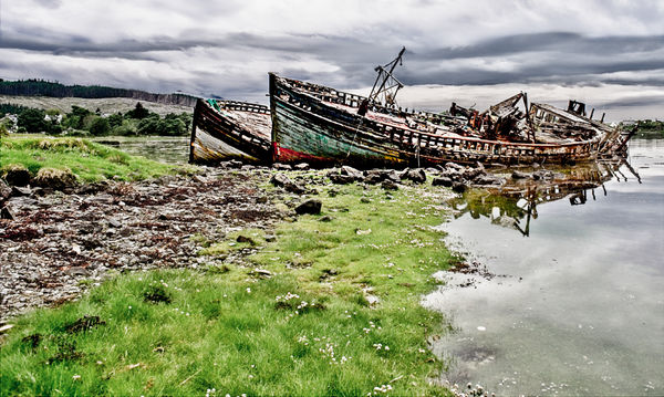
Here is my submission for My Image - Your Look http://www.uglyhedgehog.com/t-371948-1.html
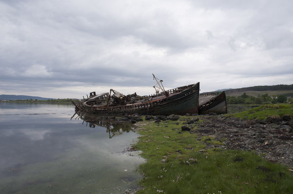
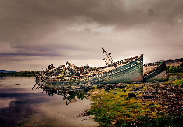
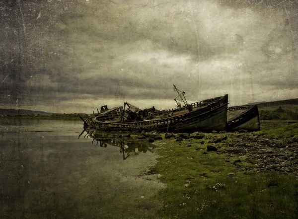
This was taken on the Isle of Mull. Full size jpg attached.
The full size .nef is here:
http://www.dropbox.com/s/8yq6uhcfntee6er/DSC_7713.NEF?dl=0
You have until midnight, Thursday PT to post them here then it will be up for voting.
This was taken on the Isle of Mull. Full size jpg attached.
The full size .nef is here:
http://www.dropbox.com/s/8yq6uhcfntee6er/DSC_7713.NEF?dl=0
You have until midnight, Thursday PT to post them here then it will be up for voting.
Jan 15, 2017 18:40:08 #
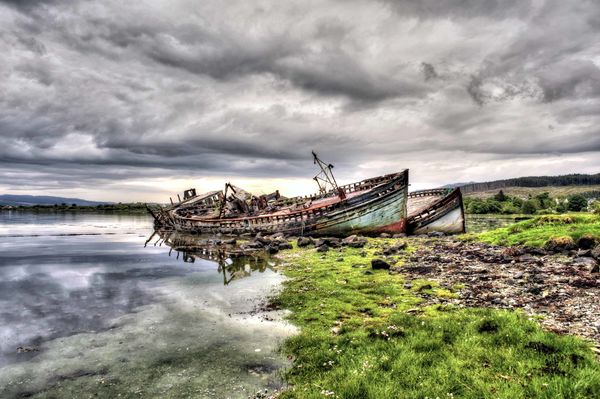
Here is my stab at it. This was a really nice file to work with and I did not want to do too much to it. Mainly I wanted to bring out the details in the image.
Jan 16, 2017 04:50:42 #

I too like the original but I had a little different thought on it. Here is my attempt.
Jan 16, 2017 12:17:59 #

A tighter crop - more so than this, even - lets the intersecting diagonals catch the viewer's eye and reel it right down to the deck. However, once there, it seemed the heavy, bright green, saturated grass tries to pull you overboard. So, desaturating everything, then adding an orange/blue gradient map knocked down the grass even more and snugged up all the colors. I agree, this is a particularly good image to play with... good job Graham!
Jan 16, 2017 13:46:05 #

Jan 16, 2017 14:22:03 #

Jan 16, 2017 15:31:33 #

Graham Smith wrote:
Here is my submission for My Image - Your Look http://www.uglyhedgehog.com/t-371948-1.html . . .
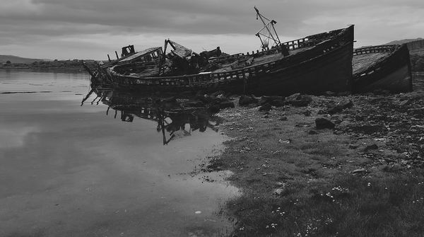
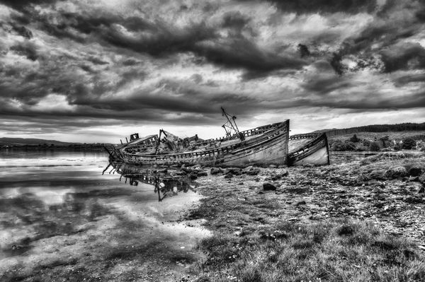
This picture immediately conveyed to me a sense of dark foreboding. The colors, which are very muted to begin with, again, to me, were not important. The picture is almost gray in its original form, and so it cried out to be monochrome.
I cropped the image to emphasize the wreck, cranked back on exposure by 0.6EV (in View NX2) to accentuate the foreboding aspect and then also cranked back on contrast (-30 out of 100) since the picture was contrasty to begin with. Dimming the image made it necessary to also take shadows out to retain the detail in the foreground (31 cranks out of 100).
-George-
Jan 16, 2017 16:25:17 #
Frank2013
Loc: San Antonio, TX. & Milwaukee, WI.
Don't feel anyone is going to out do your previous (http://www.uglyhedgehog.com/t-415985-1.html) rendition of these vessels Mr. Smith. Well taken shots...
Jan 16, 2017 16:44:03 #
Jan 16, 2017 16:56:40 #
R.G. wrote:
I think you'd have had to get your feet wet to get this angle.
-
-
We Fenmen have webbed feet

Jan 16, 2017 18:00:41 #

I really liked working over this image -- I think you for the honor of allowing me the edit of this.
Color and "Shades of Gray"......
Color and "Shades of Gray"......
Jan 17, 2017 18:53:59 #

Graham Smith wrote:
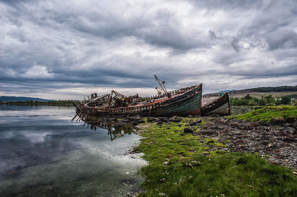
Here is my submission for My Image - Your Look http://www.uglyhedgehog.com/t-371948-1.html
This was taken on the Isle of Mull. Full size jpg attached.
The full size .nef is here:
http://www.dropbox.com/s/8yq6uhcfntee6er/DSC_7713.NEF?dl=0
You have until midnight, Thursday PT to post them here then it will be up for voting.
This was taken on the Isle of Mull. Full size jpg attached.
The full size .nef is here:
http://www.dropbox.com/s/8yq6uhcfntee6er/DSC_7713.NEF?dl=0
You have until midnight, Thursday PT to post them here then it will be up for voting.
Whether or not this entry is in time for the "My Image-Your look" vote, here is my version.
Critique welcomed.
Jan 18, 2017 05:41:59 #
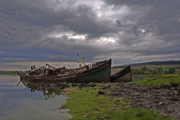
Graham Smith wrote:
Here is my submission for My Image - Your Look http://www.uglyhedgehog.com/t-371948-1.html
This was taken on the Isle of Mull. Full size jpg attached.
The full size .nef is here:
http://www.dropbox.com/s/8yq6uhcfntee6er/DSC_7713.NEF?dl=0
You have until midnight, Thursday PT to post them here then it will be up for voting.
This was taken on the Isle of Mull. Full size jpg attached.
The full size .nef is here:
http://www.dropbox.com/s/8yq6uhcfntee6er/DSC_7713.NEF?dl=0
You have until midnight, Thursday PT to post them here then it will be up for voting.
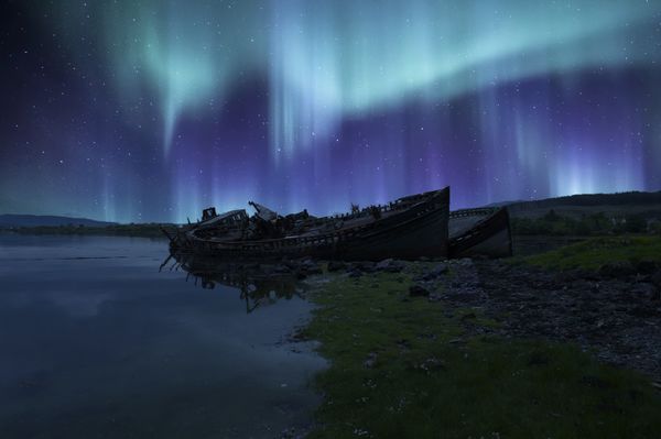
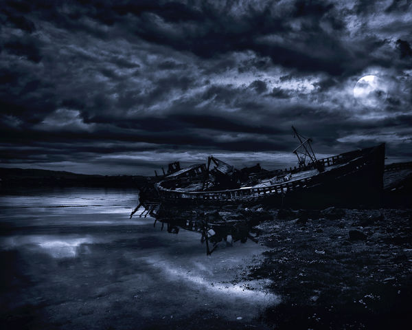
Graham, this was one I enjoyed participating in. Although, I had a lot of haloing to clean up, it was still an enjoyable task. I decided to go with a day to night scene by adding the moon, and practicing my vision of light direction for a dramatic effect. Thanks for the opportunity with this one.
Dave
Jan 18, 2017 12:28:24 #

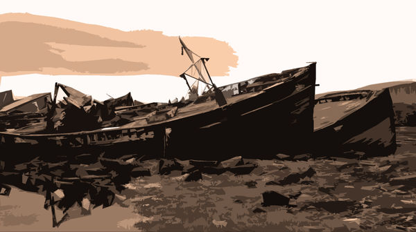
I had a fine old time working one up ever so carefully, then went to upload it and it was indistinguishable from Andrea's version, no one could've told em apart, so I tossed that and went all off in the dark tattered direction.
Jan 18, 2017 13:04:54 #
minniev wrote:
I had a fine old time working one up ever so carefully, then went to upload it and it was indistinguishable from Andrea's version, no one could've told em apart, so I tossed that and went all off in the dark tattered direction.
Sorry I beat you to the punch but I am really glad you went back to the drawing board. I don't know how it will come out in the votes but I love your version.
If you want to reply, then register here. Registration is free and your account is created instantly, so you can post right away.