Which one
Oct 28, 2016 12:20:06 #
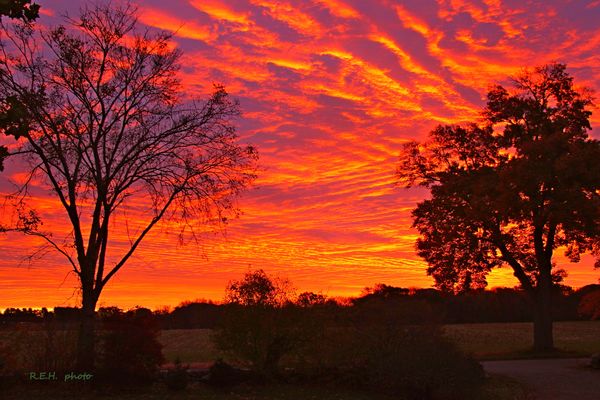
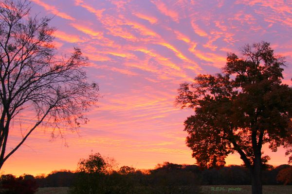
I want to print one of these, but I can't choose which one. So (at this time) I will take a poll. Which one should I print and why. I will tell which one wins. Thanks all for indulging me
Oct 28, 2016 13:36:59 #

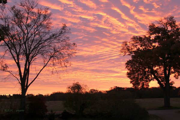
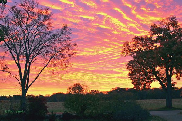
Kind of a tough question, without knowing your goal. To me, number two appears the most realistic, bright pinks and golds, the kind of sunset where your jaw drops and you go 'wow!' So if realism is your goal, I'd print that one. The last two are nice enough, but number two works a little better for me. If I were going to put a poem or a quotation in one, then I'd pick the first. The first is considerably oversaturated, which for poetic use is just fine and often works better than realism. But it depends on what you want, not what I like, lol.
Oct 28, 2016 14:02:35 #
Treepusher wrote:
Kind of a tough question, without knowing your goa... (show quote)
Thanks for the comment on your preference. BTW the shot is a sunrise. Your opinion is always appreciated.
Oct 28, 2016 15:59:14 #

Oct 28, 2016 16:02:24 #

R.G. wrote:
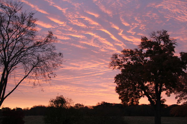
3 for realism, 2 for impact. The others seem overdone to my eye.
Ditto
Oct 28, 2016 21:38:06 #

If your wanting to print a copy of one of these one assumes you want people to notice it. The subject matter including the sky for many parts of the world is a very ordinary occurrence unlikely to warrant a second glance. The landscape material chosen is lacking in natural impact as well. Number 3 seems the most natural but is going to make an extremely ordinary print that may struggle to stop the casual passer by and cause them to look further. Two and four are just variations on this quite normal theme. So in answer to your question I would print number 1. I would not try and make a fota out of it cos really there is nothing there it but instead give full to your artistic side and push it as you have done in the first image. Forget any idea of realism sometimes mother nature can be quite mundane so turn it into what you would really like to have seen with some software enhancements along the lines of number1.
Oct 29, 2016 06:52:59 #

R.G. wrote:
3 for realism, 2 for impact. The others seem overdone to my eye.
Also ditto!
Oct 29, 2016 09:55:35 #

If it were me, I'd print the top one and print it on metal.
--Bob
--Bob
boberic wrote:
I want to print one of these, but I can't choose which one. So (at this time) I will take a poll. Which one should I print and why. I will tell which one wins. Thanks all for indulging me
Oct 29, 2016 13:11:25 #

Oct 29, 2016 13:37:24 #
boberic wrote:
The winner is number 2. I have taken all the suggestions and lightened up the real estate at the bottom and added a touch of contrast and saturation, but no where near the over cooked look of number 1. So this is the one I will print, But to tell the truth the real reason is that the wife likes this one best. Many thanks to all.I want to print one of these, but I can't choose which one. So (at this time) I will take a poll. Which one should I print and why. I will tell which one wins. Thanks all for indulging me
If you want to reply, then register here. Registration is free and your account is created instantly, so you can post right away.