Help - pictures too red
May 20, 2012 08:09:49 #
lachmap
Loc: Sydney Australia
Hi guys.
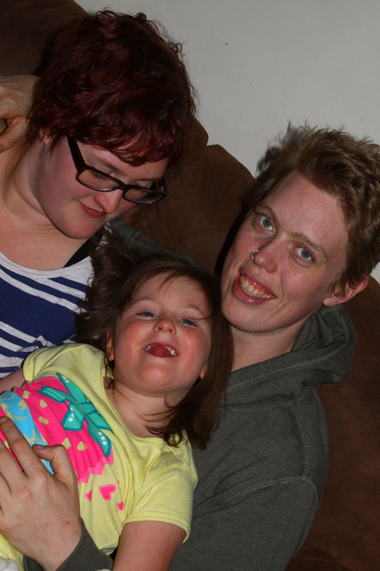
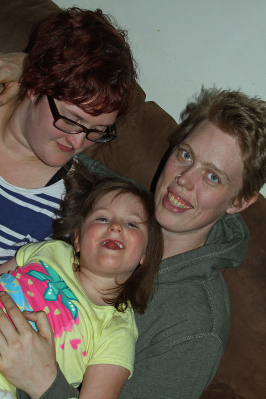
You have all been so helpful before that I wanted to ask another question. In my photos the reds are too red. This makes things like skin look awful.
I have searched my camera (Canon 50D) to see if there is a setting I can change, but to no avail. I have also tried to use paintshop pro X2 to alter the colour but I always end up making it worse (ie crazy colours).
In frustration I have turned some pics into B&W - they actually look pretty good as B&W. Anyway, if some one can help that would be great. I have attached a couple of pics as examples.
It doesn't matter what ISO I use or whether I use a flash or not.
Thanks in advance.
Phil
May 20, 2012 08:37:03 #

OK... this is only what i think that doesn't make it right.... i have never been a good color printer... and you have to know that i prefer a warm image over a cooler one... everyone has their personal preferences... but since you ask here is my answer...
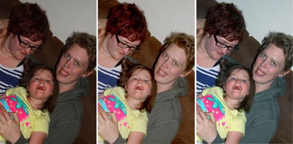
1. I think your camera is under exposing a little giving you more saturation... with density your skin tones become darker, saturating the colors... so I lightened the middle image, you will see that this takes out some of the red in the face... I believe there is a plus and minus exposure adjustment on your camera and you can set the exposure, so that when you are taking the picture it will be lighter or darker this is done in 1/3 stop increments. you may try that... personally i would rather adjust that in my photo correction software (i use Photoshop but i believe that all the programs will allow you to do that).
2. In the image on the right, I reduced the density like the center image, and added a little blue and green (which reduces the red and magenta) to the image which cooled it down. You may like these skin tones a little better .... looking at the wall in the background i tried to get it a shade of gray and it appears in this photo to be a cool gray on the blue side...
I prefer the middle image.... but that is just personal preference.. every one will give you their preference, but your the one who has to be happy.
3. I noticed that you are all redheads... maybe some Irish in you... which which would make you skin tones a little ruddy or red... I may be wrong but that has some influence on the color of the skin tones. Its like freckles you don't see them when you look at people but in a photo they may be more predominate... (you start to notice them when your doing retouching)
Well i hope all my rambling helps... this is just my guess... you have a great looking family and your images are nice and sharp... let me know what you think....
Test print
May 20, 2012 17:08:33 #
lachmap
Loc: Sydney Australia
Hey thanks mate. Both on the right look good to me.
I do tend to underexpose to increase saturation. That may be it. I can alter the colours in paintshop but have awful trouble doing that. Could you give me a lesson on this????
Yes it's a great family but only the one on the right is mine. She is my daughter and the other one is her partner and her partner's daughter.
The other two are a German couple staying with us for a week - they do handyman type stuff in exchange for bed and board. It's called help exchange.
May 20, 2012 17:11:55 #

I am assuming you shot JPEG, if so check your JPEG settings to see what the camera is adding to the shot, you might need to turn down your saturation setting a tad.
May 20, 2012 17:19:00 #
lachmap
Loc: Sydney Australia
Thanks for that. Will have a look through the settings. I may have fiddled at some stage and done something silly.
May 20, 2012 17:21:46 #
if you like he one in the center it is just lightened.... I don't have paint shop on my computer but will do some research to see what i can find out about changing the color to the print... the one on the right has just a little color correction.. we will find the answer soon in hope... keep smiling we will get a solution.
lachmap wrote:
Hey thanks mate. Both on the right look good to me... (show quote)
May 21, 2012 06:59:04 #
jdtx
Loc: SA, Tx.
you may also want to check your white balance, and shoot in raw so it can be corrected easily if it is off somewhat
May 21, 2012 12:56:27 #

lachmap wrote:
Hi guys. br You have all been so helpful before t... (show quote)
Phil,
Your Canon should have several white balance pre-sets available for you to select depending on the conditions. Auto-White balance will cause the camera to guess at the best setting, Datlight will increase the color saturation, and Portrait will soften the image and reduce color saturation.
You can correct all of these in PSP X2 by using the color tools; color balance, and color saturation.
Mgordon
PSP X4 user
May 21, 2012 15:30:58 #
lachmap
Loc: Sydney Australia
Great. Will have a go. Must admit I have left the white balance function out of my photo techniques so far as I concentrate so hard on everything else and just plain forget about it!!!
Must make a checklist!!!!
Must make a checklist!!!!
May 21, 2012 16:08:05 #

May 21, 2012 19:10:10 #
lachmap wrote:
Great. Will have a go. Must admit I have left the white balance function out of my photo techniques so far as I concentrate so hard on everything else and just plain forget about it!!!
Must make a checklist!!!!
Must make a checklist!!!!
Remember, PSP X2 can correct these errors in Post Processing.
Michael G
May 21, 2012 19:44:27 #
lachmap
Loc: Sydney Australia
Yes. I am still getting up to speed on pp. Wish my brain could handle all this. Got a new very part time job and still making mistakes after 6 weeks!!!!
May 21, 2012 22:27:08 #
jdtx wrote:
you may also want to check your white balance, and shoot in raw so it can be corrected easily if it is off somewhat
This would be my guess- only the indoor lighting looks overly red to me - you may have daylight or cloudy set - that will do that in incandescent light.
May 21, 2012 22:49:30 #

They all look over saturated to me which works ok on things but not so much so on people. The skin tones look ok on the last two just over saturated. The flash photo also seems to have a white balance problem; too blue surprisingly.
Just out of curiosity I did a quick auto adjust in PSE and lowered the saturation and got this. Without knowing what the people really look like I don't know exactly how much adjustment to make. The wall is also giving a green cast the further away from the flash. If you can I would recommend using something so you can bounce the flash off the ceiling/walls for a more even tone.
Just out of curiosity I did a quick auto adjust in PSE and lowered the saturation and got this. Without knowing what the people really look like I don't know exactly how much adjustment to make. The wall is also giving a green cast the further away from the flash. If you can I would recommend using something so you can bounce the flash off the ceiling/walls for a more even tone.
lower sat and white balance adj.
May 22, 2012 00:01:20 #
If you want to reply, then register here. Registration is free and your account is created instantly, so you can post right away.