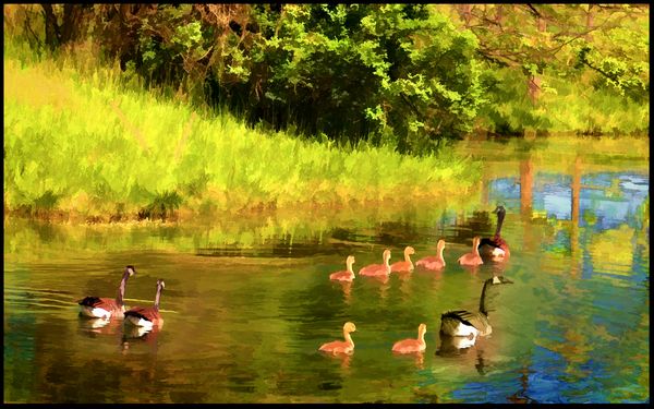
Heading Out, Lake County, IL
Jan 19, 2016 11:53:38 #
Jan 19, 2016 14:22:48 #

jim hill wrote:
Does this cross the line with too much Topaz?
If you could tame the hi-viz yellow/green a bit it would probably look like less of an extreme edit. Everything else looks fine - even pleasant :) .
Jan 19, 2016 15:24:01 #

My problem is with the goslings. The colouring doesn't seem natural. I know it is a painterly version of a photo, but the painter didn't quite get it right. I think the problem stems from the reddish tint on the goslings and three of the geese. Not really sure though Jim, as topaz is not in my wheelhouse.
Jan 19, 2016 15:44:25 #
jim hill
Loc: Springfield, IL
Nightski wrote:
My problem is with the goslings. The colouring doesn't seem natural. I know it is a painterly version of a photo, but the painter didn't quite get it right. I think the problem stems from the reddish tint on the goslings and three of the geese. Not really sure though Jim, as topaz is not in my wheelhouse.
Thanks, Sandra. I tend to shay away from Topaz because I usually go too far and I have absolutely no sense of colour. If I cut the saturation it might be helpful as R.G. has suggested something along the same lines. I'll work with it a little more to see if it can be "saved." Thanks millions for your input.
If I get it better I'll post a link to my Adobe Send Now.
Jan 19, 2016 15:46:29 #
jim hill
Loc: Springfield, IL
R.G. wrote:
If you could tame the hi-viz yellow/green a bit it would probably look like less of an extreme edit. Everything else looks fine - even pleasant :) .
Thanks for the advice, R.G. Sandra had something along the lines of colour not looking right. I'll work on it and if it seems better I post a link.
Jan 19, 2016 16:06:41 #
jim hill wrote:
... I have absolutely no sense of colour. If I cut the saturation it might be helpful as R.G. has suggested something along the same lines. I'll work with it a little more to see if it can be "saved." Thanks millions for your input.
If I get it better I'll post a link to my Adobe Send Now.
If I get it better I'll post a link to my Adobe Send Now.
It is a very nice composition, well balanced and peaceful.
AS other mentioned, it seems to be a little bit over the top in something.
I can't tell if less saturation would help, less luminosity would be better, less green/yellow, or just a brightness adjustment would be best.
It is worth playing with in your favorite software.
Jerry
Jan 19, 2016 17:41:02 #
jim hill
Loc: Springfield, IL
Erdos2 wrote:
It is a very nice composition, well balanced and peaceful.
AS other mentioned, it seems to be a little bit over the top in something.
I can't tell if less saturation would help, less luminosity would be better, less green/yellow, or just a brightness adjustment would be best.
It is worth playing with in your favorite software.
Jerry
AS other mentioned, it seems to be a little bit over the top in something.
I can't tell if less saturation would help, less luminosity would be better, less green/yellow, or just a brightness adjustment would be best.
It is worth playing with in your favorite software.
Jerry
Thanks for your comments, Jerry. Much appreciated. I have been fiddling with it awhile and still not satisfied. Maybe it'll get there.
Jan 19, 2016 23:05:24 #

I think Topaz has gone too far toward the primary colours. I think if you tone down the red and yellow channels the colour would improve. Three of the adult geese and the goslings are much too red. Nice composition though. I'd like to see the Un-topazed version.
Jan 19, 2016 23:44:22 #
jim hill
Loc: Springfield, IL
mcveed wrote:
I think Topaz has gone too far toward the primary colours. I think if you tone down the red and yellow channels the colour would improve. Three of the adult geese and the goslings are much too red. Nice composition though. I'd like to see the Un-topazed version.
Thanks Don. I'll post it along with the suggestions offered. Soon as I get it done.
Jan 20, 2016 08:02:56 #
When I'm having trouble with green vegetation becoming too vibrant, I tint-shift green towards blue a notch or two and desaturate a notch or two. You could also try darkening orange a bit and maybe desaturating a bit.
Jan 20, 2016 09:02:11 #
jim hill
Loc: Springfield, IL
R.G. wrote:
When I'm having trouble with green vegetation becoming too vibrant, I tint-shift green towards blue a notch or two and desaturate a notch or two. You could also try darkening orange a bit and maybe desaturating a bit.
Thanks R.G. I am trying to get it into something like that. I probably need to get out my Serif manual. It's such flat lighting that it's difficult to bring those little guys into a sense of reality. Even the original unprocessed file has them looking like something unreal.
Jan 20, 2016 09:45:48 #
jim hill
Loc: Springfield, IL
mcveed wrote:
I think Topaz has gone too far toward the primary colours. I think if you tone down the red and yellow channels the colour would improve. Three of the adult geese and the goslings are much too red. Nice composition though. I'd like to see the Un-topazed version.
Thanks for your interest, Don. Here's link to original:
https://files.acrobat.com/a/preview/7ce6c164-8277-4479-9329-8899e768a5bb
Jan 20, 2016 13:24:25 #
jim hill wrote:
Thanks for your interest, Don. Here's link to original:
https://files.acrobat.com/a/preview/7ce6c164-8277-4479-9329-8899e768a5bb
https://files.acrobat.com/a/preview/7ce6c164-8277-4479-9329-8899e768a5bb
Jim, Now I see where Topaz got those reddish tones. Perhaps if you backed off the vibrancy/saturation a bit on the original, and perhaps darkened it a bit, Topaz would give a better result.
Jan 20, 2016 13:52:35 #
jim hill
Loc: Springfield, IL
mcveed wrote:
Jim, Now I see where Topaz got those reddish tones. Perhaps if you backed off the vibrancy/saturation a bit on the original, and perhaps darkened it a bit, Topaz would give a better result.
Thanks, Don. I will give that a try.
Jan 20, 2016 16:29:38 #

If you want to reply, then register here. Registration is free and your account is created instantly, so you can post right away.