Help with accurate colours, esp reds and purples
Jun 21, 2015 09:01:40 #

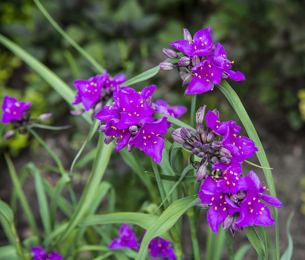
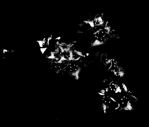
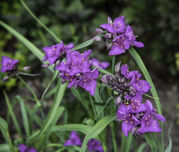
In shooting flowers, I'm struggling with getting accurate colours, especially with purples and reds. See the attached for instance. Additionally, these colours tend to blow out details. Any advice? I've tried to adjust in post processing
Jun 21, 2015 09:11:34 #
Leitz
Loc: Solms
RickH wrote:
In shooting flowers, I'm struggling with getting accurate colours, especially with purples and reds. See the attached for instance. Additionally, these colours tend to blow out details. Any advice? I've tried to adjust in post processing
You'll probably get better advice by posting this in the photo gallery, or photo analysis.
Jun 21, 2015 09:20:19 #
It's not the colors so much as the exposure. In this case, over-exposed. I would use spot metering and meter only the petals.
Jun 21, 2015 10:01:48 #
amfoto1
Loc: San Jose, Calif. USA
Setting a Custom White Balance before taking the shot will often help immensely with color accuracy. Most DSLRs and many other digital cameras allow you to do that. Learn to do it with yours and make a habit of it.
Also try to work in the shade or carry a diffusion panel with you to shade the subject. Full sun is often too contrasty. An overcast day is ideal.
If not already doing so, shoot RAW for more control in post-processing. JPEGs just don't tolerate very much adjustment. Eventually for many purposes you'll want to save a 8 bit JPEG copy, usually in sRGB color space, because those are the standards used by many printers and online. But while making adjustments it can really help to work the image in 16 bit form and Adobe RGB color space.
And, yes, a Custom White Balance does effect what you see, even when shooting RAW. You never actually view a RAW file directly... you are looking at a JPEG rendition of it, with various preset adjustments applied. If you look at the image in the camera manufacturer's own software, you can display it "As Shot" and the software will use the camera settings to interpret the RAW file.
If using a third party software such as Photoshop/Lightroom, most of the camera related "tags" in a RAW file (sharpness, contrast, etc.) are ignored. But White Balance is not. With respect to the color temperature and tint it's shown "as shot" by almost all softwares (all I can think of, that are capable of interpreting a RAW file). It can be changed in post-processing... which is better done working a 16 bit RAW file than an 8 bit JPEG.
Next, your computer monitor might be lying to you. Most consumer grade monitors do not show full color gamut and are way too bright, causing the user to overly darken their images. It especially shows up when a print is made from the image.
A graphics quality monitor that shows a wider color gamut more accurately can help... but with any monitor some sort of calibration needs to be done. Some people with a really good eye can calibrate a monitor manually... but most of us need the help of a calibration device and software. The most widely seen and popular of these are Datacolor Spyder, Xrite ColorMunki and Pantone Huey. The first step with all these is to set the brightness of the monitor. After that the software produces a series of color test patches that are measured with the colorimeter "puck" device, and finally a profile is created for that specific monitor under those specific conditions. Monitors change with time and use... growing dimmer and shifting color. So recalibration is necessary every month or two for best accuracy. It's also hard to work with portable computers of any type... since viewing angles and ambient light conditions change. Technically one should recalibrate every time you move the computer to a different location or close and open a laptop with a different viewing angle. Best results are usually from a fixed work station that's kept properly calibrated.
Softwares need to work with that color profile, too. I see you're using Photoshop CC to make image adjustments. That's good and works with a profile. Depending upon how you plan to use the images, you may need to load some soft proofing profiles, such as for specific printer ink and paper combos. Some other things, such as Windows Picture Viewer, Explorer and Internet Explorer do not use a color profile and may not display images all that accurately (not a whole lot you can do about that... just be sure that anything displayed online is in the sRGB color space).
I actually don't see very much of an exposure problem with your image example. But, yes, that's critically important, too. You might try bracketing your images, if unsure about exposure. It is highly saturated... which may be what you wanted. Be a little careful not to oversaturate images when you adjust them in post-processing.
"Blown out" colors actually might not be blown out at all... It could be that your computer monitor is simply unable to fully display those colors and is clipping them. Even with a graphics quality monitor with a wide color gamut, I am often pleasantly surprised how much more detail there is in both the highlights and shadows of my images, when I make a print from them (especially when printed on smooth, matte paper, which shows the most detail and sharpness).
Hope this helps.
Jun 21, 2015 10:11:08 #
many thanks; this is truly helpful
(I did shoot with spot metering, and I do use RAW). The advice on WB seems crucial
(I did shoot with spot metering, and I do use RAW). The advice on WB seems crucial
Jun 21, 2015 13:12:30 #

Jun 22, 2015 05:26:04 #

RickH wrote:
In shooting flowers, I'm struggling with getting accurate colours, especially with purples and reds. See the attached for instance. Additionally, these colours tend to blow out details. Any advice? I've tried to adjust in post processing
Shoot out of direct sun; cloudy/overcast/shade is better (or make your own shade)
Do a custom white balance before shooting.
Meter accurately so that you don't overexpose. I'd meter off of my hand or a grey card or even better, use an incident meter (gasp! Get the torches and pitchforks!)
Jun 22, 2015 06:45:13 #
RickH wrote:
In shooting flowers, I'm struggling with getting accurate colours, especially with purples and reds. See the attached for instance. Additionally, these colours tend to blow out details. Any advice? I've tried to adjust in post processing
Profiling with a ColorChecker Passport will solve this for many images. Using a shading device, shooting on a cloudy day or anything you can do to avoid direct sunlight will work. Your issue is color saturation and color channel clipping, not overall tonal value. Whatever metering system you use, you can clip the saturation on any color without overexposing the overall image. A luminance histogram will not necessarily show this.
There is no metering system that can detect this prior to pressing the shutter unless the amount of clipping is considerable. From practice, if you shoot in raw, and you profile the camera, and you still have issues, you can look at the color histogram on the back of the camera and get a sense of how badly the red and blue color channels are over saturated and underexpose a bit. You will end up with a darker image, but you won't lose the detail to channel clipping. You can then adjust the color in your raw converter, and providing you did not clip the color too badly, you should be able to retain all the detail. Reading you hand, a gray card, using an incident meter, spot meter, etc - will give you a ballpark decent exposure, but to be certain you aren't clipping channels, checking that histogram and bracketing your exposures are both indispensable.
Even if you can't check or forget to bracket, you can fix this either in your raw converter, or by using a saturation mask in Photoshop.
https://luminous-landscape.com/restore-those-clipped-channels/
Jun 22, 2015 07:59:23 #
Jun 22, 2015 08:28:27 #
There is also the possibility that your settings on the camera are: VIVID COLORS, or HIGH CONTRAST which tend to overly saturate colors.
Jun 22, 2015 08:51:54 #
amfoto1 wrote:
Setting a Custom White Balance before taking the s... (show quote)
Alan, I would like to make a few clarifications to what you wrote.
If you shoot raw, a custom white balance will not affect the image capture. The entire spectrum of color will be captured. Shooting jpeg, or viewing the raw file's jpeg preview will show a difference but the raw data is not changed.
According to Nikon, and I am certain that it is the same for other camera mfgrs:
"The primary benefit of writing images to the memory card in NEF format rather than TIFF or JPEG is that no in-camera processing for white balance, hue, tone and sharpening are applied to the NEF file; rather, those values are retained as instruction sets included in the file."
http://www.nikonusa.com/en/Learn-And-Explore/Article/ftlzi4ri/nikon-electronic-format-nef.html
Custom white balance shows differences in colors but it is not hard coded into the file. Like all the other picture settings other than exposure, it is a tag.
To my knowledge, the only cameras that provide 16 bit raw files are the Leica, Hasselblad and Capture One backs - and are all medium format.
The reasons you state for avoiding current laptops is more about limited bit depth and gamut, than viewing angles. Most laptops are just 6 bit devices with dithering, frame rate control and other methods to give the appearance of deeper color bit depth or wider gamut. It is still an illusion that is enabled by the eye's latency, and not ideal for static image editing.
Hope you don't mind.
Jun 22, 2015 09:07:36 #

RickH wrote:
many thanks; this is truly helpful
(I did shoot with spot metering, and I do use RAW). The advice on WB seems crucial
(I did shoot with spot metering, and I do use RAW). The advice on WB seems crucial
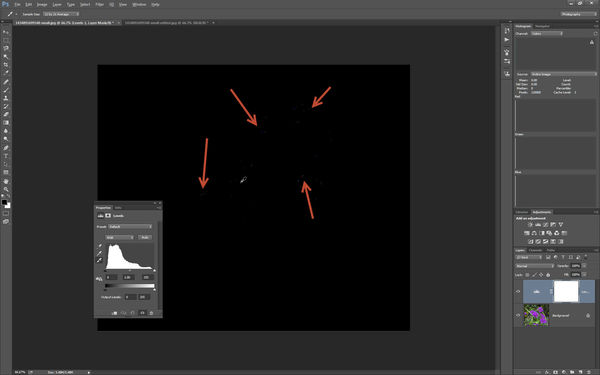
The image is "over exposed". Look at a good histogram. Or learn how to see a "threshold" view (done differently in different editors) to show you which pixels are too high (or too low).
The image attached at the end of this article shows a thresholded view, with the threshold set to 245. Everything from 246 to 255 is white. And everything in that range will be seen as "washed out", even though it is not clipping at 255.
To a great degree this is an effect of increasing the saturation. If you were trying to edit this as a JPEG it would help greatly to drop the saturation, then adjust brightness and contrast, and afterwards bring the saturation back up. But you are shooting in RAW, and doing the conversion process correctly is vastly better.
First, learn to use an histogram to judge exposures in the camera. Using a spot meter requires an educated guess as to what should be metered. And in fact so does using every other type of metering! Best is to look at what you get when you shoot an image, and adjust to make it better on the next exposure! Extra exposures are free, use them!
When you do the conversion from raw sensor data, look at an histogram then too! Everything above about value 245 produces very low contrast on either a print or on a monitor. Some detail can be seen, but not much. Avoid significant areas (as oppose to sharpened edges) on an image, in particular when detail is desired, with values above 245. Two of the most significant examples are the shiny spots on a face in a portrait, and highly saturated flower colors (particularly the ones that are half way between red, green, and blue (i.e., cyan, magenta and yellow).
Then use contrast and brightness controls (or a curves tool) to map various tone as appropriate to each individual image.
One good bit of advice you were given was to shoot in the shade, for less contrast than in direct sunlight.
All pixels with a value above 245 shown as white
Jun 22, 2015 11:59:13 #
If I don't like the colors, I open both raw and jpeg's in Photoshop cc/ raw filter, and adjust the colors to however I like them. I've found, over the years, that trying to get real accurate color is for when you need it that way. Otherwise just adjust the colors to whatever is most pleasing to you. Almost all of my serious photos have at least some color adjustment to it. Otherwise you will beat your head against a wall trying to get that so called accurate color.
Jun 22, 2015 12:47:28 #
RickH wrote:
In shooting flowers, I'm struggling with getting accurate colours, especially with purples and reds. See the attached for instance. Additionally, these colours tend to blow out details. Any advice? I've tried to adjust in post processing
Rick, I took another look at the image and this is what I found.
Obviously you did not shoot this in sunlight.
You have over saturated blue and purple(magenta) channels.
Your image is not overexposed.
It can be adjusted in post processing.
Using a color checker passport and a raw file of this image is the best (fastest and most effective) way to fix this, though it can be handled as a 16 bit tiff, or even a jpeg file.
The only clipped highlights are some of the tiny bright spots (similar to specular highlights) on the petals of some of the flowers. The brightest I found were a couple at 250. This is something that using a threshold layer can mislead you on.
You need channel specific information to be able to fix this, and you need to be able to localize your adjustments to the specific color range and area on the image.
To show you channel clipping, add a Levels adjustment Layer, click on the white sampler eyedropper, hover over the image and press Alt key. This will show you the clipped channels.
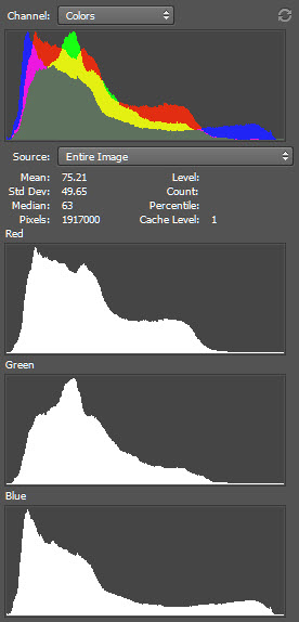
The first image below is a screenshot of the clipped channel information.
The second is the expanded view of the histogram and as you can see, the exposure is as far as it can go without clipping.
The image just needs a little TLC. I did a little work on the jpg that you posted, but clearly a D800E can produce a stunning image with much more detail. If you shot this in raw, then there is even more recoverable information in those highly saturated blues and purples.
The third image is the result of using a saturation mask, making small adjustments to the blue and magenta channels for saturation and levels, and using the mask again to locally adjust local contrast - I used the unsharp mask filter with a large radius (I think I used 400) and a relatively small amount - about 18%, then went back and used a normal amount (around 200%) and a small radius - .7.
Using an original raw file I can get better results. There is an alternate method that uses channel mixing to copy the detail present in one channel to another, which is useful for moderately blown highlights. But I didn't try it on this image.
Let me know if this was what you were trying to do on this image.
Jun 22, 2015 13:26:00 #
RickH wrote:
In shooting flowers, I'm struggling with getting accurate colours, especially with purples and reds. See the attached for instance. Additionally, these colours tend to blow out details. Any advice? I've tried to adjust in post processing
Color is purely subjective. One might argue(suggest) that a photograph is merely a representation of the scene. No photo will ever be an exact copy of the subject. In fact your left eye sees color differently than your right. You can tweak this thing or that, but never expect perfection.
If you want to reply, then register here. Registration is free and your account is created instantly, so you can post right away.