Cropping Question
Dec 20, 2014 16:23:45 #

I am a bit late on this, but just wanted to say that I like the composition as is. It tells a story and he is so cute to boot! IF I were to make a change, it would just be to crop 5 x 7 as it would still keep enough to tell a story of what he is doing and make you want to know where he is looking. Great timing in capturing this!
davefales wrote:
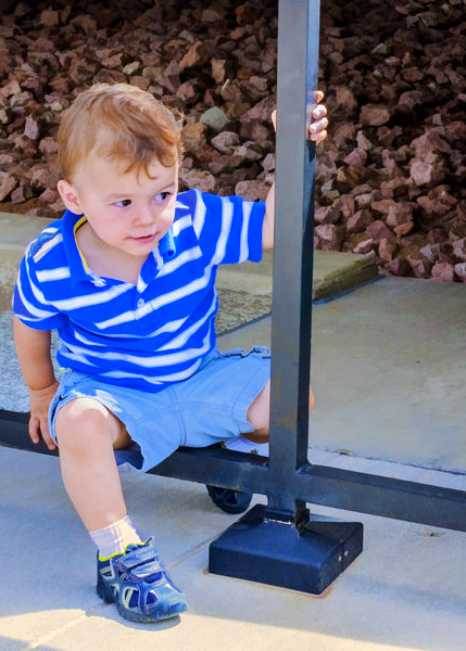
:thumbup:I offer this composition for comments. There are so many variables to the best way to crop this one (Rule of Thirds, Rule of Space, general impact at first view).
This is No. 4 grandson. I used Topaz Simplify lightly.
What do you think about the cropping? I have a fair amount of image space outside of the crop. Thanks in advance.
This is No. 4 grandson. I used Topaz Simplify lightly.
What do you think about the cropping? I have a fair amount of image space outside of the crop. Thanks in advance.
Dec 27, 2014 11:10:34 #
Clicker2014 wrote:
I am a bit late on this, but just wanted to say that I like the composition as is. It tells a story and he is so cute to boot! IF I were to make a change, it would just be to crop 5 x 7 as it would still keep enough to tell a story of what he is doing and make you want to know where he is looking. Great timing in capturing this! :thumbup:
Thanks for your kind comments, Clicker.
Jan 3, 2015 13:25:46 #

rehess wrote:
This may just be me, but I find the pale triangle in the upper right to be distracting. Cropping farther to the right would "fix" that "problem" also.
Agree, also the camera being slightly tilted is distracting to me.
Like the clarity and depth of field for this shot though..
I would have cropped a little tighter, keeping same ratio
Vinny
Jan 3, 2015 13:29:20 #
Clicker2014 wrote:
I am a bit late on this, but just wanted to say that I like the composition as is. It tells a story and he is so cute to boot! IF I were to make a change, it would just be to crop 5 x 7 as it would still keep enough to tell a story of what he is doing and make you want to know where he is looking. Great timing in capturing this! :thumbup:
I just made a reply to rehess.
This is exactly what I meant except for the camera tilt. Nice job. Vinny
Feb 10, 2015 09:54:14 #
DavidPine
Loc: Fredericksburg, TX
First, I would get as low as possible to make this image. I carry a yoga mat so I can lay prone if need be. Second, this composition needs space to where he is looking so the rule of thirds would apply. Third, single point focus on his near eye. Forth, an X-rite color card would be helpful for post processing.
davefales wrote:
I offer this composition for comments. There are so many variables to the best way to crop this one (Rule of Thirds, Rule of Space, general impact at first view).
This is No. 4 grandson. I used Topaz Simplify lightly.
What do you think about the cropping? I have a fair amount of image space outside of the crop. Thanks in advance.
This is No. 4 grandson. I used Topaz Simplify lightly.
What do you think about the cropping? I have a fair amount of image space outside of the crop. Thanks in advance.
Feb 10, 2015 11:22:14 #
paulrph1
Loc: Washington, Utah
IN THIS CASE CROPPING WOULD NOT HAVE ADDED MUCH. But it would have made you feel closer to the subject.
Feb 17, 2015 01:15:57 #
CO wrote:
If the original image has more space on the right I would include that. It would be good to have more space in the direction that he is looking. I think your vantage point is too high. It would have been good to squat or kneel down to get the camera closer to his height.
I agree!
Feb 19, 2015 12:14:39 #
Don Fischer
Loc: Antelope, Ore
CO wrote:
If the original image has more space on the right I would include that. It would be good to have more space in the direction that he is looking. I think your vantage point is too high. It would have been good to squat or kneel down to get the camera closer to his height.
This is my though too. I'd move it up and back a bit. I like to see something moving, moving into the photo and something still looking into the photo. The boy is looking to his left and slightly down. Nice photo though.
BTW, I'd try a wider apperture to throw the background out of focus and show the boy better.
Feb 19, 2015 20:50:53 #

Feb 20, 2015 04:32:00 #

Why cut off? And so a good photo. And a cute kid on her! Perhaps this can be useful for photo enthusiasts http://ams-collage.com
Mar 1, 2015 13:29:47 #
I would try to get the aspect ratio right, i.e., (5 x 7). By so doing, you could crop behind the boy and leave the apace in front of him to look. Also, consider getting down on his level (not taking picture downward). Focus and color are good and subject is a good looking young man.
Mar 1, 2015 19:40:23 #
infocus wrote:
Personally I think the boy is the point of interest. He has a cheeky little smile that is adorable. Hope you don't mind but you asked what we thought - this is what I think.
I agree with infocus ......
There are 3 things you could do ......
1. center the boys head on the upper left 1/2 intersection
2. crop out a bit of the bottom to eliminate the harsh light which is somewhat of a distraction ......
or .......
#3 ....... which is what infocus stated and I agree, the expression and smile is what captures me and of course is the subject ;)
Mar 6, 2015 10:39:59 #

I agree with the comment on the light triangle. Maybe clone the bark to fill it. I would not crop this any further - it looks good the way it is.
Mar 6, 2015 12:00:01 #
A late comment: reduce the "blue" a bit. Concrete, etc. is a little blue taking away from the boy's lovely blue shirt. Love his curious look!!
Mar 8, 2015 16:38:51 #

It is a very nice picture but I feel that there are a few items in the picture that draw your eyes such as the rocks in the background and the heavy black posts. I think that a closer crop on the boy which would eliminate the distractions could work. as long as he can be fit slightly to the left of center to allow for the viewer to sense that the boy is looking off in that direction.
If you want to reply, then register here. Registration is free and your account is created instantly, so you can post right away.