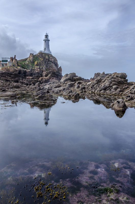
Corbiere Lighthouse Jersey Is UK
Apr 10, 2014 13:05:43 #

I would like to receive you option(s) on each of the attached photos and your comparision opinion
Apr 10, 2014 13:35:42 #
I can hardly tell the difference. The sky is darker in #1; it looks like the sky was lightened in #2. Personally, I don't see a need for all that foreground, especially the weeds. I think you could crop some off the bottom and the right and come up with a more balanced shot.
Apr 10, 2014 15:09:03 #
dave sproul wrote:
I would like to receive you option(s) on each of the attached photos and your comparison opinion
Correction
I would like to receive feedback on the photo & thank whoever remove the light one.
Sorry I screwed up.
Apr 10, 2014 15:19:35 #

dave sproul wrote:
I would like to receive you option(s) on each of the attached photos and your comparision opinion
I think the foreground is an excellent way of introducing some originality into a lighthouse shot. Lighthouses are such a popular subject, they need something out of the ordinary to make them stand out. Ditto for the low viewpoint.
Apr 10, 2014 15:21:16 #

dave sproul wrote:
I would like to receive you option(s) on each of the attached photos and your comparision opinion
I think this is a great shot because of the vegetation in the foreground. That is what makes this image stand out from all of the other lighthouse-on-a-rock photos that I have seen.
The only thing that might have made it better would have been to have set your focus point a little closer to the camera - the foreground details are a little soft. I think if you print this no larger than 8x10 inches it may not noticeable.
Apr 10, 2014 16:22:14 #

Wow, I agree with Selmslie and RG...this has got to be a day to remember. I love the lines leading from the veggie covered rock under water to the rocky ridge leading up to the lighthouse. I wouldn't give up those reflections for anything. One little nit pick. I'd get rid of the ugly building(garbage canisters?) to the left. Crop or edit out. I think they detract.
Apr 10, 2014 16:29:57 #

dave sproul wrote:
I would like to receive you option(s) on each of the attached photos and your comparision opinion
I like this photo a lot. The composition of the light, the reflection, the water and the underwater vegetation is pretty wonderful. I agree with Nightski about the stuff on the left side - the building or bins or whatever - they take away. I might get rid of the people unless they are people I know and want to keep in there. This is a story that lies between the regal-looking lighthouse structure and the sea world down below in the shallows. Sky rendering is nice too - just interesting enough but not competing with the other elements.
The slight softness doesn't really detract. If one is too get everything fore to back ground in focus, there have to be compromises.
Very good image. A pleasure to look at over and over.
Apr 10, 2014 19:15:05 #

Wonderful composition and lighting. As already stated the foreground enhances and gives depth. Well done. :thumbup:
Apr 10, 2014 23:08:50 #

I love the foreground on this, it adds so much more interest... I do however concur with the others about removal of the objects and out building on the far left side... I think if it was removed it would put this image one step closer to magical......
Apr 11, 2014 06:03:46 #

dave sproul wrote:
I would like to receive you option(s) on each of the attached photos and your comparision opinion
I also like the foreground on this as it adds interest to the subject. And, I also concur with the other comments about removal of the objects on the left side would improve the photo. Over all, this is a very nice shot.
Apr 11, 2014 08:33:48 #
Thank you for your comments -- I appreciate all of them. You provide me with part of the information I need to overcome my photography learning curve.
Apr 11, 2014 10:39:06 #

At a photo club meeting last night a judge reviewed a series of images. Looking at one seascape shot, he commended the photograph for including a strip of sand in the foreground. His opinion was that it provided the viewer with "a place to stand" -- a kind of emotional resting place-- when viewing the image.
It is perhaps because of his comments that I think miss that "place to stand" in this image. Maybe the image makes me feel a little disquieted because it seems to be floating without a solid foundation upon which to rest. The issue for me, of course, is whether I would have had the same reaction without having heard the photo contest judge last night.
It is perhaps because of his comments that I think miss that "place to stand" in this image. Maybe the image makes me feel a little disquieted because it seems to be floating without a solid foundation upon which to rest. The issue for me, of course, is whether I would have had the same reaction without having heard the photo contest judge last night.
Apr 11, 2014 10:42:43 #
jgordon wrote:
...............It is probably because of his comments that I think miss that "place to stand" in this image. Maybe the image makes me feel a little disquieted because is seems to be floating without a solid foundation upon which to rest. The issue for me, of course, is whether I would have had the same reaction without hearing the photo contest judge last night.
It looks quite shallow in the foreground JGordon, so with a pair of decent boots you could easily stand there to rest. :D
Apr 11, 2014 11:33:21 #

Including the spit is a definite plus. The only detriment as I see it is the building/garbage cans/people to the left. If you cropped a bit more tightly you can get rid of most of that, but you'd still need to clone out the antenna. But cropping as I see it will sort of throw the image out of balance, so that might not work either.
Apr 13, 2014 14:47:46 #

dave sproul wrote:
I would like to receive you option(s) on each of the attached photos and your comparision opinion
This image, beyond its technical excellence, exudes strong impact...hard to look away... and epitomizes several principles of composition in, but not limited to, the landscape genre.
Perspective, leading lines, quantitative recession, balance, and atmospherics.
Further, there is minimal and subtle, yet absolute crucial reliance on color.
Withall, one of the... if not THE most exemplary image I've seen posted on UHH.
Impact: 4.9
Technical: 5
Composition: 5
Total: 14.9 (we all must continue to strive for perfection!)
This image would "High Ribbon" in any show or contest I've ever had the pleasure to judge.
Dave in SD
If you want to reply, then register here. Registration is free and your account is created instantly, so you can post right away.